Project Meerkat
UBS AG
Contents
Intro
Project Meerkat was developed to replace outdated derivative tools used by UBS’s sales and trading teams. The goal was to seamlessly integrate it into the larger UBS service ecosystem, offering a more cohesive and user-centric platform.
Challenge
The existing off-the-shelf solution was generic and failed to address the specific needs of UBS's sales and trading teams. The challenge was to redesign the dashboard, making it more intuitive and tailored to their unique workflows and requirements.
Solution
A custom dashboard was designed focused on the team's needs, offering enhanced usability through simplified UI components and data visualisations. This solution streamlined trade execution workflows, making processes more efficient and user-friendly.
1. Introduction

Meerkat was designed to replace the outdated derivative tools used by UBS's sales and trading teams, integrating seamlessly into UBS’s broader service ecosystem. The goal was to create a more cohesive platform that would evolve with future services.

At the core of Meerkat was the RFQ order management workflow, essential for managing trades. Beyond that, the platform handled incoming data, regulatory compliance, pricing, business intelligence, and trader lifecycle management while also connecting with external markets and clients.

Meerkat aimed to be an all-in-one solution, allowing users to manage every aspect of their workflow from a single, unified interface.

Below are screenshots of the original Meerkat interface.
Original Meerkat dashboard - Screen 1
Original Meerkat dashboard - Screen 2
Original Meerkat dashboard - Screen 3
2. User Research

To ensure the redesign of Meerkat effectively addressed user needs, comprehensive user research was conducted, involving regular calls with six key traders who were expert users of the platform. These traders possessed valuable insights into the RFQ workflow and its associated challenges. Engaging with a select group of knowledgeable users allowed for gathering a representative sample of the broader user base, ensuring the findings were both relevant and actionable.

The research approach included qualitative interviews and guided walkthroughs, allowing for exploration of various aspects of the user experience. The focus was on understanding:
Throughout these sessions, traders provided feedback on their experiences with the interface, discussing what worked well and what could be improved. This direct engagement with expert users was instrumental in uncovering pain points and suggestions for enhancement.

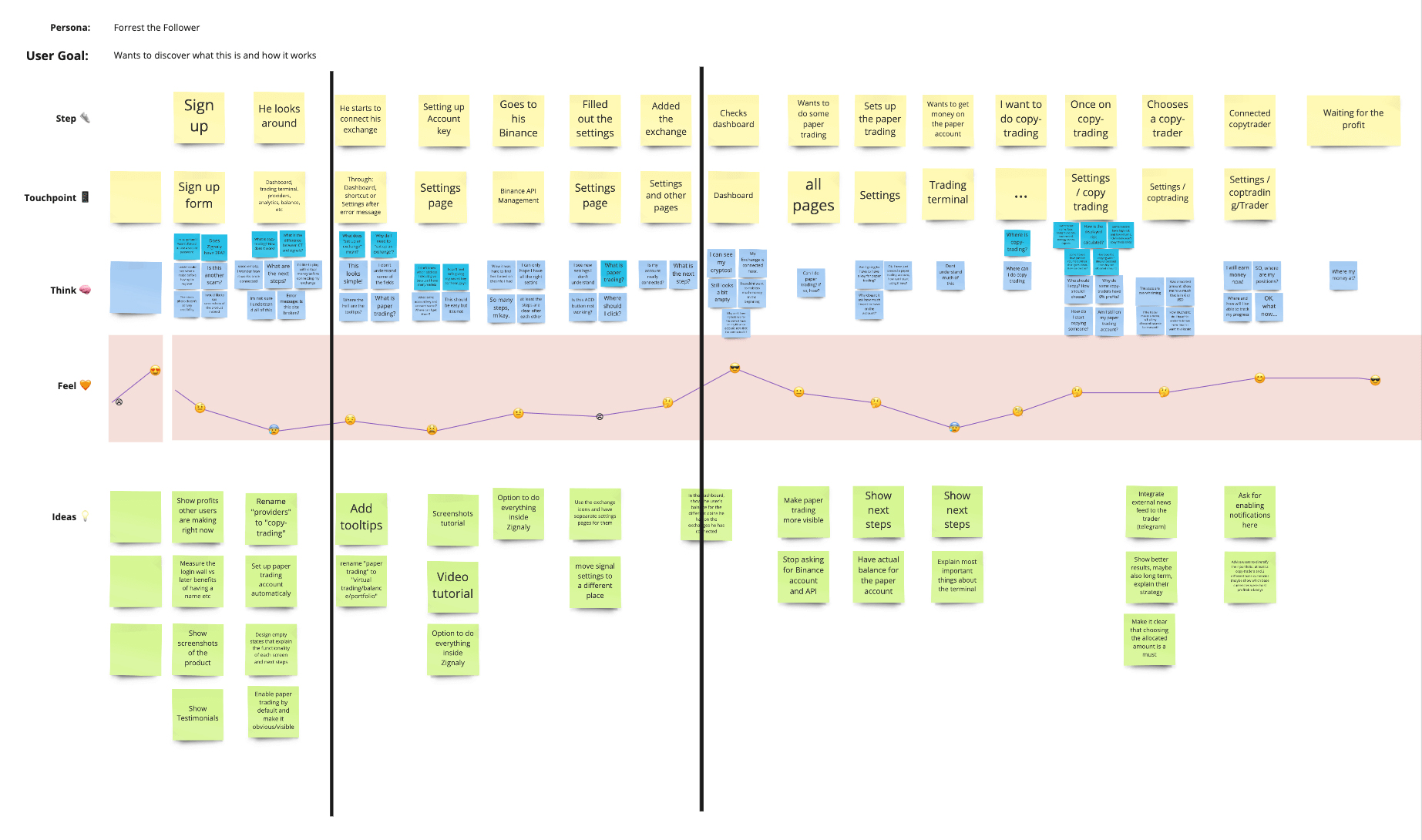
These insights allowed for constructing a hypothetical user journey (shown below), using real user data to identify and prioritise key pain points. This analysis established a solid foundation for a strategic roadmap, steering the redesign of the Meerkat interface to improve usability and enhance user satisfaction.
Mapping out the user journey helped identify and prioritise user pain points
Mapping the user journey enabled the identification and prioritisation of key user pain points
3. Key Findings

The insights gathered from user research revealed several critical challenges faced by traders when using Meerkat. These findings highlighted specific areas where the user experience could be enhanced, shaping design priorities and effectively guiding the implementation of solutions.
Issue
Description
Outcome
Lack Awareness of Ticket Status
Users struggled to quickly assess the status of tickets, leading to potential delays in critical actions.
Conduct user interviews to gather insights on ticket status assessment, then prototype and test intuitive status tabs and alerts.
Visual Clutter from Filtering Options
The existing filtering options contributed to visual clutter, distracting users from the main dashboard.
Analyse feedback on filtering, design an overlay-based system, and conduct usability tests to ensure it reduces clutter and enhances focus.
Complexity in Data Grouping
Users found it challenging to organise and retrieve related data efficiently.
Engage users to identify grouping pain points, then design user-defined labels and test the new functionality for simplicity.
Sorting Method Confusion
Users experienced confusion with the sorting methods available, impacting their ability to manage data effectively.
Gather insights on sorting confusion, develop two clear sorting options, and conduct user testing to find the most effective solution.
Difficulty in Contextualising Data Across Blotters
Users had trouble connecting and contextualising data between different blotters.
Collaborate with users to understand contextualisation needs, design a context-sharing feature, and test it for functionality.
Complicated Data Upload Processes
The data upload process was cumbersome and not user-friendly.
Map the current upload process to identify pain points, redesign with user-friendly dropdowns, and validate through user testing.
Action Buttons Lacking Usability
Action buttons were visually unappealing and lacked clear functionality, causing confusion among users.
Conduct A/B testing on action button designs, gather user feedback, and select the most effective design for improved interaction.
Disorganised Sales and Trader Ticket Layouts
The layouts of sales and trader tickets were cluttered, making navigation difficult for users.
Review layouts with users to identify issues, implement a grid system, and test for improved navigation and reduced clutter.
Inefficiencies with Multiple Windows
Users often struggled with managing multiple windows, hindering workflow efficiency.
Observe users managing multiple windows, design a control stacking feature for better management, and test usability in real scenarios.
Manual Data Entry Challenges
Users faced challenges with manual data entry when bulk uploading, which was time-consuming and prone to errors.
Survey users about entry pain points, design a new bulk upload feature, and validate effectiveness through user testing.
Lack of Cohesive Data Visualisation Tools
Users requested more effective data visualisation tools to interpret complex data sets easily.
Gather user feedback on visualisation tools, develop new features for the dashboard, and conduct usability tests to enhance data interpretation.
These findings provided a clear understanding of the traders' challenges, allowing for prioritising essential improvements for the Meerkat interface. Addressing these pain points became the focus as the transition into the low-fidelity prototyping phase began.
4. Low-Fidelity Prototyping

Through user research and studying the current Meerkat platform, a better understanding of the requirements was gained.

The first low-fidelity prototype was created on Axure, a prototyping tool that allowed for rapid prototyping and complex interactions, which was ideal for simulating the use of the product. These prototypes allowed for testing the information architecture and user flows.

Please see below three early Axure prototypes for the different parts of the Meerkat platform. Click on the thumbnail to open a new page displaying the prototype.
GED Blotters and Workspaces
GED Blotters and Workspaces Prototype
Sales Accept and Order
Sales Accept and Order Prototype
Overall Quote area
Overall Quote Area Prototype
5. High-Fidelity Prototyping

High-fidelity prototypes were developed to provide users with a realistic preview of the product's appearance and functionality. These prototypes incorporated the colours and components from the UBS design system, ensuring visual consistency and compliance to brand guidelines. Enhanced UI elements were also introduced to resolve user issues and effectively demonstrate potential interactions within the final design.

Below are the key features integrated into the new Meerkat interface, accompanied by spec sheets for developer reference.

Status tabs
Status tabs
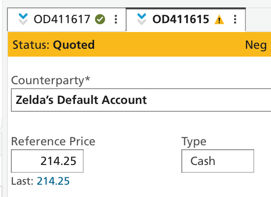
The status tabs and alerting feature were prioritised to enhance user awareness. The objective was to enable users to quickly assess the status of any ticket in the data rows, facilitating timely interventions when necessary. This feature ensured that critical actions were never overlooked, streamlining communication across teams.

Prototype Spec sheet
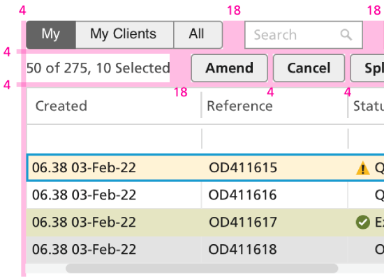
Filtering
Filtering
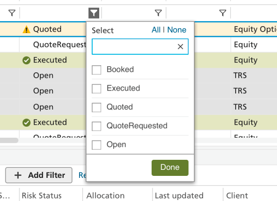
A new overlay-based filtering approach was explored to minimize visual clutter. This design choice allowed users to apply filters without overwhelming the dashboard's main interface, maintaining focus on the data. By offering a streamlined filtering experience, users could efficiently refine their search criteria without losing context.

Prototype Spec sheet
Grouping
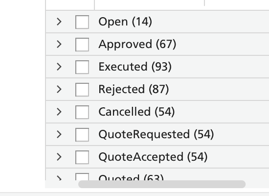
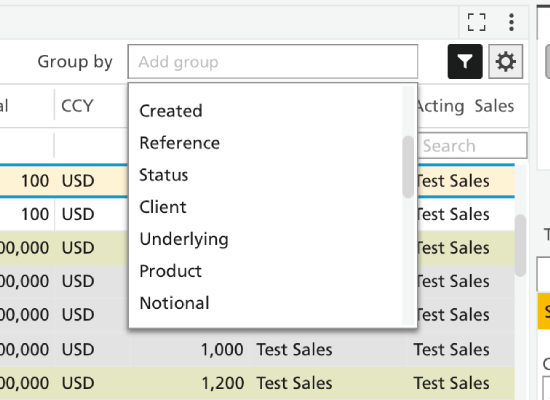
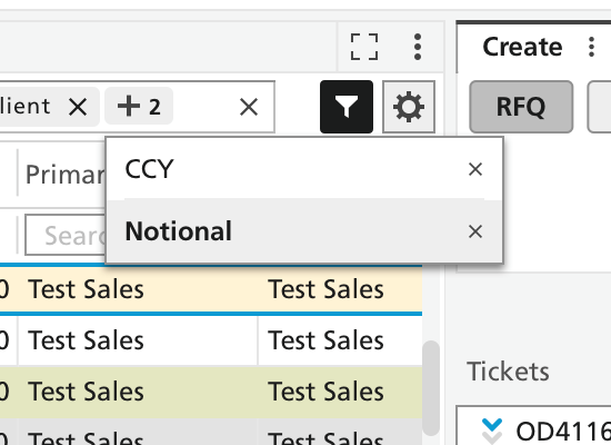
The grouping functionality was enhanced with a dedicated text box for user-defined labels. When a group was created, a visual indicator (a pill) appeared in the text box, and an accordion grouping formed in the blotter. This design simplified the organization and retrieval of related data, making it easier to manage workflows. Multiple designs were tested.

In versions 1 and 2, different placements for the checkbox and arrow icons were tested on opposite sides. While both configurations functioned similarly, version 1 was selected for the spec sheet due to its clarity. The final decision hinged on compatibility with the existing AG grid, ensuring the chosen design wouldn’t interfere with its performance or visual layout.

In version 3, the removal of the "Done" button from the pop-up window made the grouping process more intuitive by automatically placing a pill in the text box as soon as a group option was selected. This streamlined interaction reduced unnecessary clicks and created a more seamless workflow, allowing groups to be quickly seen without extra confirmation actions.

A prototype was also created to demonstrate how the field box behaved when the maximum number of group pills were added. The final pill triggered a collapse, hiding any additional pills that couldn't fit within the text box. By clicking on the collapsed pill, users could easily reveal and access all hidden group labels. This design maintained a clean, uncluttered interface while ensuring that all selected groups could be managed and viewed without overwhelming the space.

Spec sheet
Version 1 – Checkbox and then arrow
In this version, the checkbox is placed first, followed by the arrow, offering a clear and straightforward user interaction.

Prototype
Version 2 – Arrow and then checkbox – with pills overflow
This version switches the placement of the arrow and checkbox and adds pill overflow functionality to handle more data visually.

Prototype
Version 3 – No 'Done' button
In this version, the "Done" button is removed, simplifying the interaction and streamlining the user flow.

Prototype
Grouping with max pills in text box
This version handles the scenario where the maximum number of group pills is reached in the text box, showing how excess pills are collapsed and hidden.

Prototype
Sorting
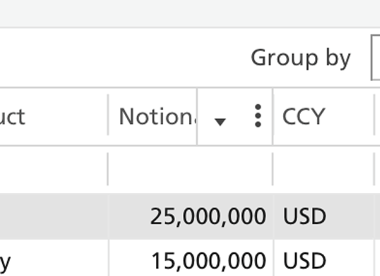
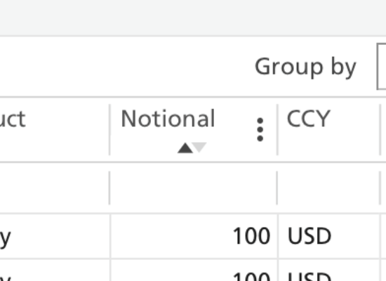
Two distinct sorting methods were explored. The first design featured an overlay that maximised the visibility of label text within the blotter, while the second option was more experimental and positioned sorting controls at the bottom of the label. User testing was planned to determine which method best met user needs, ensuring the final choice was both functional and user-friendly.
Version 1 – Sorting overlay on top of label
Prototype
Version 2 – Sorting options at the bottom of label
Prototype
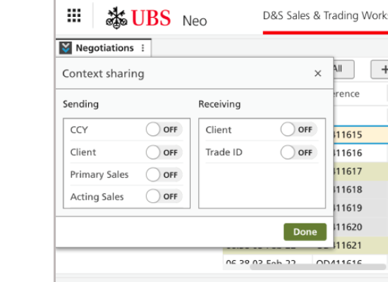
Context Sharing
This feature enabled users to toggle connections between different blotters, enhancing data contextualisation. Users could choose from the following options to customise their view, allowing for a tailored workflow:
  • Inbound and outbound off
  • Inbound on, outbound off
  • Inbound off, outbound on
  • Inbound and outbound on
Context Sharing prototype A prototype was developed to display the context sharing panel, triggered by clicking the related icon. The goal was to ensure users could easily manage inbound and outbound connections between blotters without confusion, making the feature both accessible and functional within the workflow.
Various icon designs were explored, and after testing, the icons on page 3 was selected as the most effective. This decision was based on user feedback that favoured its clarity and intuitive representation of context sharing.

Prototype Design ideas
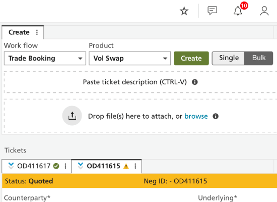
Create Panel
Create Panel
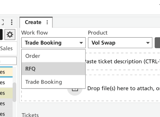
This section was redesigned for simplicity, utilising dropdowns to facilitate data uploads. This approach clearly presents available options, improving user efficiency when inputting information.

Prototype
Action buttons
Action Buttons
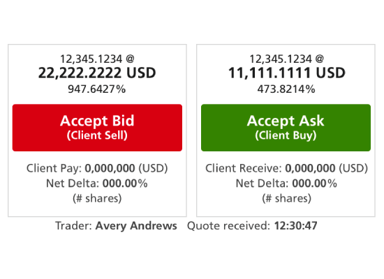
Different action button styles were explored, focusing on balancing aesthetics with usability. After testing, the design on the third page was selected, providing the best blend of visual appeal and clear functionality. This design was integrated into the sales ticket interface, ensuring users could easily access critical actions without confusion.

Design ideas Spec sheet
Sales Ticket
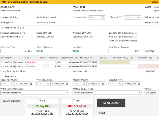
To enhance the usability of the sales ticket, a grid system was implemented. This approach organised information systematically, reducing visual clutter and enabling a more streamlined user experience.

Spec sheet
Version 1 – 7 column grid system
Prototype
Version 2 – 6 column grid system
Prototype
Tickets with scrollbars
Prototype
Trader ticket
Trader Ticket
Similar to the sales ticket, the trader ticket underwent redesigns to improve clarity and organisation. Implementing a grid system allowed for a cleaner layout, making it easier for users to navigate and complete tasks.

Prototype
Controls stacking
Controls Stacking
Recognising that users often managed multiple windows, a control stacking feature was designed to allow for easy resizing. This adaptability was crucial for maintaining workflow efficiency in a dynamic trading environment.

Spec sheet
Bulk upload
Bulk Upload
A prototype was developed to illustrate how users could conduct bulk uploads from external files, such as Excel spreadsheets. This functionality streamlined data entry, minimising manual input and enhanced user productivity.

Prototype
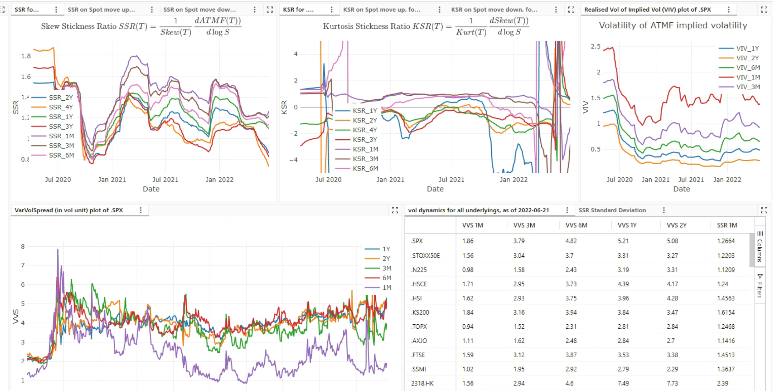
Data Visualisation
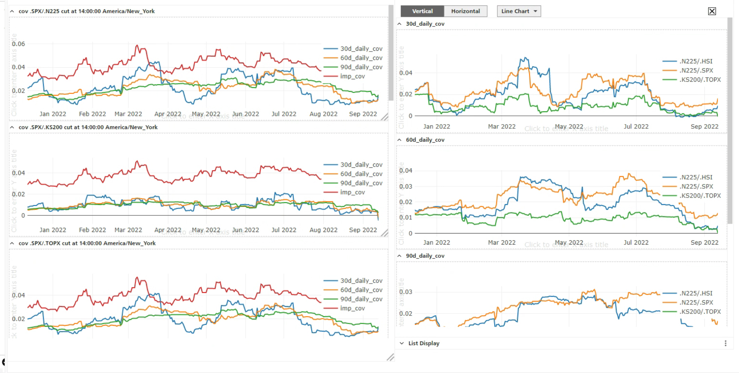
In response to client requests, cohesive data visualisation tools were integrated into the Meerkat dashboard. The designs were optimised for clarity, allowing users to quickly interpret complex data sets. By simplifying visual elements and incorporating colour coding, users could understand quantitative information at a glance, supporting fast, informed decision-making.

Data visualisation - screen 1 Data visualisation - screen 2
6. Conclusion

Collaborating with the sales and trading team was both a challenging and exciting endeavour. While they were often pressed for time and reluctant to provide feedback, the participants in this project were instrumental in shaping the Meerkat trading platform, ensuring it would deliver a meaningful experience for them in the years to come.

Engaging closely with key decision-makers was particularly beneficial. The clients displayed genuine interest and openly shared their needs and frustrations, which helped refine product and marketing strategies. Their understanding of design rationale and market insights encouraged a productive partnership.

Although in-person workshops were preferred, this project was conducted remotely, utilising tools like Miro, Hangouts, and Slack to facilitate effective communication and information sharing.

This experience underscored that while innovation is valuable, familiar design patterns often enhanced usability. Testing new features with users remained essential, as innovative elements may not always align with their expectations.