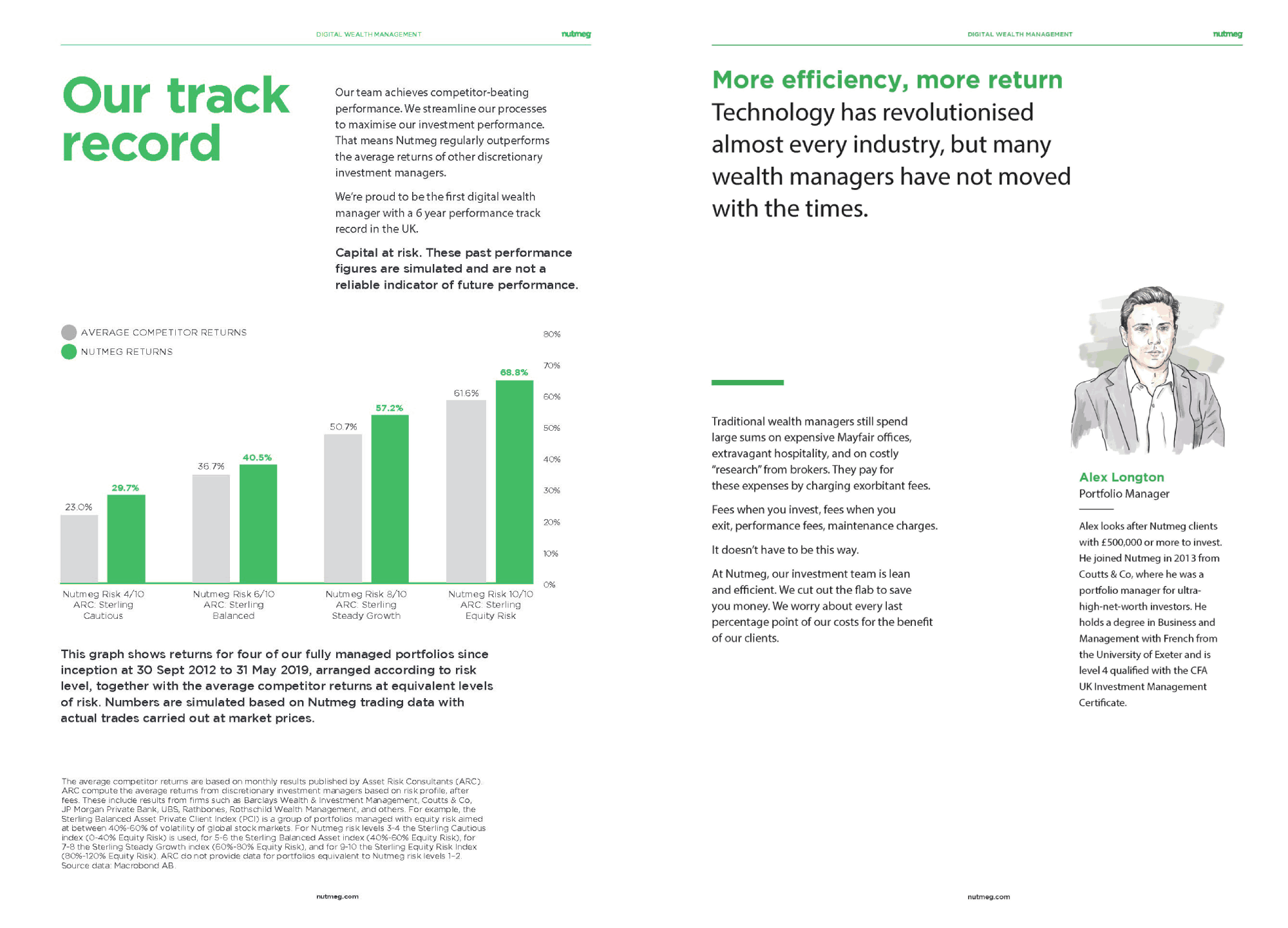
Intro
The Nutmeg rebrand marked a pivotal shift in the company’s visual identity and user experience. A refreshed design language was introduced to better reflect the brand’s values and its reach to a wider audience.
Challenge
A full-scale rebrand required alignment across multiple platforms and teams. The visual update needed to balance modern appeal with the credibility expected from a financial services provider.
Solution
A brand system was developed and rolled out across digital, print, and marketing channels. Scalable design components ensured visual consistency while supporting many content types and use cases.
1. Introduction
The success of Nutmeg’s website redesign acted as a catalyst for a wider brand transformation across all marketing channels. The new visual direction, which introduced a collage-style graphic style, received a positive response from both internal stakeholders and external users. This stylistic shift blended traditional investment values with a contemporary digital identity, combining crafted, textured illustrations with clean, scalable vector graphics.
The goal was to establish Nutmeg as a bold and trustworthy FinTech brand by introducing a fresh, distinctive design style that clearly set it apart from visually similar competitors. The rebrand extended across a wide range of collateral, including web graphics, custom iconography, print adverts, digital campaigns, and internal-facing assets, creating a consistent and recognisable identity across all platforms.
2. Brand Refresh
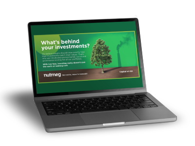
The visual identity underwent a significant transformation, resulting in a brand that felt more vibrant, human, and approachable. The use of montage-style illustrations, layered with textures, abstract forms, and cut-out shapes, introduced a distinctive aesthetic that brought warmth and character to the brand. These designs featured heavily in hero graphics, and icon sets.
The updated style used scalable vector graphics, allowing assets to adapt fluidly across print and digital formats without loss of quality. Colour palettes were optimised to inspire trust and warmth, and typography was standardised to ensure readability and accessibility across devices.
3. Website Redesign
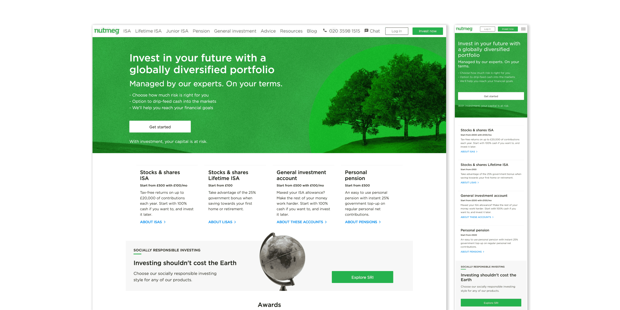
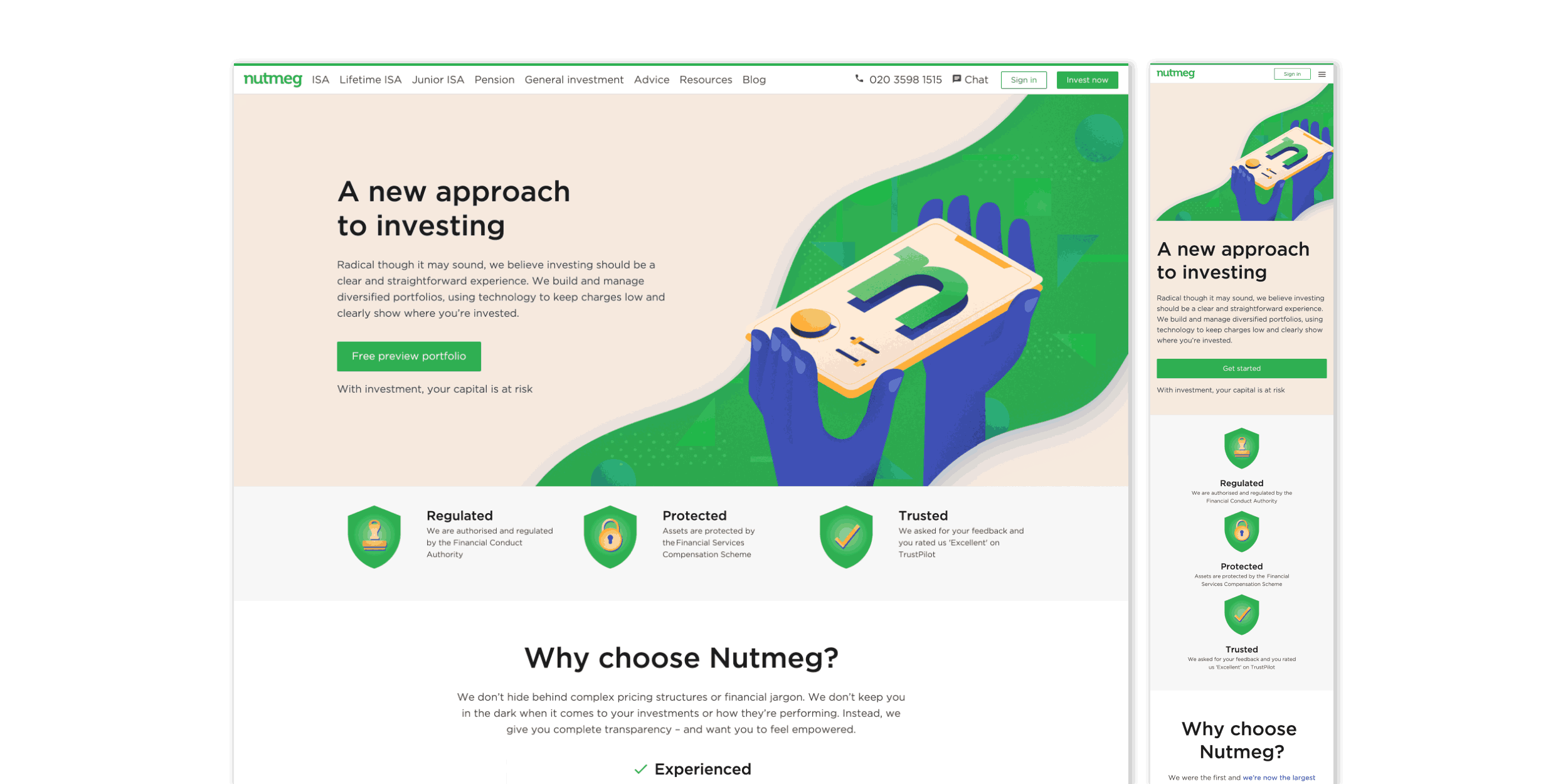
The brand refresh had a major impact on the website’s layout and structure. Every key product page was redesigned, with improvements to information architecture, visual consistency, and overall tone. Pages that had previously used stock photography were reimagined with the new illustrative style, creating a more consistent and distinctive look.
The redesigned homepage (shown below), illustrated the impact of the new visual approach, showing how the updated design improved readability, enhanced visual appeal, and reduced cognitive load. The redesign helped to make information more accessible, without compromising clarity or credibility.
BeforeAfter
Nutmeg Homepage
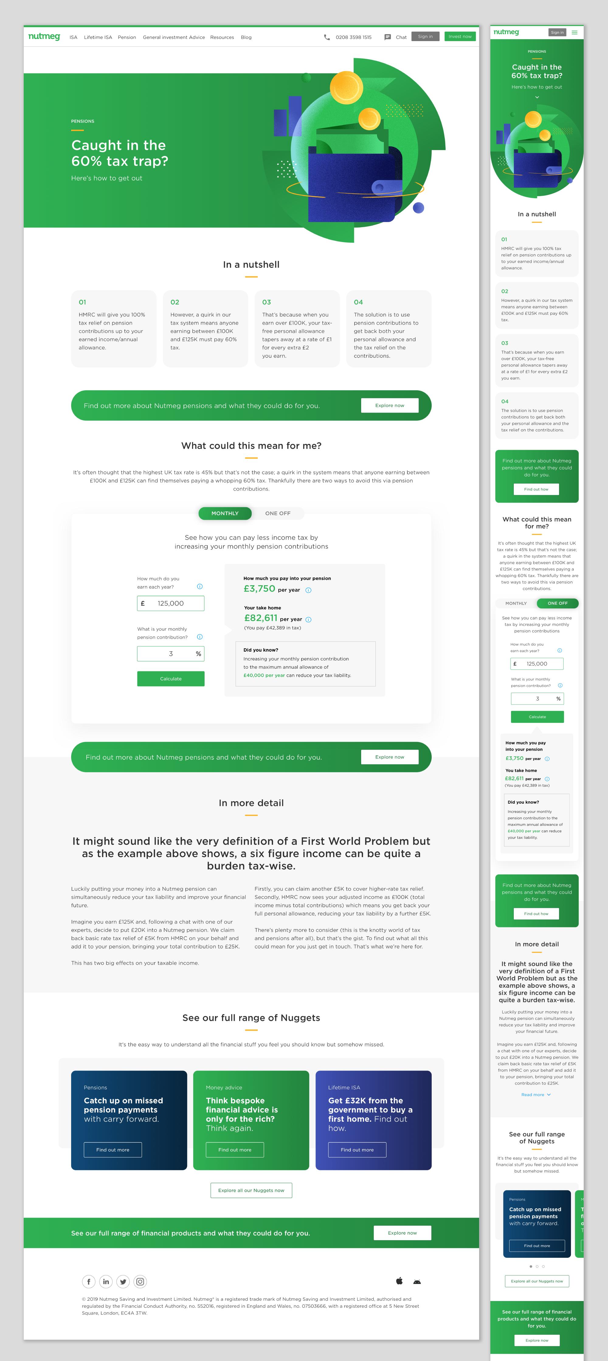
Nutmeg Nuggets
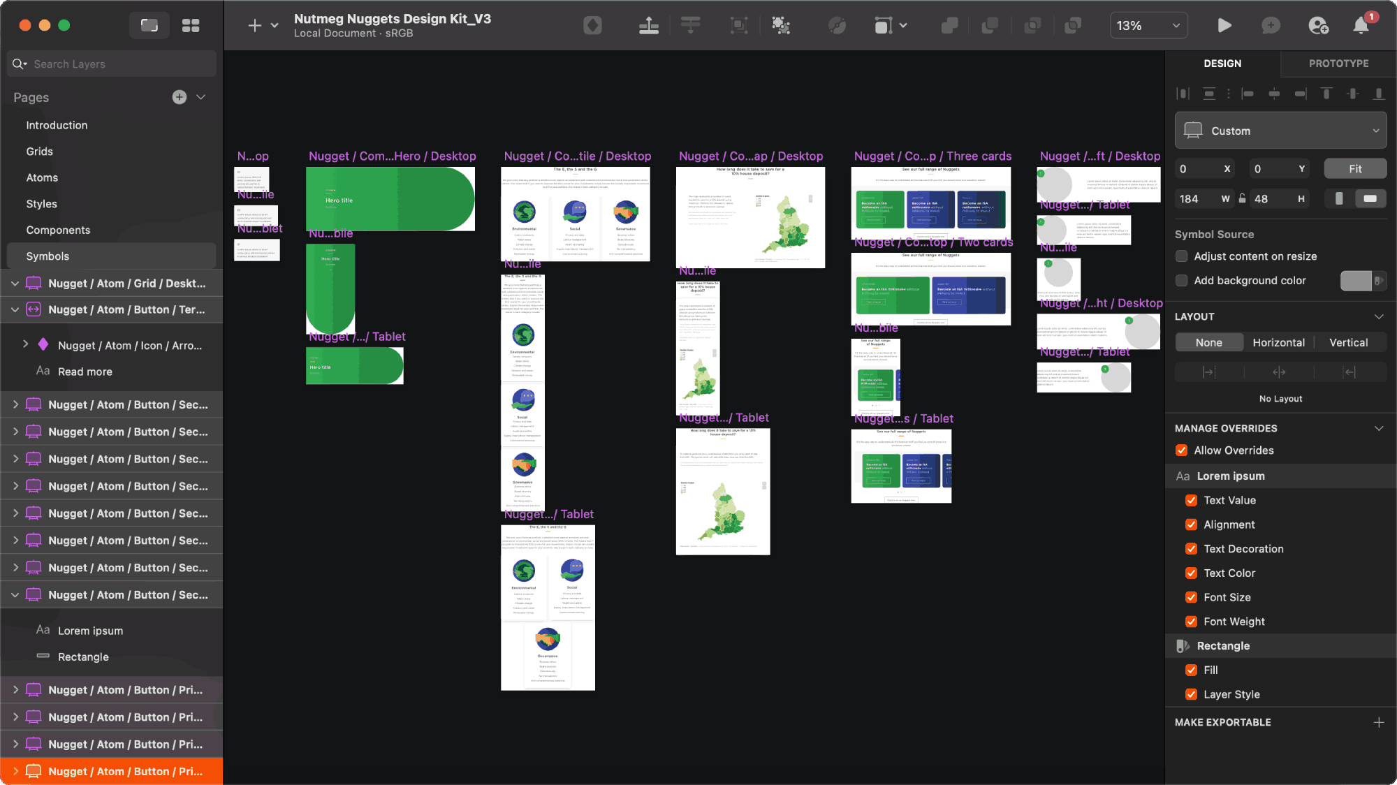
As part of the wider rebrand, Nutmeg Nuggets, an educational content hub, was developed to provide users with accessible financial knowledge in a format that felt engaging, informative, and visually consistent with the rest of the brand. While it needed to align with the overall brand identity, it also required a distinctive look and feel to establish itself as a standalone knowledge base for customers of all experience levels.
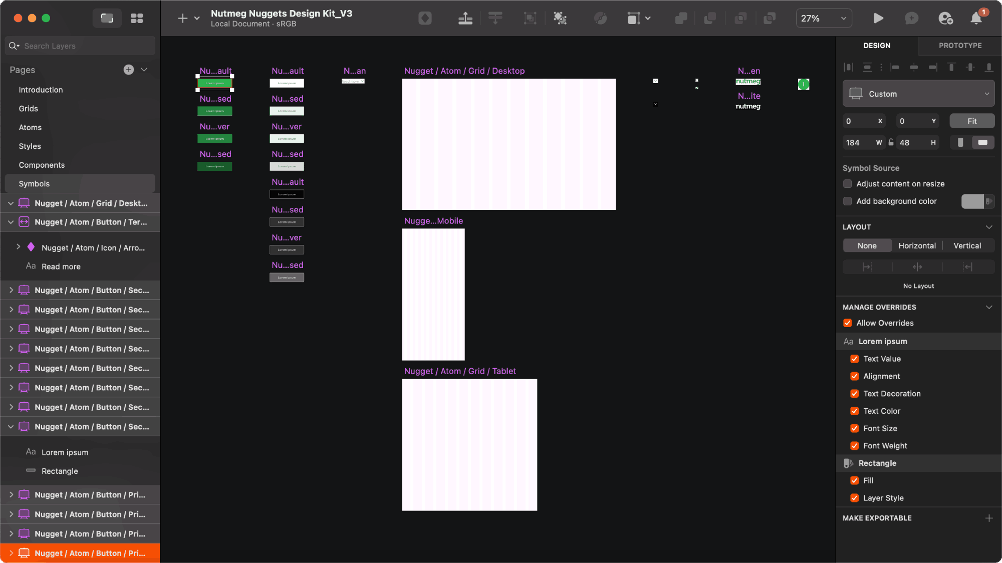
To support this, a dedicated design system was created specifically for Nuggets, introducing new components, layout structures, and visual treatments. Articles were organised into modular blocks to improve readability and navigation.
Design System in Sketch
Scroll Here
Nuggets Homepage
Custom illustrations were created to help categorise content and bring warmth to the experience. A selection of animated hero graphics and icons added a layer of interactivity and energy to the interface, making educational content more approachable and dynamic.
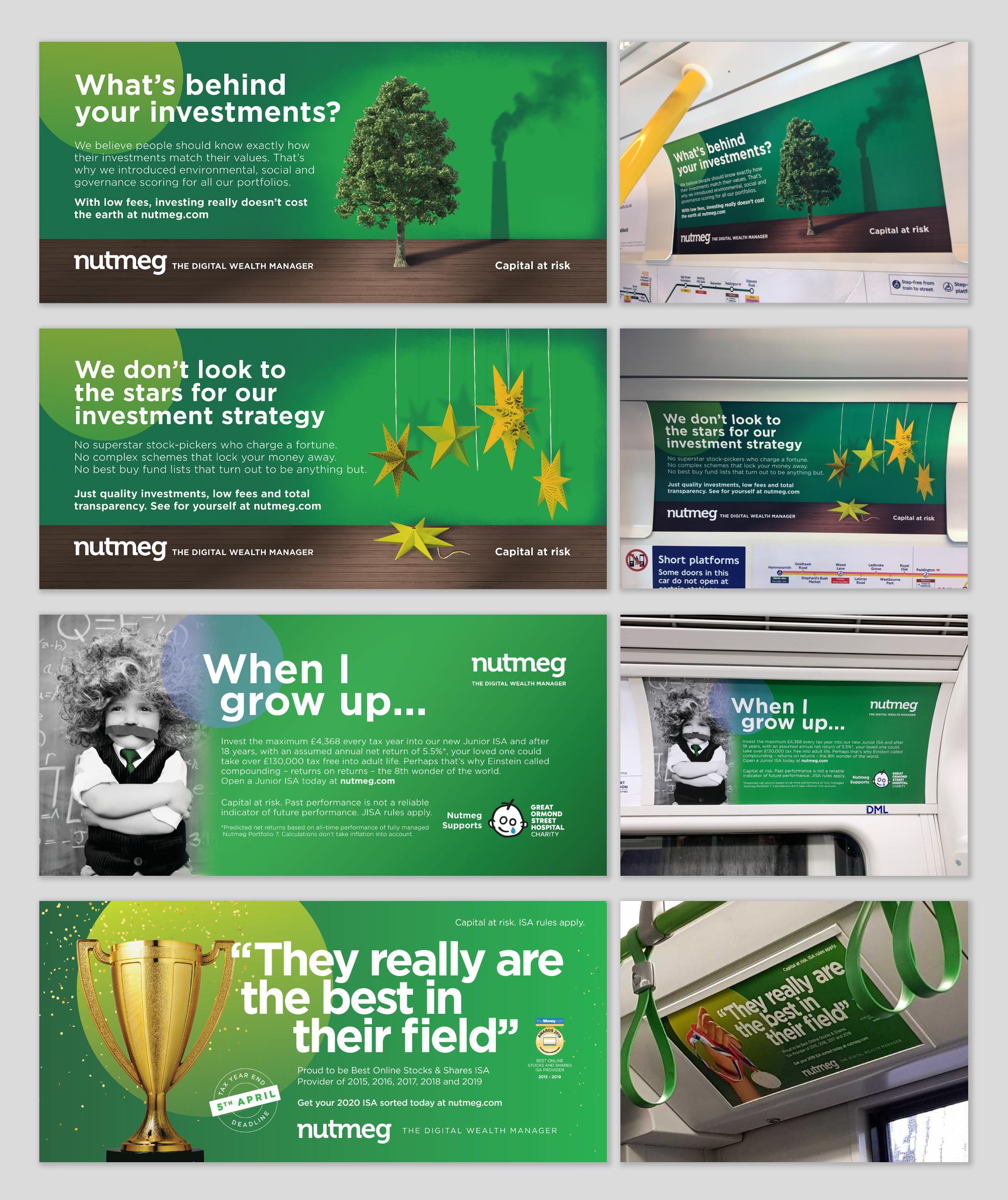
4. Nationwide Adverts
The refreshed brand identity was rolled out across nationwide campaigns, with a focus on achieving strong visual impact in high-traffic locations throughout London
Car panel posters were installed across the London Underground. These featured bold illustrations and approachable copy, tailored to resonate with busy commuters. The designs balanced eye-catching imagery with clear value propositions, effectively introducing the new brand tone to the public.
Scroll Here
Tube Car Panel Adverts
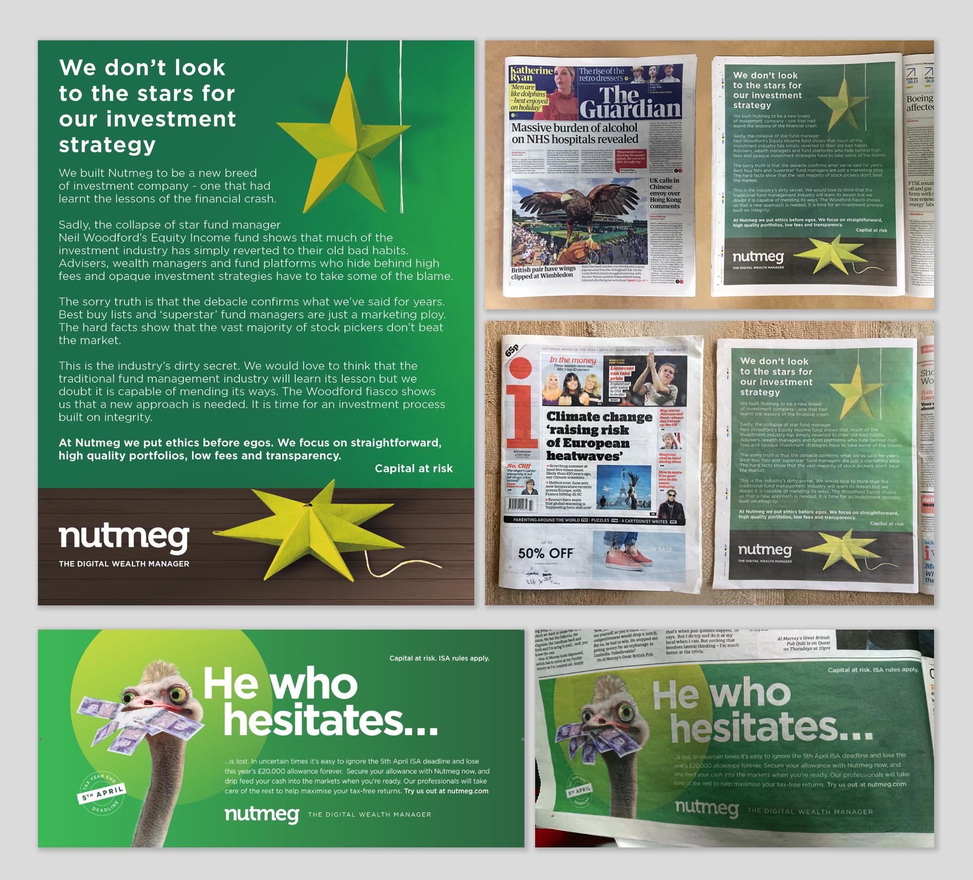
Print advertisements were redesigned to feel modern and relevant, using editorial-style layouts, improved typography, and strong brand visuals. These ran in major national newspapers and financial publications, helping the brand reach audiences in more traditional media spaces.
Scroll Here
Newspaper Adverts
5. Social Media Adverts
The new visual identity was extended into digital marketing, particularly across social media platforms with the purpose of driving traffic, increasing conversions, and communicating the refreshed brand.
Animated video adverts were developed for paid social campaigns, offering a dynamic and engaging way to showcase key messages and product benefits to targeted audiences.
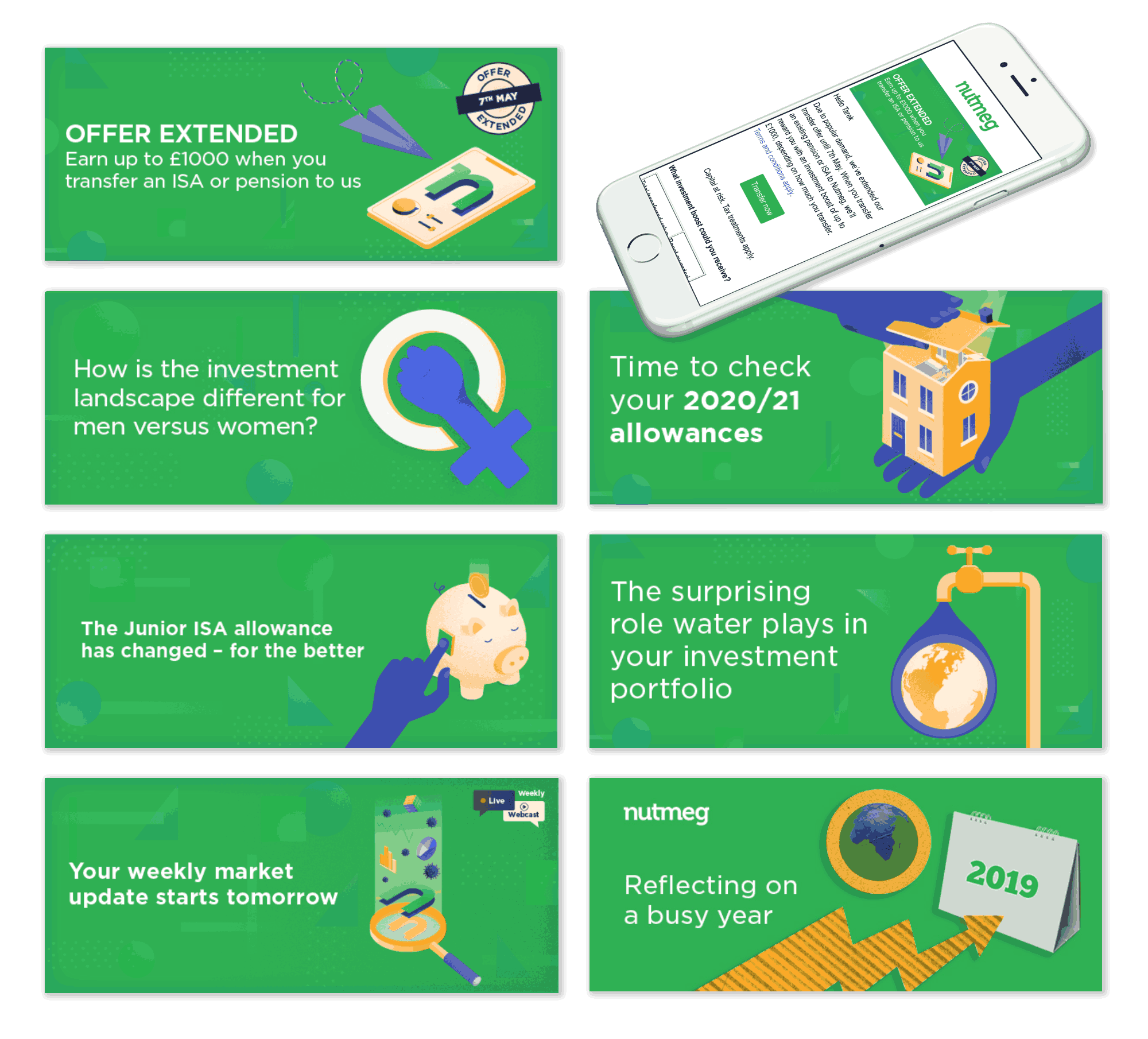
Email templates were updated with static and animated banners to reflect the new branding, including updated visuals, simplified layouts, and responsive formats. These designs helped reinforce brand consistency across customer communications while improving readability and engagement.
Scroll Here
Email Banners
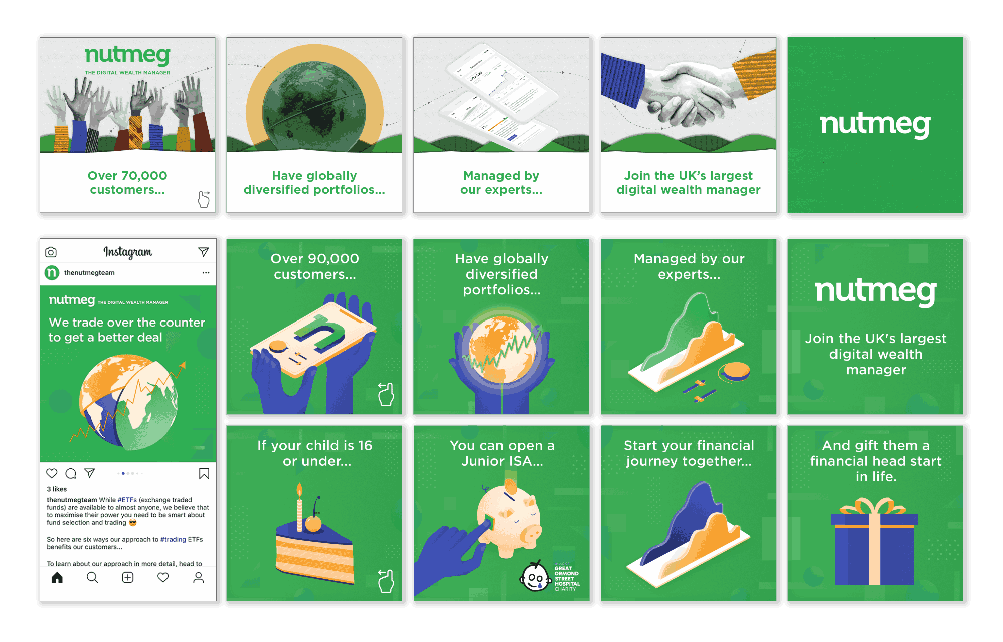
A selection of branded assets was created for platforms such as Facebook, Instagram, and LinkedIn. This included templates for carousels, single posts, and stories. The campaigns highlighted core product offerings and brand values, helping to boost engagement and strengthen Nutmeg’s digital presence.
Carousel Advert and Instagram Social Media Posts
Facebook Social Posts
6. Brochures
Printed and digital brochures were redesigned to reflect the refreshed brand identity, incorporating updated visuals, tone of voice, and layout. These materials served as key tools for customer education, partner engagement, and internal training.
Brochure
A collection of downloadable guides was also produced to help users understand account types, investment strategies, and tax-efficient savings. The materials were formatted for accessibility and provided a consistent extension of the digital brand experience.
Downloadable Digital Guides
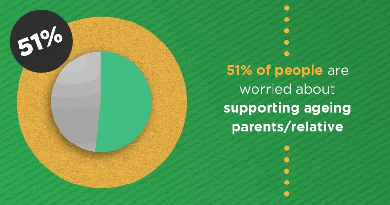
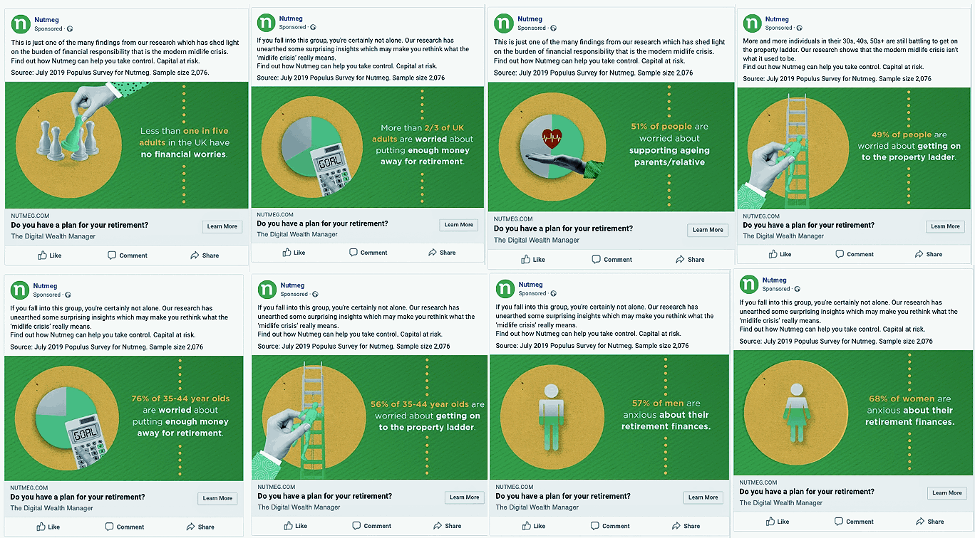
7. Infographics
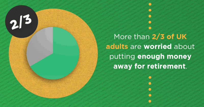
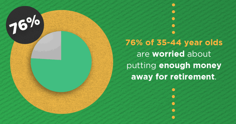
Infographics were introduced to simplify complex financial topics and make them more accessible to a broader audience. These visual explainers were distributed through blog posts, email campaigns, and social channels.
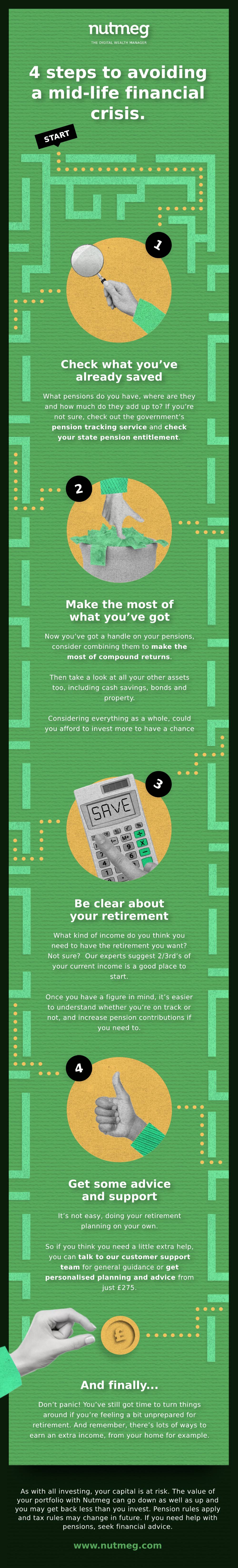
The example infographic below for the Mid-Life Financial Crisis campaign, illustrated investment behaviours and concerns among 40 to 55-year-olds. The design featured a maze-inspired visual metaphor to reflect the sense of confusion and uncertainty often experienced at this life stage. Combining playful illustrations with structured data, the infographic aimed to both engage viewers and deliver meaningful insights into mid-life financial planning.
Scroll Here
Mid-Life Crisis Infographic
8. Conclusion
The Nutmeg rebrand project offered a rare opportunity to help shape the visual and strategic direction of a growing FinTech brand. What began as a website refresh evolved into a company-wide transformation that touched every customer-facing and internal touchpoint, from print adverts and email campaigns to educational platforms and social media.
Working across such a broad range of deliverables required a deep understanding of brand systems, consistency, and user engagement. Designing a consistent visual language that was flexible enough to work across static print, digital platforms, and animated content pushed the boundaries of creative problem-solving and cross-functional collaboration. Each asset had to not only align with the new brand direction but also serve a specific purpose, whether that was building trust with first-time investors or improving internal onboarding processes.
One of the most valuable aspects of the project was learning how to translate complex financial concepts into approachable, visually engaging narratives. The creation of the Nutmeg Nuggets content hub and the Mid-Life Financial Crisis infographic were particularly rewarding in this regard, as they involved combining education with creativity to improve user understanding. The project also provided valuable experience in building and implementing scalable design systems, utilising tools such as Sketch to create reusable components that ensured consistency across all formats.
From a collaboration perspective, the project reinforced the importance of clear communication and agile workflows, especially when aligning multiple departments, from marketing to product and compliance. Regular feedback loops helped ensure alignment while enabling continuous iteration.
Overall, the project served to sharpen both strategic thinking and visual execution. It reinforced the influence of thoughtful design on brand perception, user trust, and commercial effectiveness. The refreshed identity successfully positioned Nutmeg as a confident, modern FinTech brand and laid a strong foundation for future growth and deeper customer engagement.
 Home
Home