T-Pay App
Contents
Intro
T-Pay is T-Mobile’s internal app for managing payments, billing info, and transaction history. The project aimed to improve usability while staying aligned with an evolving design system.
Challenge
Payment flows were cluttered, inconsistent, and lacked clear hierarchy. Users faced friction when completing essential tasks such as updating payment methods or setting up AutoPay.
Solution
Wireframes were created to simplify layouts and improve the user flow. The redesign followed Design Thinking principles and used modular components to support both iOS and Android development.
1. Introduction

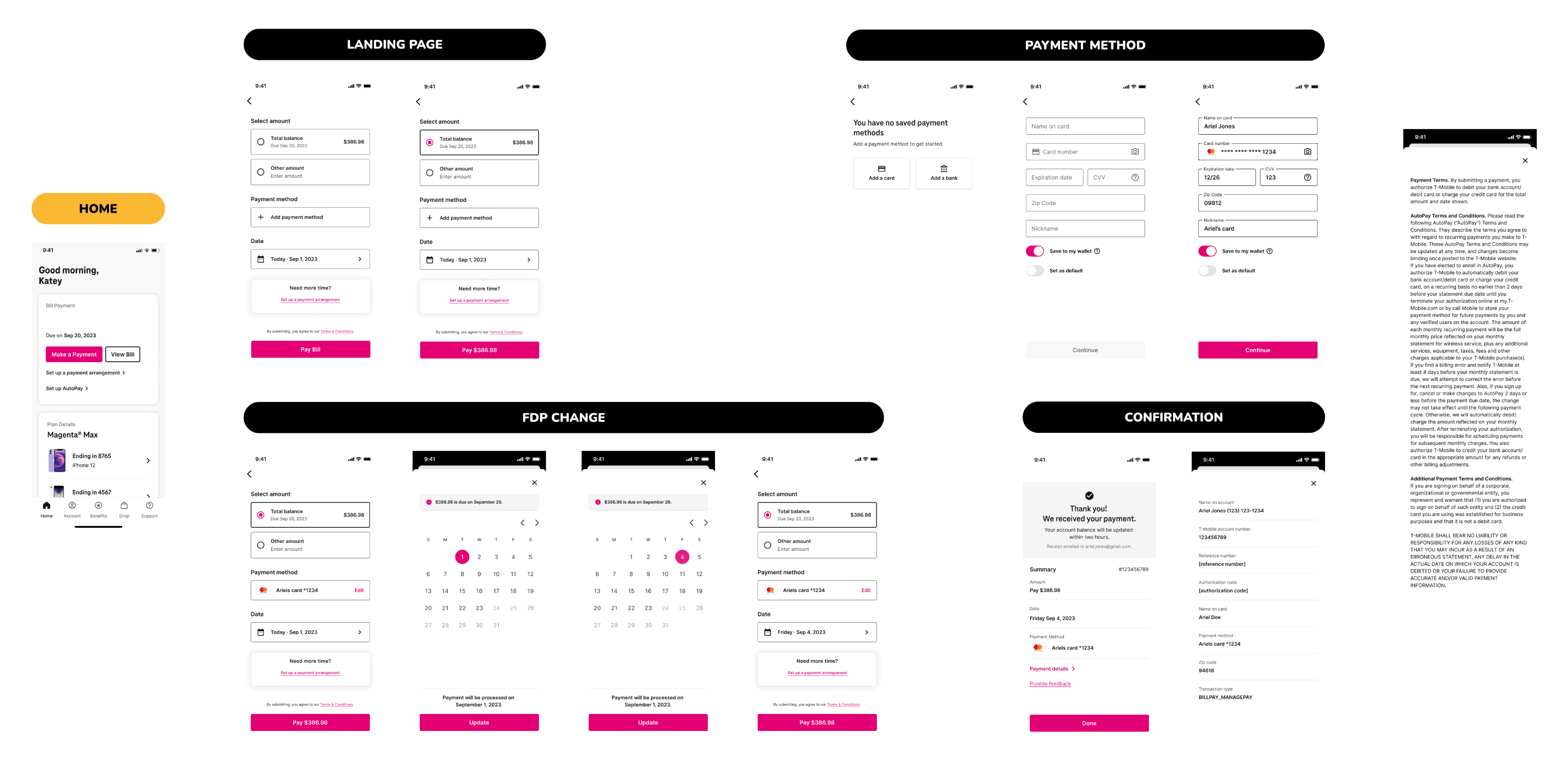
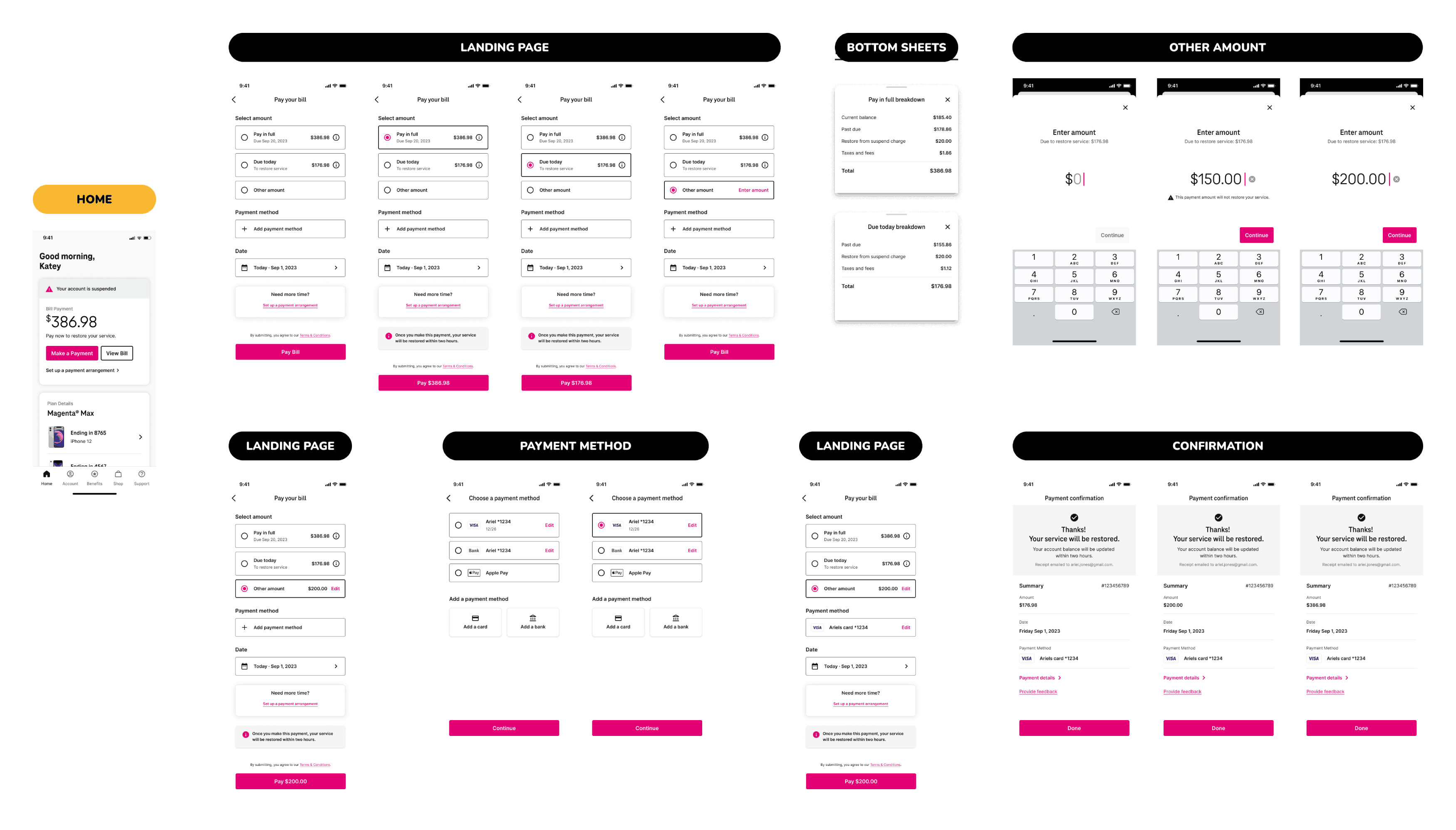
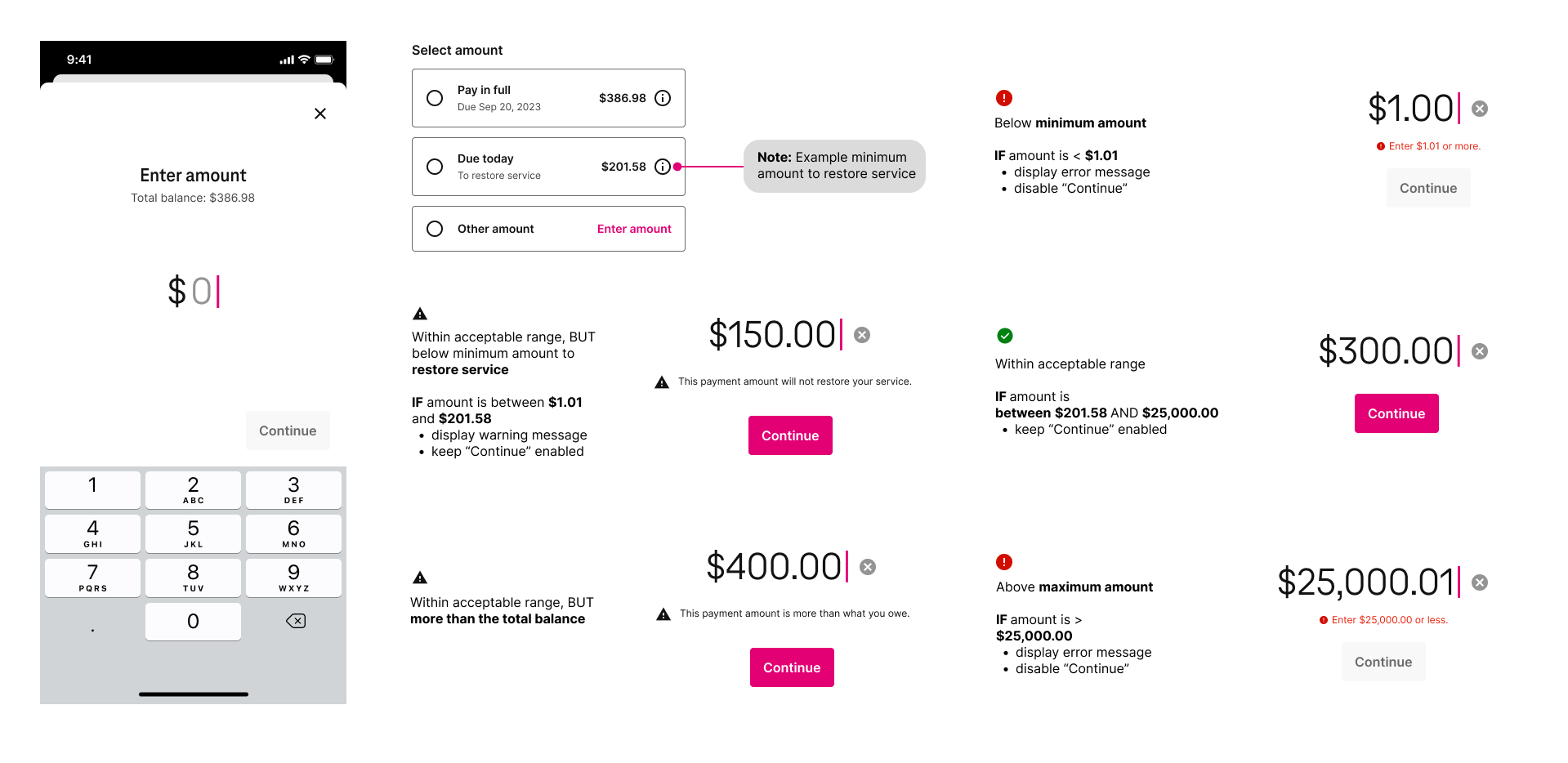
T-Pay functioned as T-Mobile’s integrated in-app payment system, enabling users to manage bills, review payment history, and configure recurring services such as AutoPay. As part of a UX enhancement initiative, the Payments UX team was tasked with reworking existing app flows to align with modern usability standards while maintaining functional consistency.

The project involved create wireframes to refine content layout, simplify user flows, and apply modular design patterns. The approach remained platform-agnostic, optimised for mobile use without committing to specific iOS or Android conventions. Key improvements were informed by benchmarking insights from leading financial, telecom, and BNPL apps.

The final output aimed to improve the payment user flow, introduce reusable UI components, and establish a foundation for ongoing integration with the evolving design system.
Constraints
  • Legacy screens were dense, inconsistent, and visually outdated.
  • Core payment logic had to remain unchanged to avoid backend disruption.
  • Design system components were still evolving during the redesign phase.
  • Screen layouts needed to be mobile-first but remain platform-agnostic.
Project Goals
  • Improve screen clarity and reduce visual noise across payment flows.
  • Enhance usability while preserving familiar user pathways.
  • Align UI structure with Apeiron design system for scalable handoff.
  • Prepare wireframes for future UI and accessibility enhancements.
Animated Screen
2. Benchmarking Analysis

As part of the redesign initiative, a comprehensive benchmarking analysis was conducted across a range of financial, retail, utility, and subscription-based applications to identify best-in-class practices in digital payment experiences. The objective was to uncover user interface patterns, interaction flows, and visual strategies that could inform a more intuitive, efficient, and user-centred payment flow for T-Pay.

Scroll Here
Example of Benchmarking Analysis
The competitor research was organised into six major categories, with the following insights gained from observing top-performing apps in each domain:
A comparison of the leading apps revealed many consistent UX patterns. The insights below directly informed improvements to the T-Pay experience:
Comparative Insight
Description
Visual Hierarchy & Design
Financial and BNPL apps leaned toward minimalist design and high-contrast call-to-actions, while utility apps favoured detailed layouts to accommodate extensive information.
Confirmation & Feedback
User confidence was reinforced with real-time feedback and clear confirmation messages after payment completion.
Modularity & Flexibility
Payment flows were broken into modular, manageable steps, letting users pause or resume without losing progress.
Accessibility & Inclusivity
Leading apps adopted accessibility best practices, such as scalable typography, voiceover compatibility, and high-contrast modes, ensuring usability for a wider range of users, including those with visual or motor impairments.
Personalisation & Contextual UI
Apps like Apple Wallet and Klarna used contextual data to surface relevant payment options or reminders based on user behaviour, device location, or time of day, streamlining the experience and reducing user input.
Security & Trust Signals
Trust was built through clear security indicators, such as biometric login icons, padlock symbols near payment fields, and step-by-step explanations for how user data was handled, helping reduce anxiety around digital transactions.
Error Prevention & Recovery
Apps like PayPal and Venmo included inline validation, smart defaults, and undo/redo options to reduce input errors and help users recover quickly from mistakes without abandoning the flow.
Multi-Platform Continuity
Most apps offered a seamless user experience across mobile, tablet, and web, with saved states, cloud sync, and consistent UI patterns allowing users to switch devices without friction.
Onboarding & Feature Discovery
Apps like Zelle and Afterpay invested in onboarding overlays and lightweight tutorials to help users discover core features and payment tools, reducing drop-off in first-time sessions.
3. User Research

User research combined analytics, surveys, and moderated interviews to uncover distinct behavioural patterns within T-Pay’s audience. Findings revealed three primary personas, each reflecting varying levels of technical confidence, daily routines, and account responsibilities. The following personas helped to prioritise key features for the app redesign.
Ava – The Everyday T-Mobile User
I just want to check my balance and pay quickly, usually while waiting for coffee or in between meetings.
Profile
  • Mid-30s professional, active mobile user.
  • Uses the T-Mobile app on-the-go, during lunch breaks, commutes, or between tasks.
  • Prefers fast, frictionless payment journeys and minimal screen clutter.
  • Often relies on Face ID or tap-to-pay features for speed.
Pains
  • Overwhelmed by cluttered dashboards and nested menus.
  • Frustrated by slow load times or poor network responsiveness.
  • Unclear bill summaries make quick reviews difficult.
Goals
  • Access billing and balance details with one tap.
  • Update card details and complete payments in under a minute.
  • Get real-time confirmation that payments went through.
Solutions
A simplified UI with high-priority actions on the home screen, biometric login, and real-time updates for key account changes.
Requirements
Needs rapid, context-aware access to core billing functions without excessive scrolling, navigation, or input.
Outcomes
A streamlined mobile experience saves time, increases user satisfaction, and reduces payment delays or missed due dates.
Frank – The Tech-Averse Customer
If I tap the wrong thing, I worry I’ll be charged twice. I just want it to be clear and simple.
Profile
  • Retired, late 60s, less familiar with modern mobile interfaces.
  • Prefers using the app with guidance or via phone support.
  • Often second-guesses interactions and fears accidental charges or changes.
Pains
  • Overcomplicated flows and too many options.
  • Lack of clear confirmations or error feedback.
  • Distrusts abstract icons or unfamiliar terms.
Goals
  • Feel confident when making payments or checking balances.
  • Understand each screen and button at a glance.
  • Avoid mistakes and have clear ways to undo actions if needed.
Solutions
A simplified, guided experience with clear labels, progress indicators, and accessible text sizing and contrast.
Requirements
Requires a low-complexity UI, reassuring feedback messages, and large tappable areas for easier interaction.
Outcomes
Increases confidence, trust, and retention among older or less tech-savvy users by reducing friction and cognitive load.
Jasmine – The Multi-Line Manager
I need to see what each line costs and make sure payments are split the right way, without jumping through hoops.
Profile
  • Mid-40s parent and small business owner managing multiple lines.
  • Handles bills for both family and team members under one account.
  • Uses the app on both mobile and desktop to manage details.
Pains
  • No consolidated view of all lines and their respective charges.
  • Hard to track who owes what when bills are grouped.
  • Manual payment breakdowns create room for error.
Goals
  • Quickly see payment status and breakdown by line or user.
  • Automate payment splitting or assignment to each line.
  • Reduce time spent reconciling bills manually.
Solutions
A dashboard that highlights per-line usage, charges, and payment status, with intuitive controls for bill splitting and adjustments.
Requirements
Needs multi-line visibility, breakdown automation, and the ability to assign rules to users or devices.
Outcomes
Reduces errors, improves billing accuracy, and saves time for account managers with multiple users or lines under one account.
4. Wireframing

Multiple explorations were created across iOS and Android platforms to test structure, flow, and usability in the early stages of the T-Pay redesign. These low-fidelity wireframes focused on improving clarity, reducing cognitive load, and making the payment process more intuitive.
Scroll Here
Wireframe Exploration
Platform Explorations

Three iOS explorations and two Android versions were developed to assess different navigation patterns and interaction models. These tested variations in keypad placement, amount input behaviour, and date selection for scheduled payments. Special attention was given to consistent field hierarchy and actionable CTAs to streamline user flow across devices.

UX Concepts

High-level UX concepts were introduced to support different user needs and contexts:
Feature Integration

Wireframes evolved to support added features such as part-time payment views, card status tracking, and spending insights. Later screens included billing cycles, interactive graphs, and a redesigned home screen to centralise financial information. All iterations aimed to reduce friction and support repeat usage through clear layout, accessible interactions, and scalable design components.

The wireframing phase laid the groundwork for a user-centred interface, balancing system constraints with user needs while maintaining consistency across platforms.
5. Final Design

The final high-fidelity prototype is available to view below and demonstrates the full scope of the redesigned T‑Pay experience. These solutions were shaped by extensive research and testing, with a focus on making the experience easier to understand, simpler to use, and smoother at every step.

Key user flows, such as standard payments, service restoration, and error handling, were designed to guide users confidently through their tasks while addressing critical pain points uncovered during the discovery phase. Each flow below outlines the refined interactions and content strategy used to enhance the user journey:

Payment Happy Path Flow
  1. Home Screen: Displayed a friendly greeting along with a clear summary of the bill, due date, and payment options. The “Make a Payment” button was prominently placed for easy access. Alerts were shown when a payment was due soon, encouraging timely action.
  2. Payment Landing Page: Presented options to pay the full balance, due-now amount, or a custom amount. The layout remained clean and included helpful links such as “Set up a payment arrangement” to support flexibility. Visual separation between options enhanced scalability.
  3. Detailed Amount Selection: Guided users through selecting or entering an amount using multiple variations. Totals updated dynamically, offering clarity and confidence during selection. Supporting microcopy provided additional context for each option.
  4. Bottom Sheet Breakdown: Revealed a detailed breakdown of charges, including taxes and fees, when tapped. This maintained transparency without disrupting the flow. Expandable sections preserved a clean layout while allowing access to more information when needed.
  5. Payment Method: Enabled selection or addition of cards, bank accounts, or Apple Pay. Saved preferences and quick toggles allowed for faster interaction. Default selections helped reduce input for returning users.
  6. Confirmation: Displayed a confirmation message with summary details, including date and payment method. A feedback link was included to capture user input. Options to download or email a receipt supported record-keeping and user assurance.
Payment Happy Path Prototype
Service Restore Flow
  1. Suspended Home: Displayed an alert indicating account suspension along with the amount required to restore service. The “Make a Payment” call-to-action was highlighted to prompt immediate action. Messaging was crafted to convey urgency while maintaining a supportive tone.
  2. Restore Landing Page: Presented options to pay the restore amount, full balance, or a custom amount. Messaging clarified the implications of each choice. Estimated restore times were shown to help set expectations.
  3. Other Amount Entry: Allowed custom payment entry with real-time alerts if the amount fell below the required threshold. The interface was designed to minimise input errors. Quick links enabled a return to predefined payment options when needed.
  4. Payment Method: Maintained the same intuitive layout used in the standard flow, supporting card, bank, and Apple Pay options. The experience was optimised for speed and clarity during urgent scenarios. Security messaging was included to reinforce trust.
  5. Restore Confirmation: Displayed a confirmation message with service restore details, including date, method, and payment summary. Feedback options were included for user engagement. Post-payment guidance helped prevent future service interruptions.
Restore from Suspension Prototype
Error Scenario Criteria
  1. Custom Amount Entry: Enabled users to input a custom payment using a focused keypad. Real-time validation highlighted issues such as low, excessive, or non-restorative amounts through dynamic feedback.
  2. Error Messaging: Provided clear warnings with contextual microcopy (e.g., “Enter $1.01 or more”). Icons and colour cues were used to signal valid or invalid entries at a glance.
  3. Feedback and Guidance: Displayed green checkmarks for valid entries and red alerts for common mistakes. Inline tips helped users adjust inputs confidently without leaving the screen.
  4. Flexibility and Control: Supported a range of payment amounts while helping users avoid errors before submission. The screen balanced user freedom with reassurance and clarity.
Error Scenario Prototype
6. Testing

Testing 
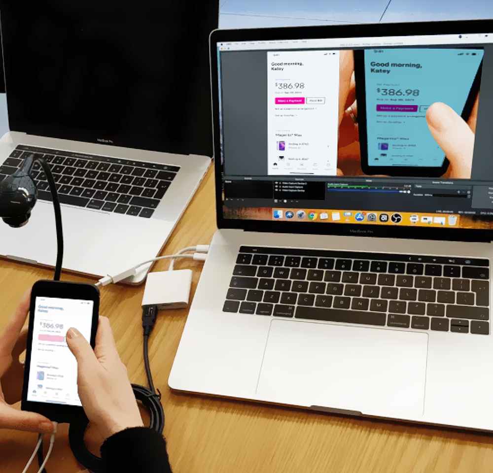
Multiple usability testing methods were employed to validate design effectiveness and identify areas for improvement. Remote unmoderated usability tests using high-fidelity prototypes allowed observation of user interactions in realistic settings. Core user tasks such as completing payment flows, navigating menus, and handling errors were thoroughly evaluated.

A/B testing compared alternative design versions, with results showing a 15% increase in transaction success rates for the optimized payment confirmation screen. Task time analysis demonstrated a 20% reduction in completion time after simplifying form inputs and streamlining the flow.

Additionally, heatmap analysis during moderated sessions identified areas of user hesitation and confusion around button placement and navigation elements. Adjustments informed by these insights contributed to a 25% improvement in user satisfaction scores. Both qualitative feedback and quantitative performance metrics were collected, driving iterative refinements that enhanced overall usability and aligned the product with business objectives.
7. Conclusion

The T-Pay redesign project successfully delivered a comprehensive overhaul of the payment experience, focusing on improving usability, accessibility, and overall satisfaction. By adopting a user-centred design approach and leveraging rigorous research and testing methods, the redesign addressed key pain points and streamlined the payment flow across platforms.

Key achievements include:
Overall, the T-Pay redesign not only improved the payment experience but also laid a strong foundation for ongoing innovation and user-centered enhancements.