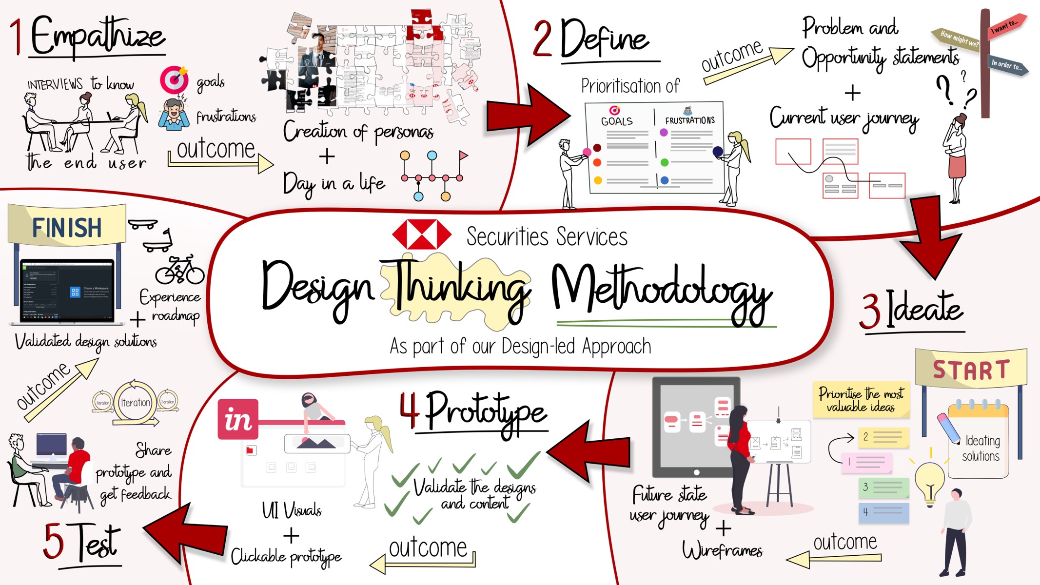
Comprehensive Audit
Review of existing workflows, UI components, and accessibility gaps helped identify pain points such as unclear visual hierarchies, poor contrast ratios, and inconsistent component use.
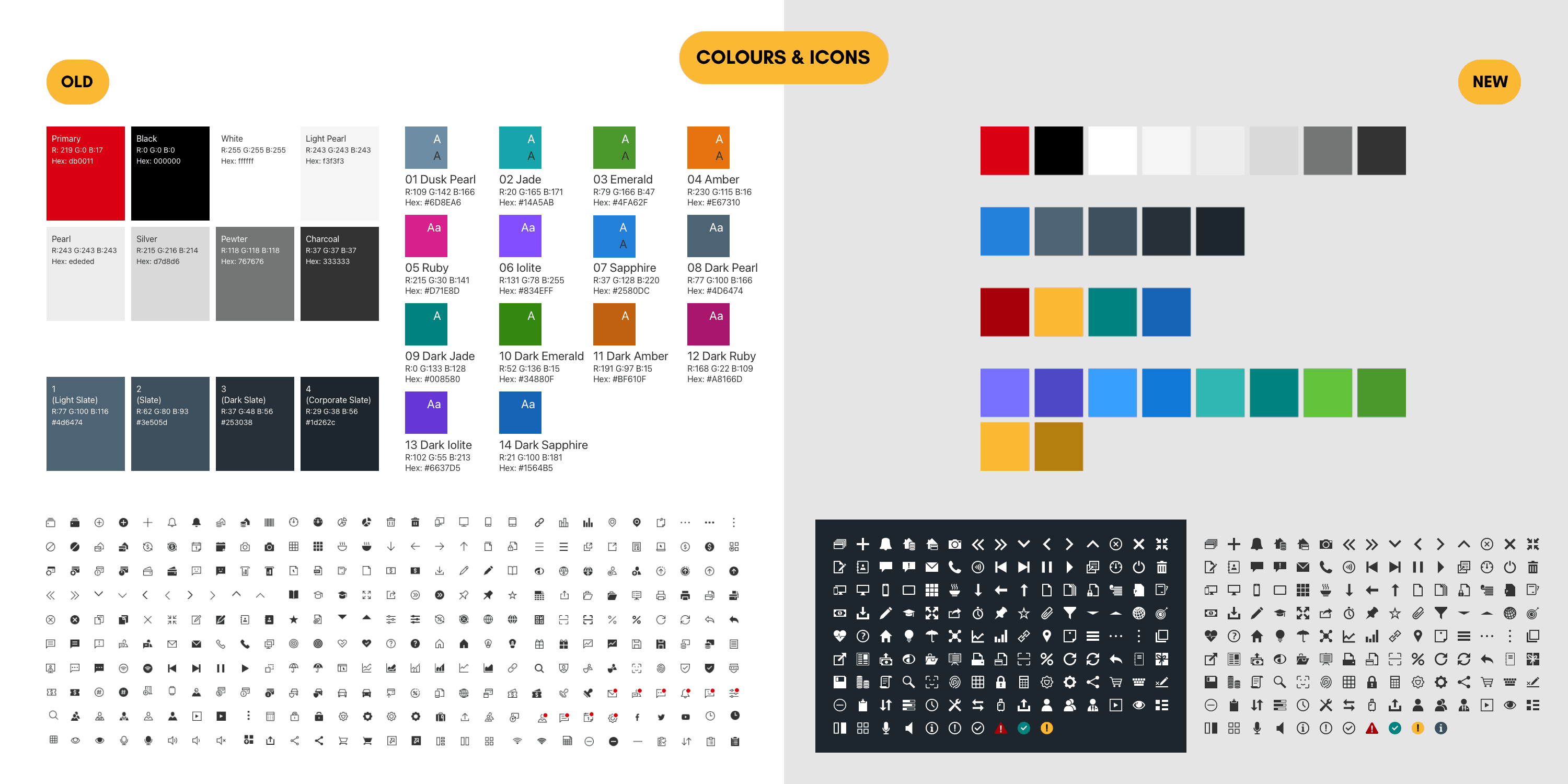
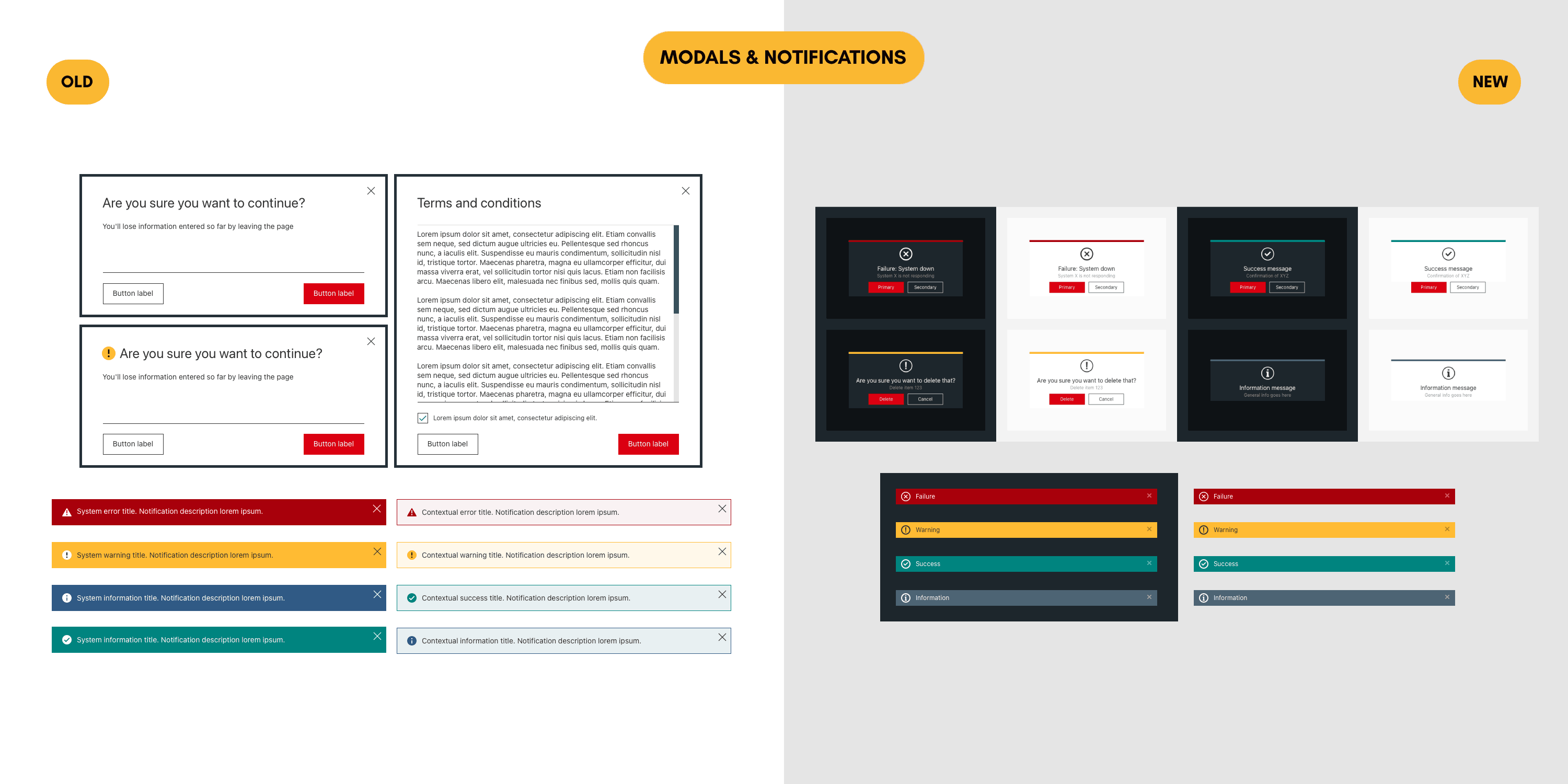
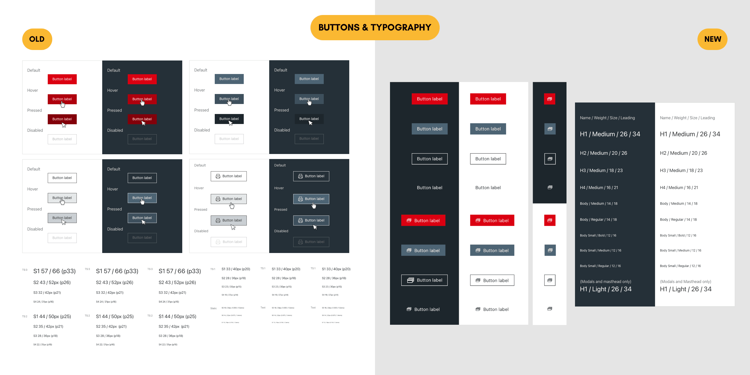
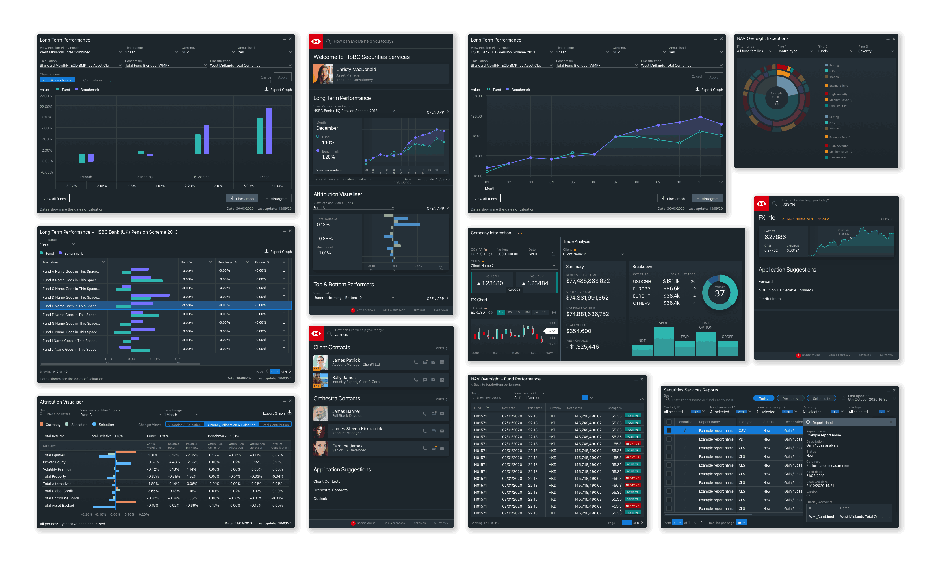
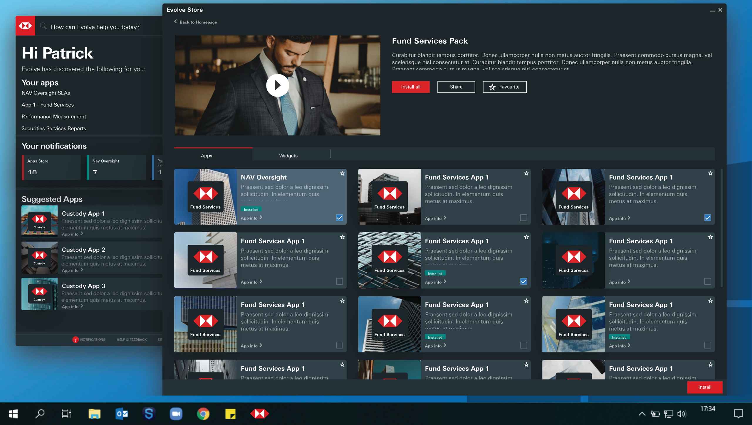
Unified Design System
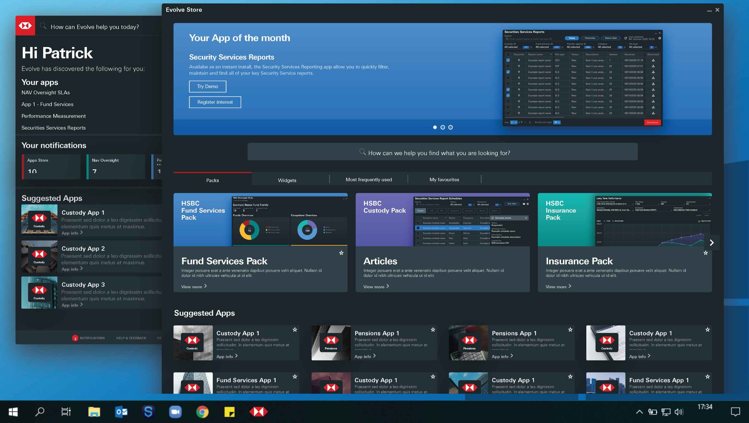
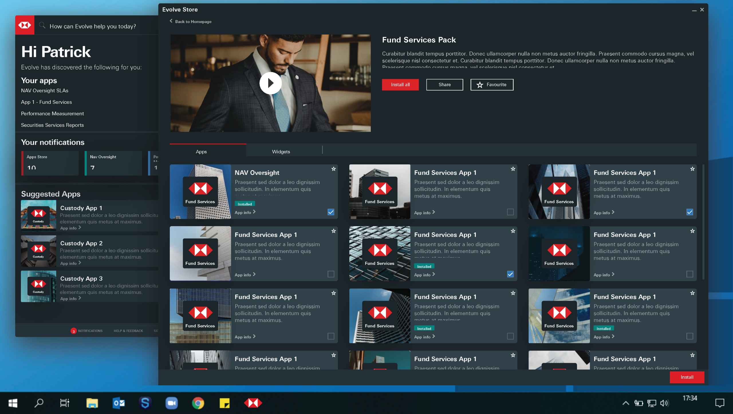
A scalable design system was introduced, replacing outdated UI patterns with consistent and accessible components optimised for both light and dark themes.
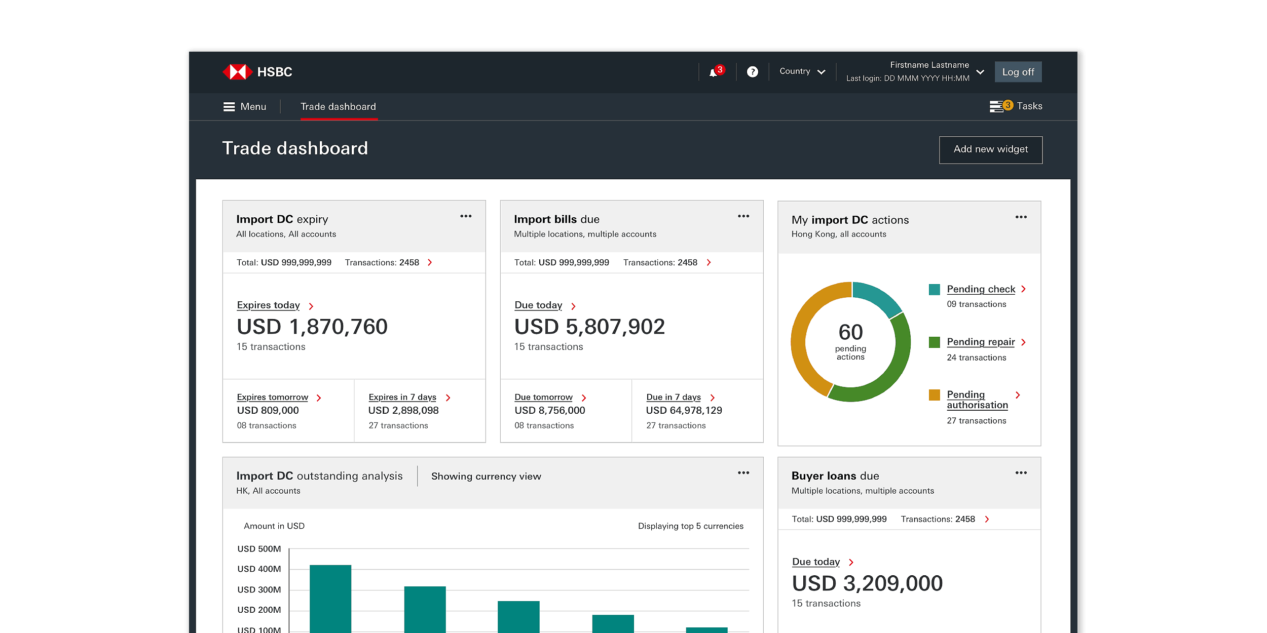
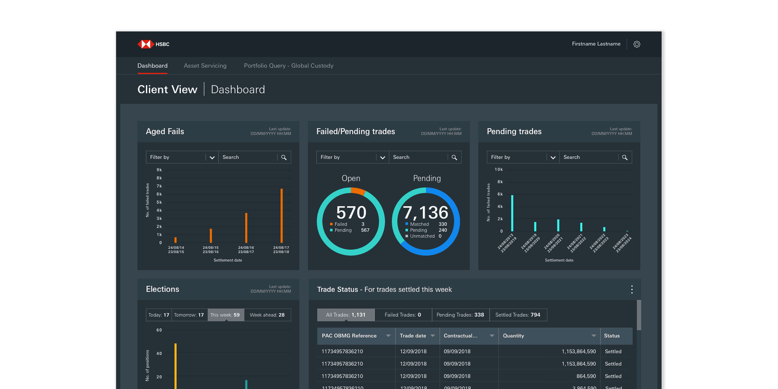
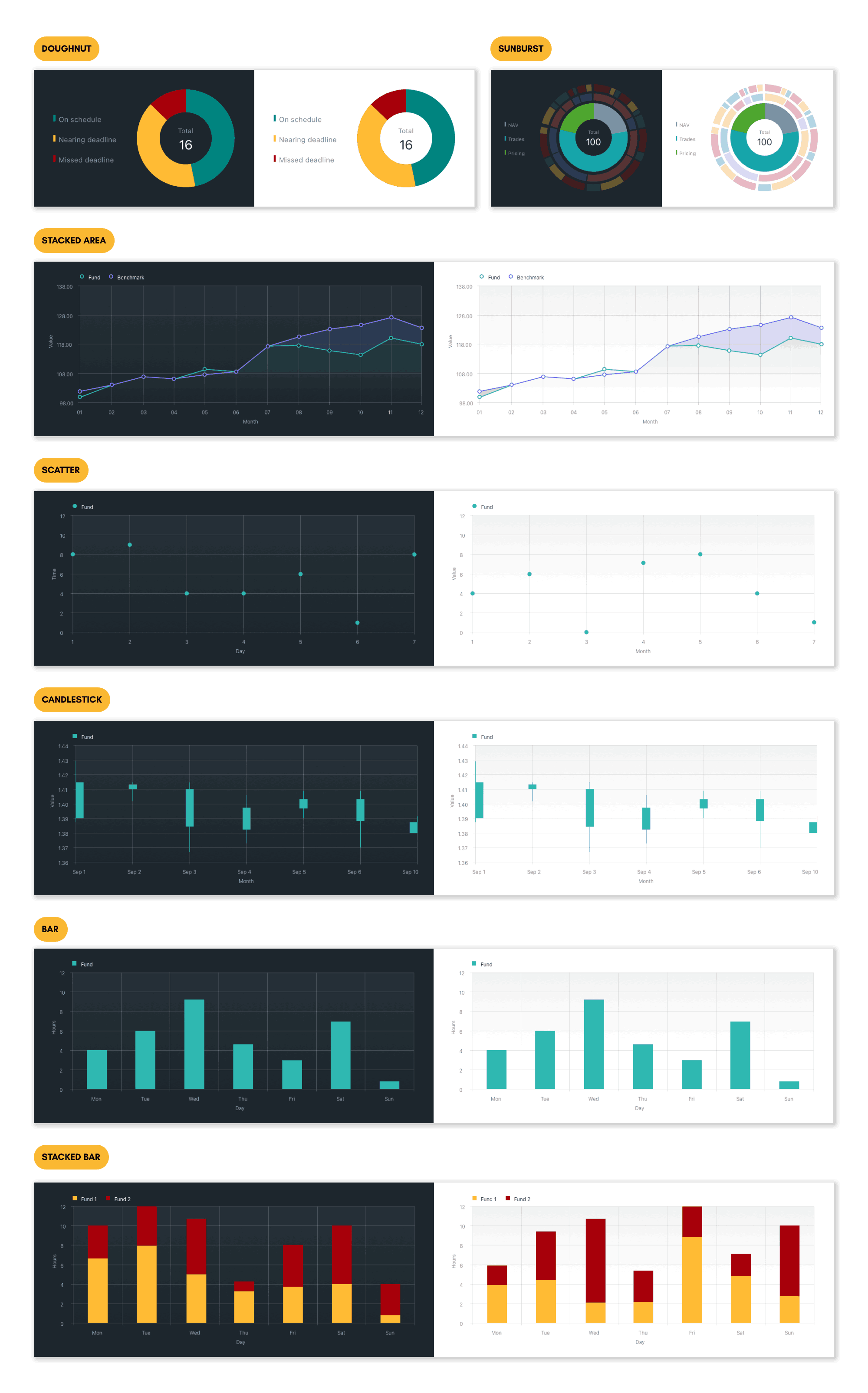
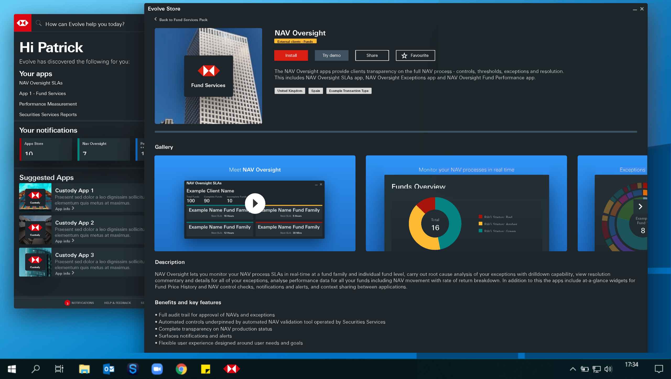
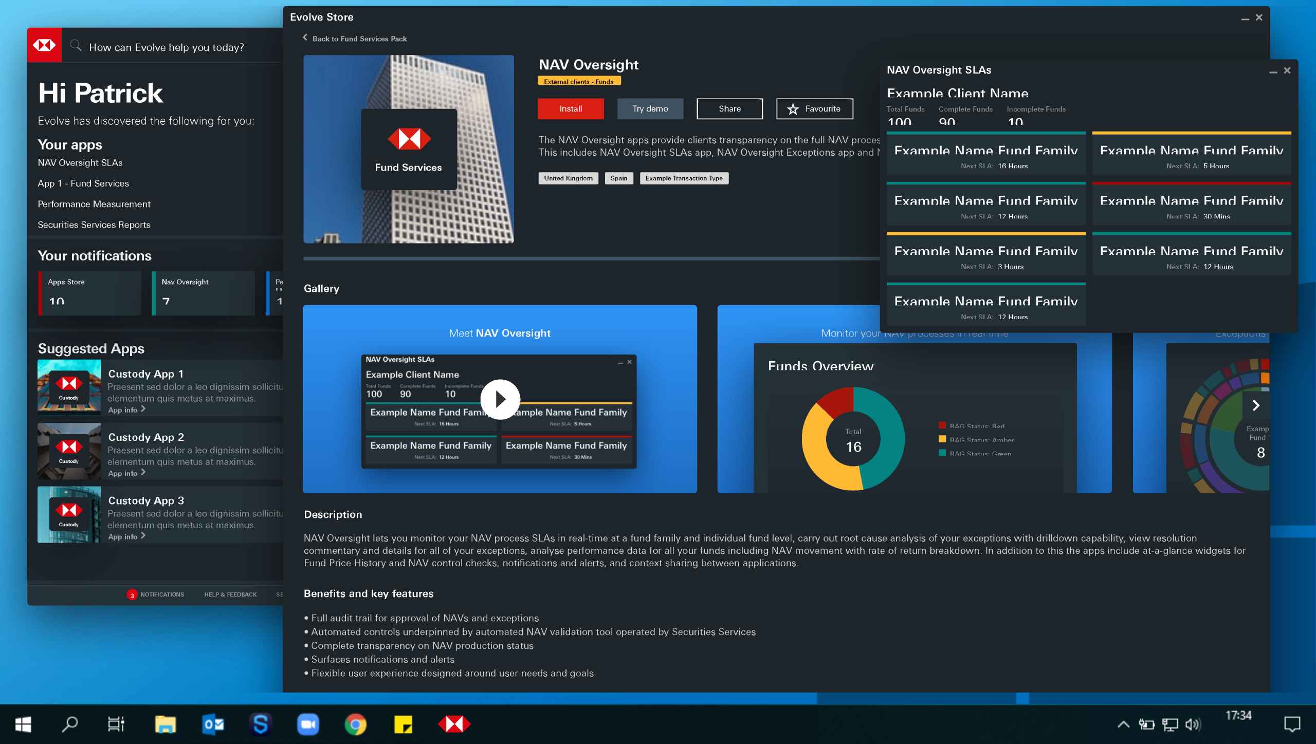
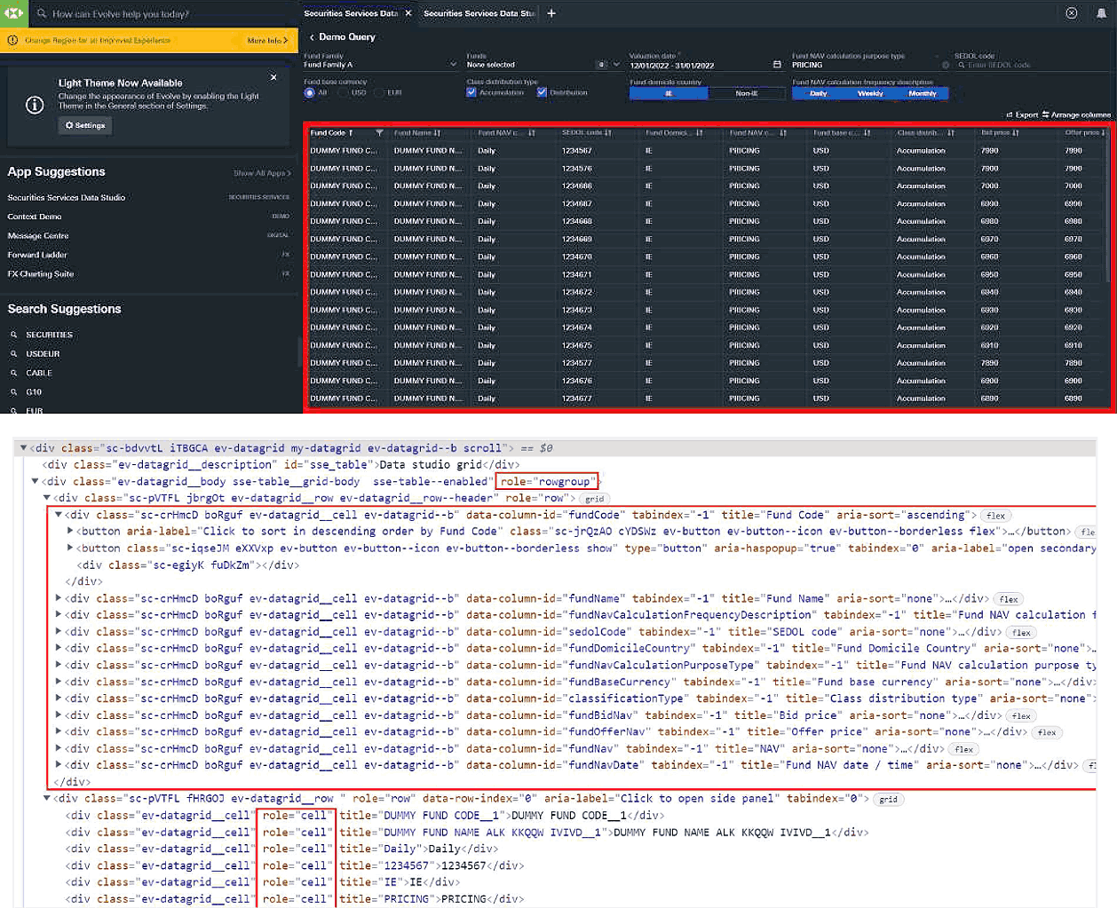
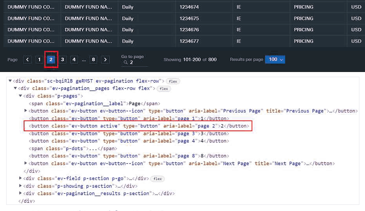
Improved Data Visualisation
New templates and visual standards were developed to bring clarity, consistency, and understanding to charts, tables, and new dashboard components.
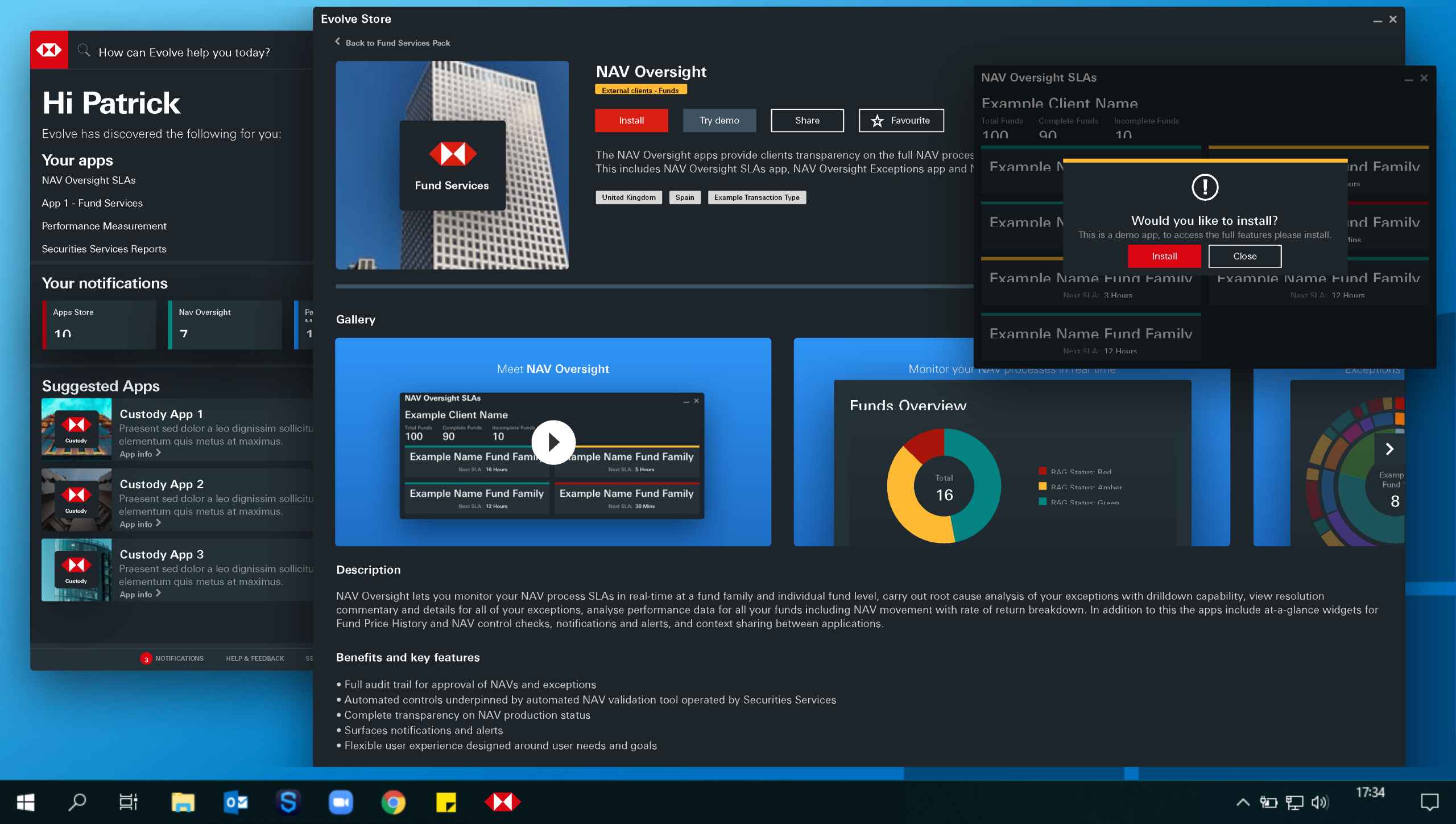
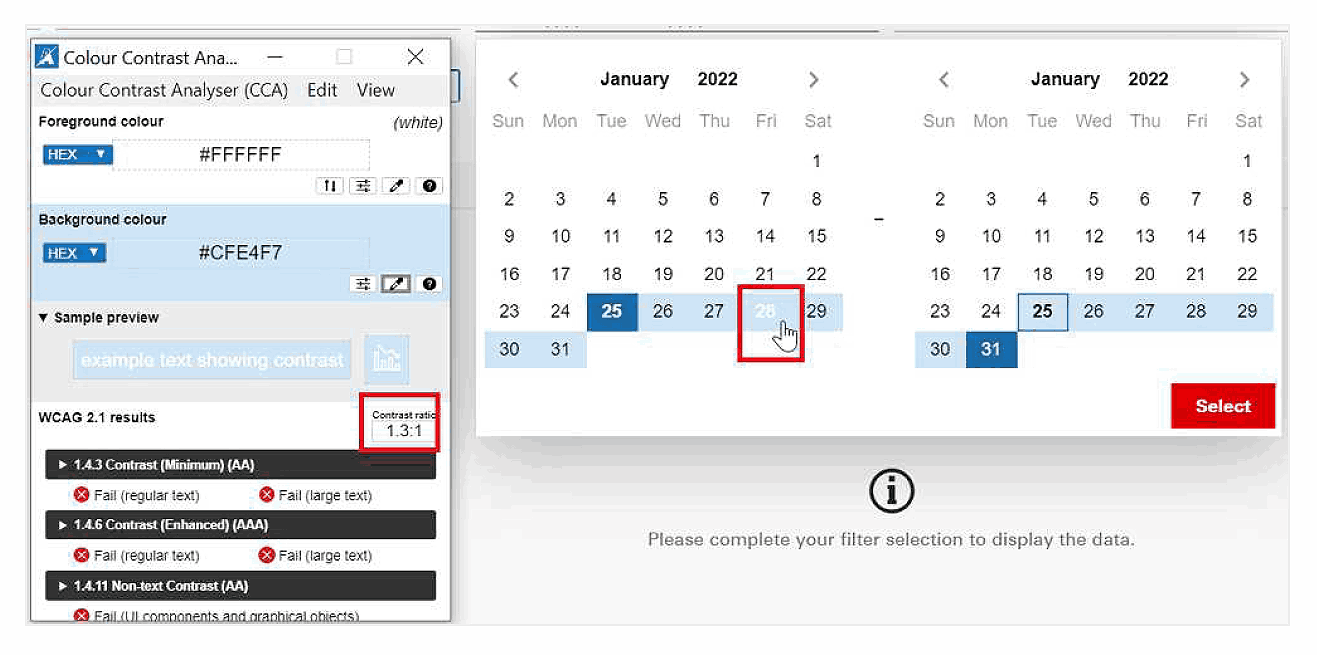
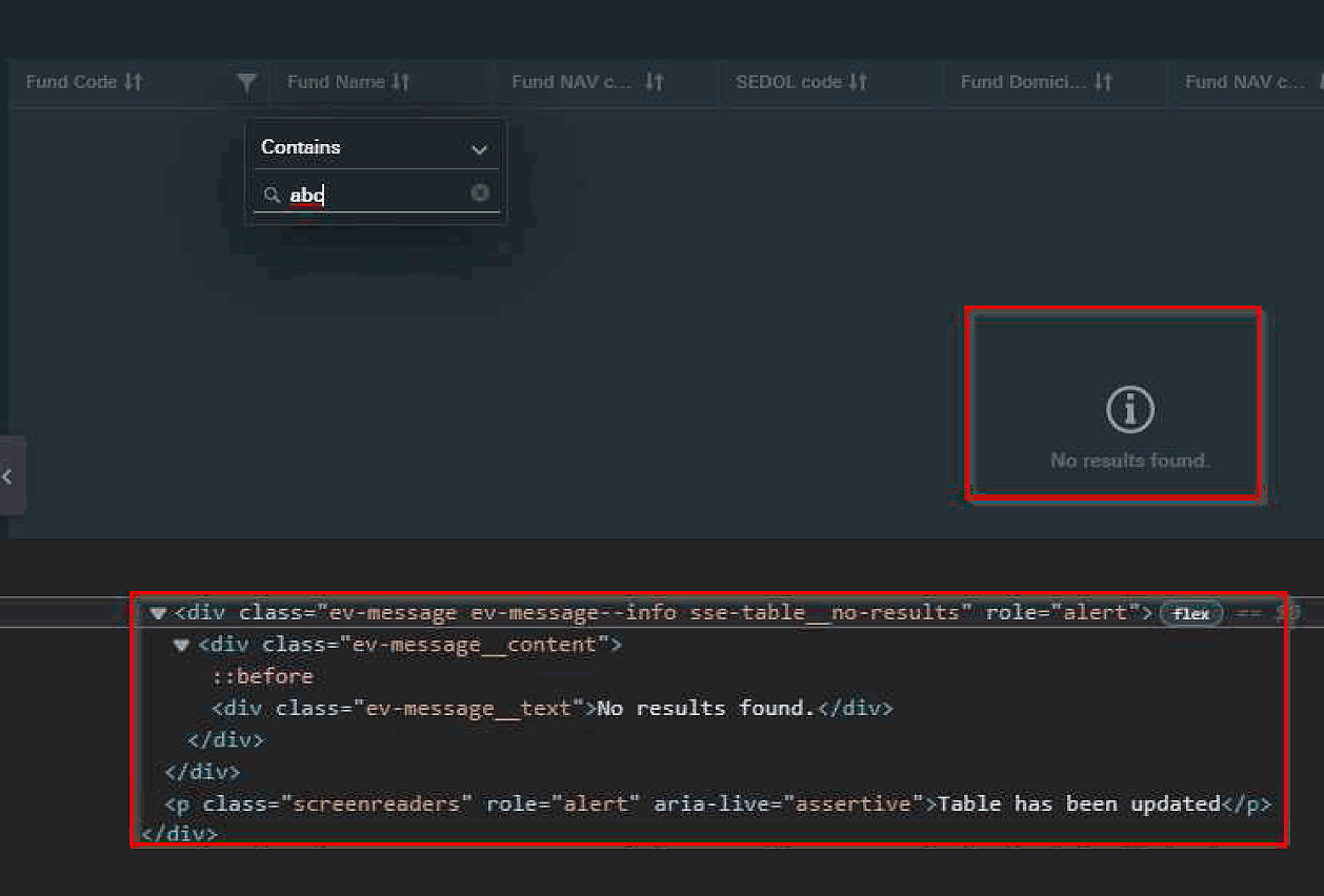
Accessibility Enhancements
A WCAG 2.1 AA audit revealed issues like missing ARIA attributes and inaccessible dynamic content, fixed with semantic HTML, improved markup, and live region support.
User-Centric Refinements
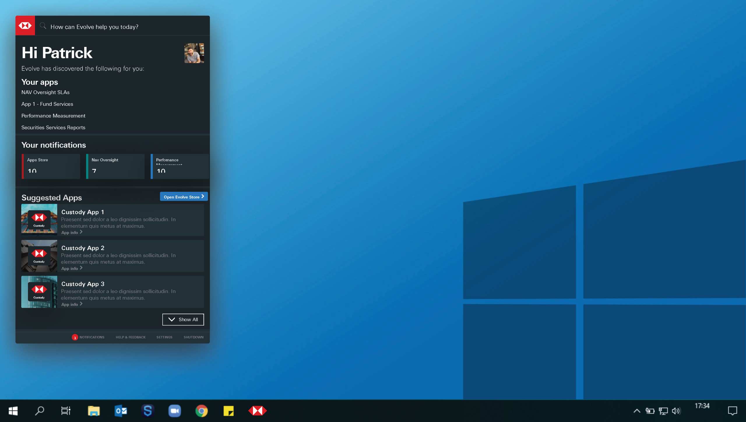
Iterative feedback from user testing and stakeholder reviews informed enhancements to the dashboard design, interaction flows, and overall usability.
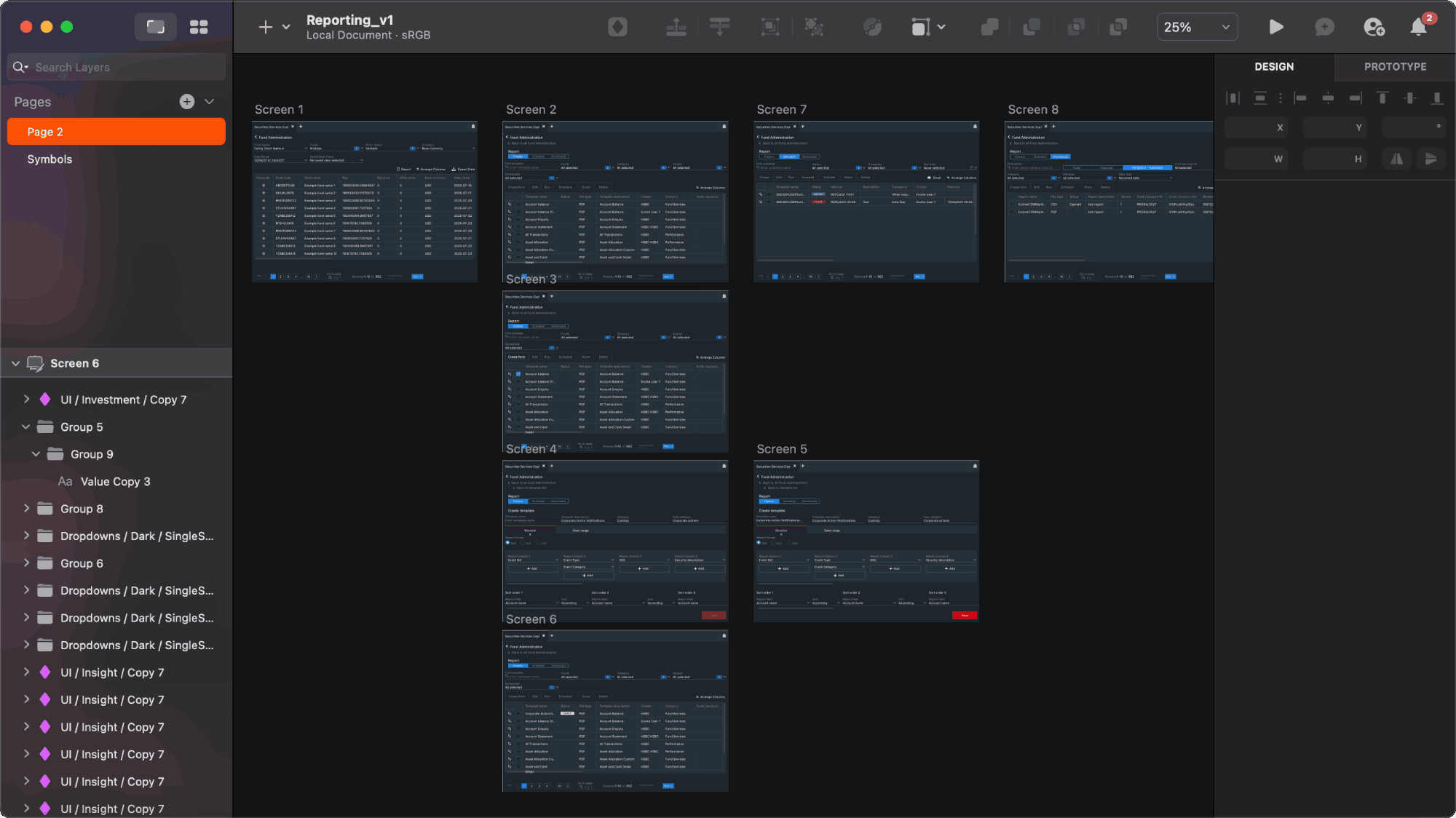
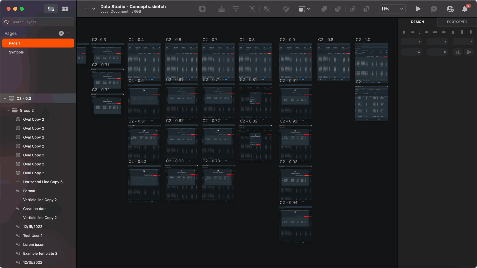
Implementation Support
Final deliverables included updated component libraries, annotated screen flows, and design documentation to guide development and future adoption of Evolve.
These efforts established a strong foundation for scalability, integration, and inclusivity. The result was a future-proof interface that aligned with HSBC’s global design standards and better addressed the operational needs of the Securities Services platform.
 Home
Home