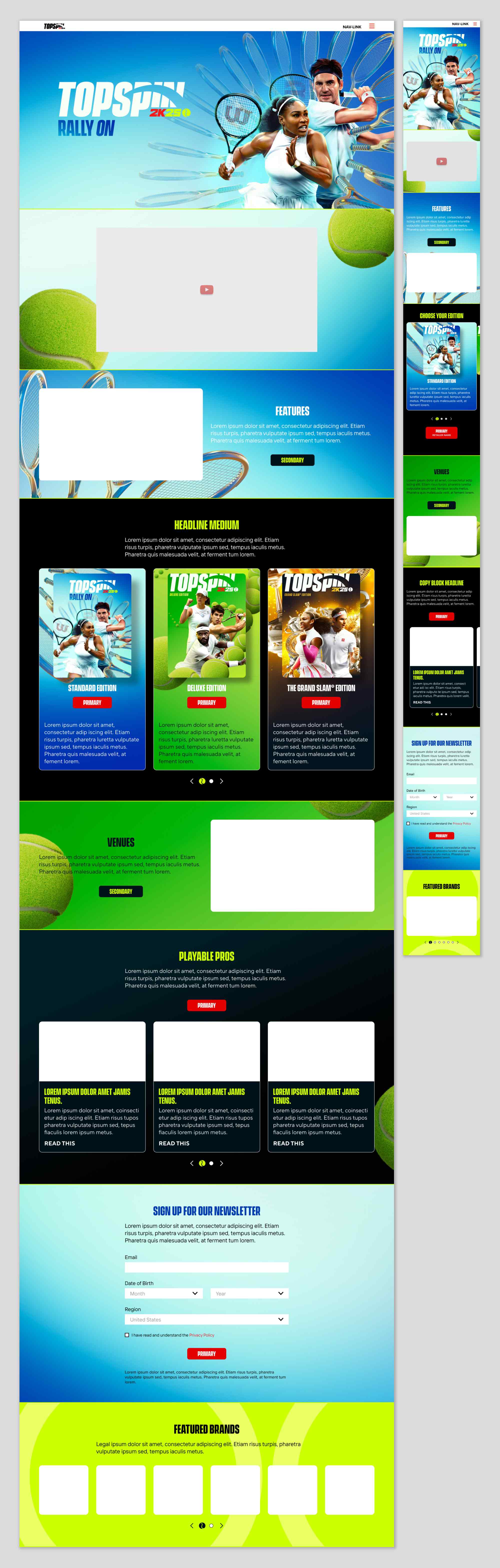
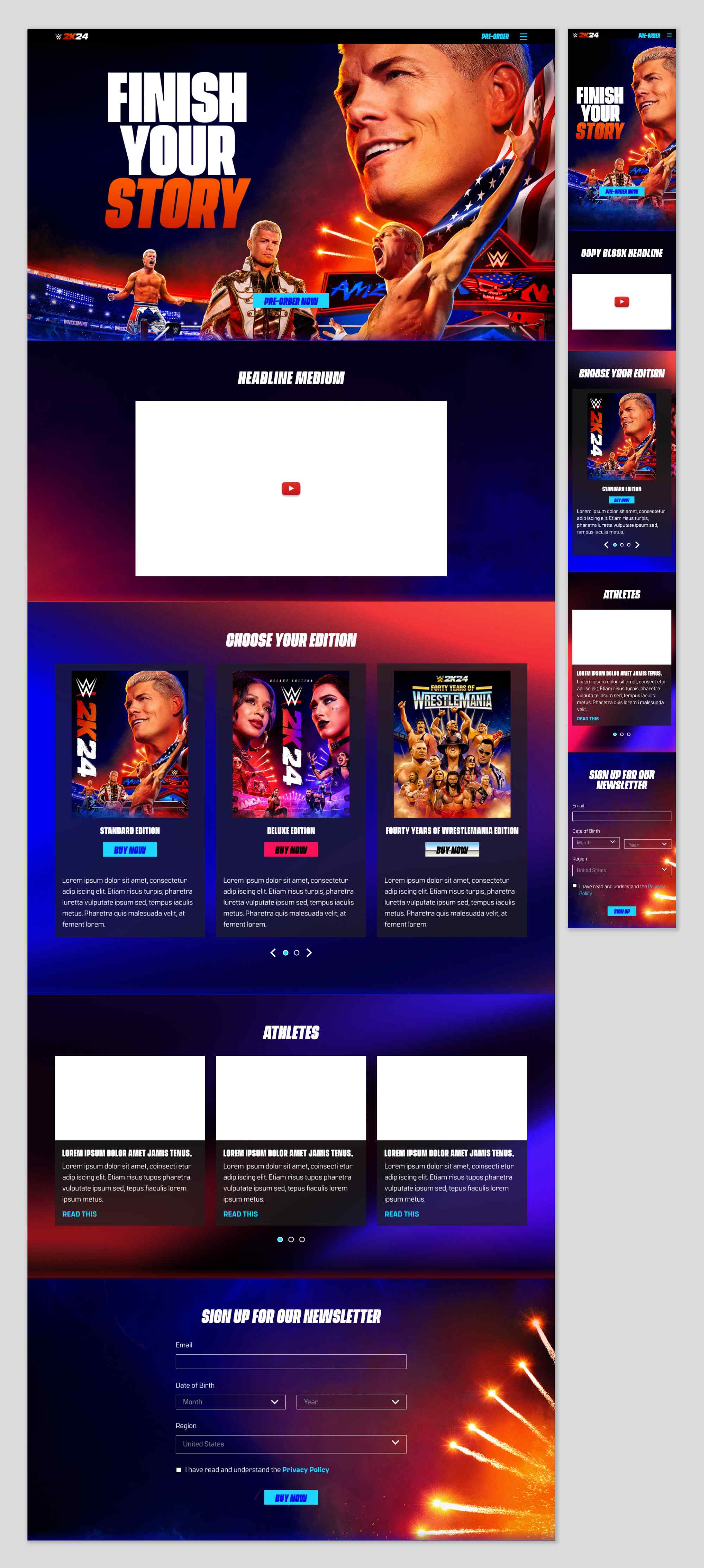
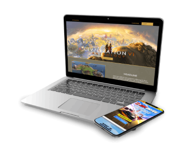
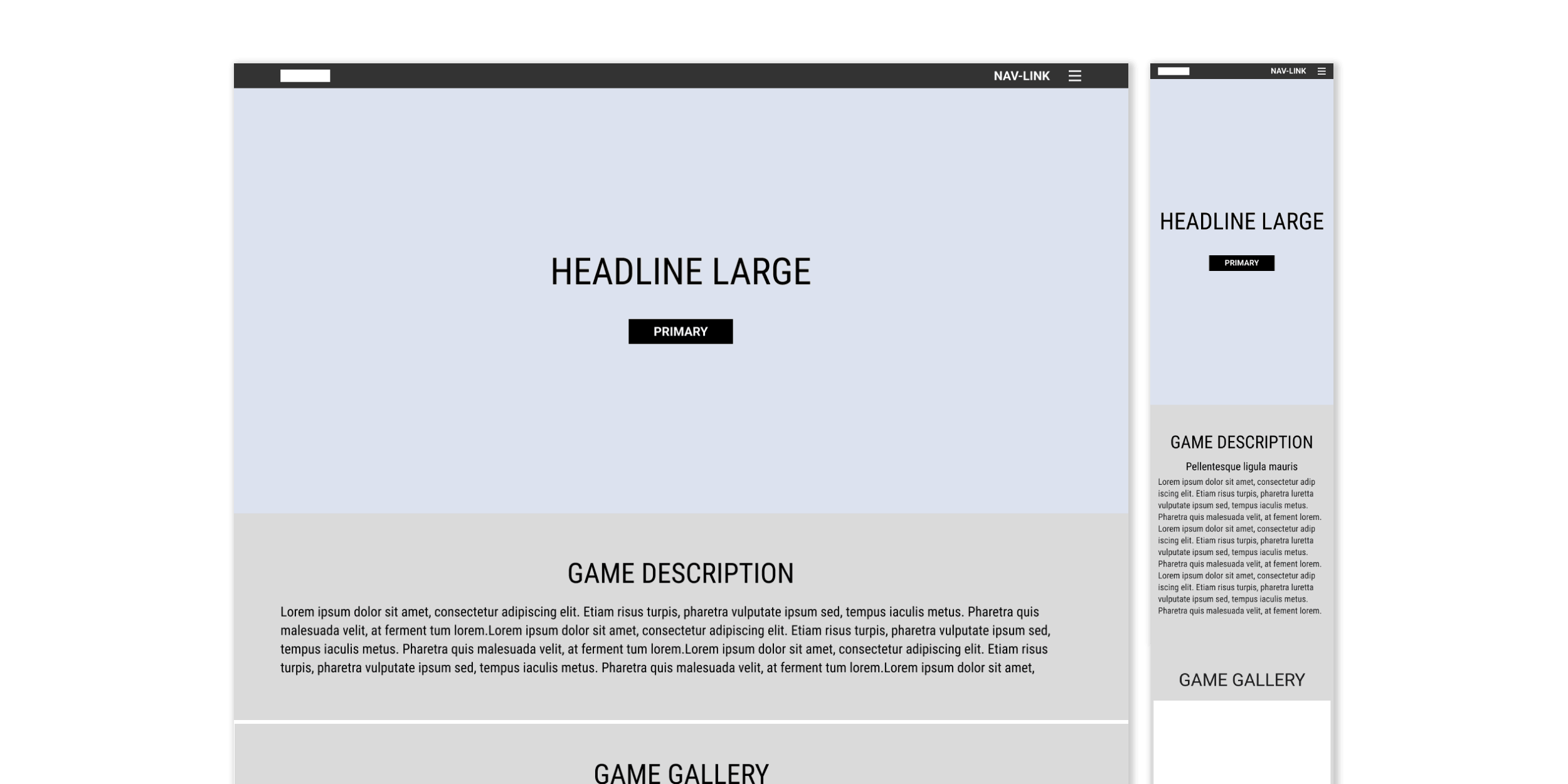
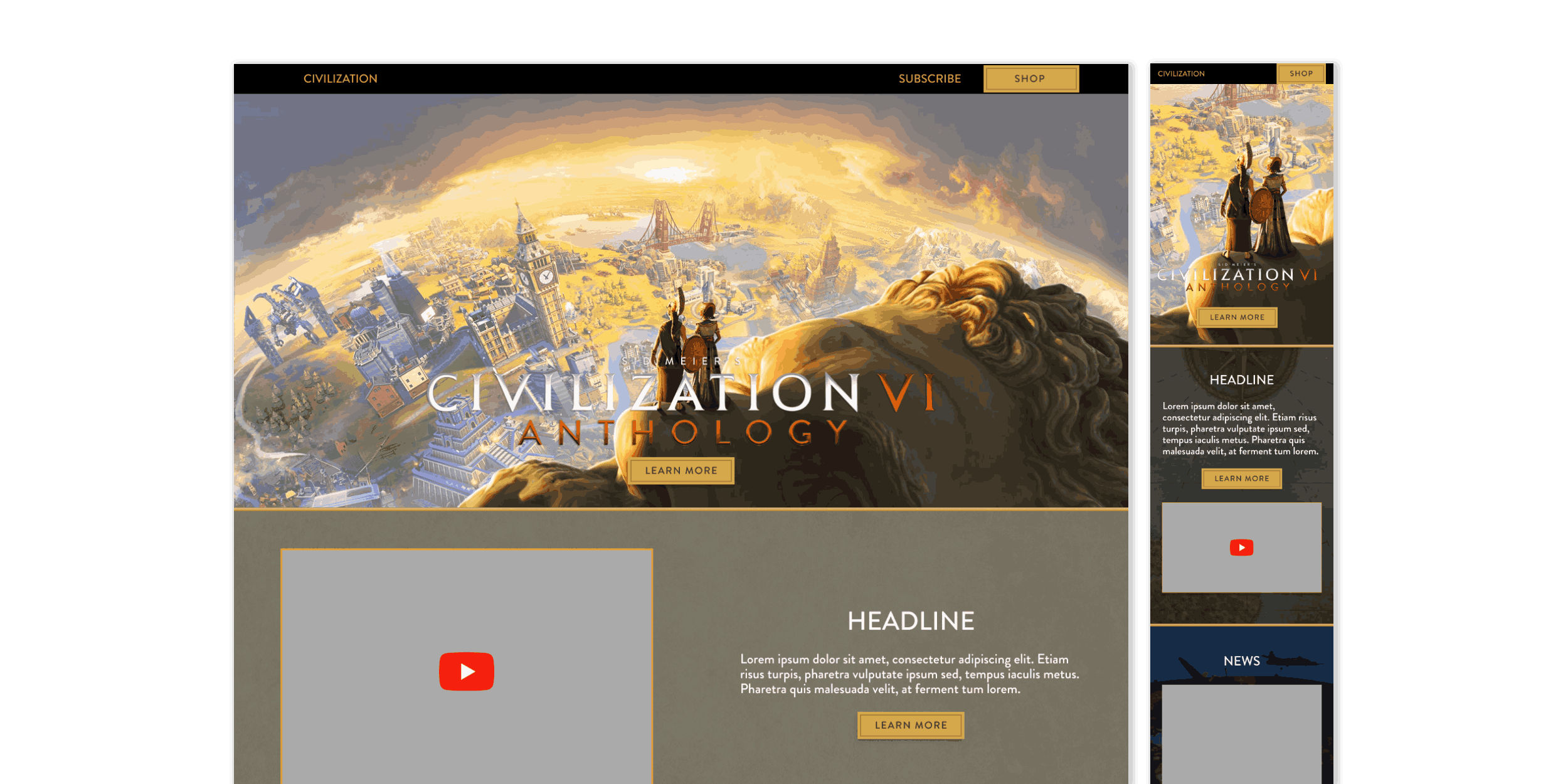
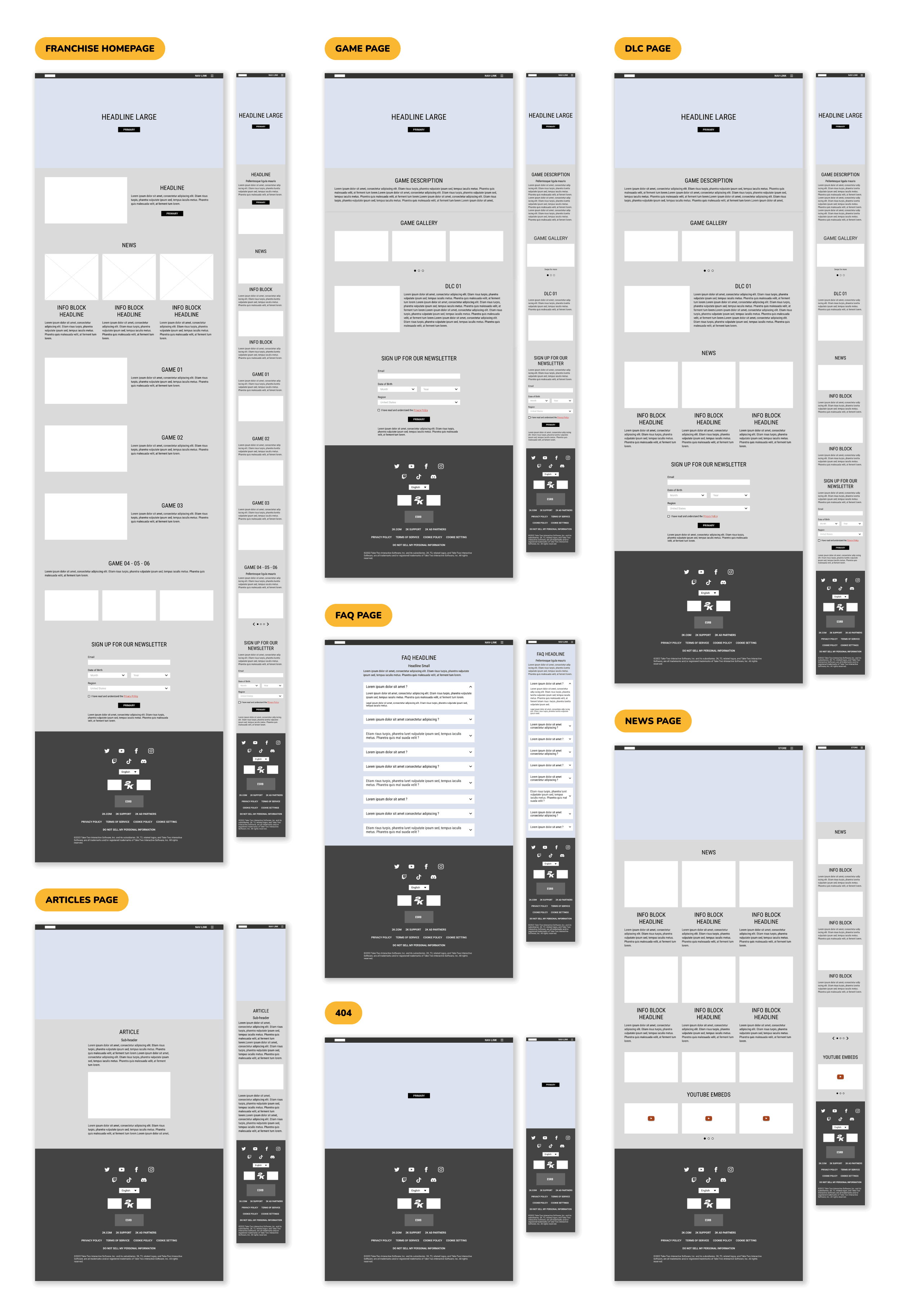
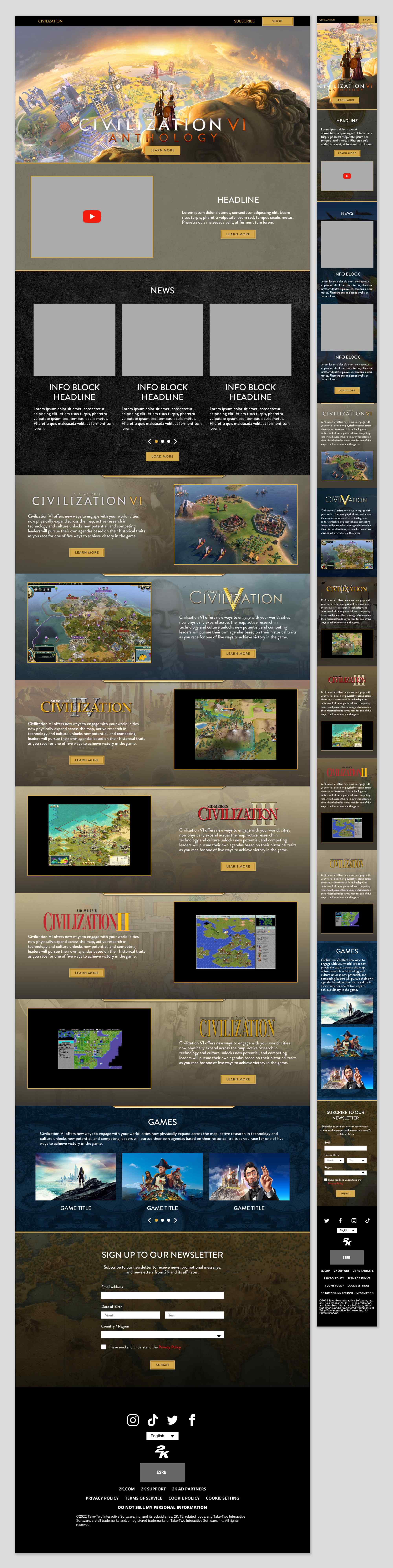
Hero Section
Featured a cinematic trailer with a strong visual impact, accompanied by a clear call-to-action for purchase.
Overview
Introduced the game’s historical scope and core mechanics, offering a concise value proposition for new players.
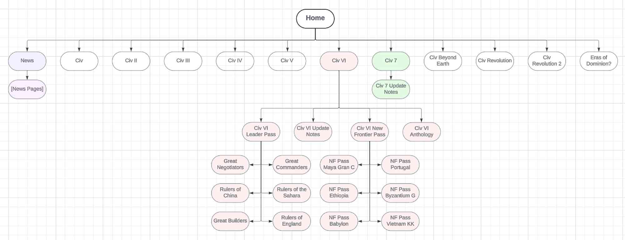
What’s New
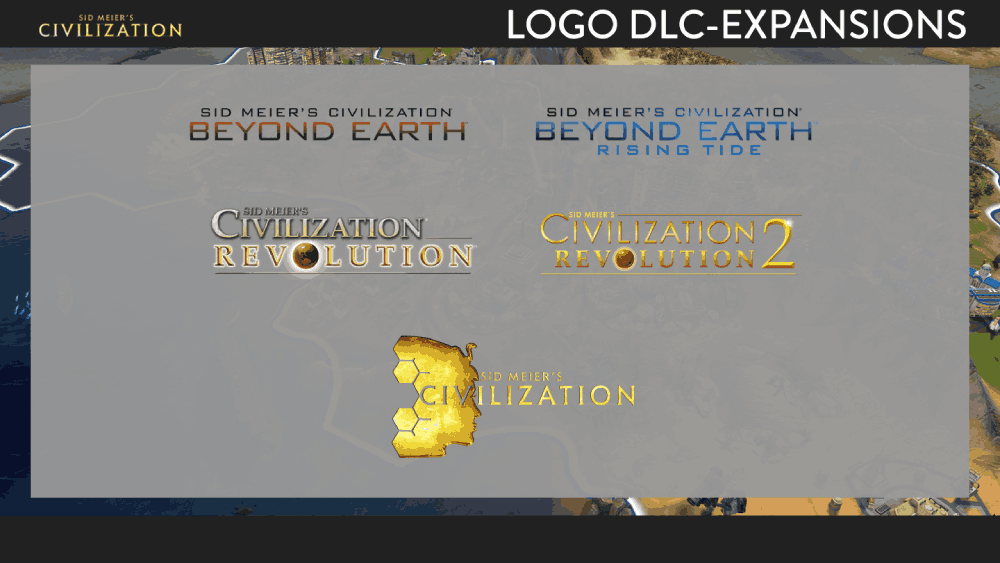
Highlighted updates, expansion packs, and downloadable content including the Leader Pass and New Frontier Pass.
Media Gallery
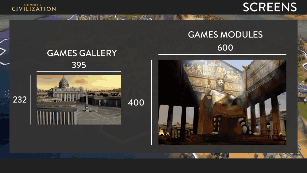
Showcased screenshots and gameplay videos to provide a visual sense of the game world.
Editions
Compared Standard, Deluxe, and Platinum editions to help users make informed purchasing decisions.
FAQs & Specs
Listed system requirements, supported platforms, and common support topics to reduce purchase friction.
Pre-order/Purchase Module
Designed as a persistent or anchored module to ensure high visibility throughout the page.
Deep-Dive Sections
Explored expansions like Rise and Fall or Gathering Storm, spotlighting new leaders, factions, and gameplay features.
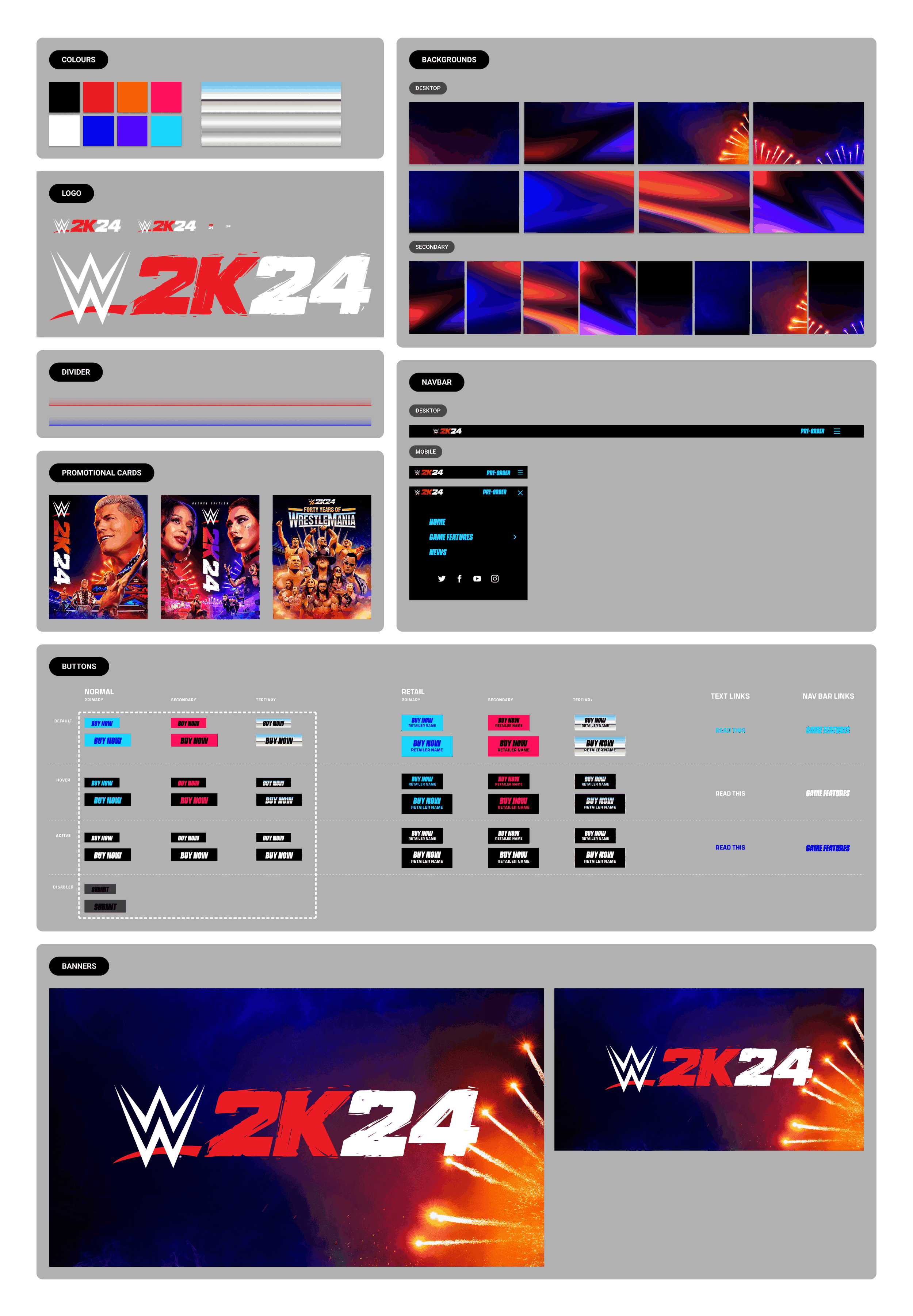
This flow balanced immersive storytelling with consistent access to key actions, ensuring that users could explore and purchase seamlessly. The structure was then adapted and re-skinned for other Civilization titles and extended to fit the unique branding of additional 2K game properties.
 Home
Home


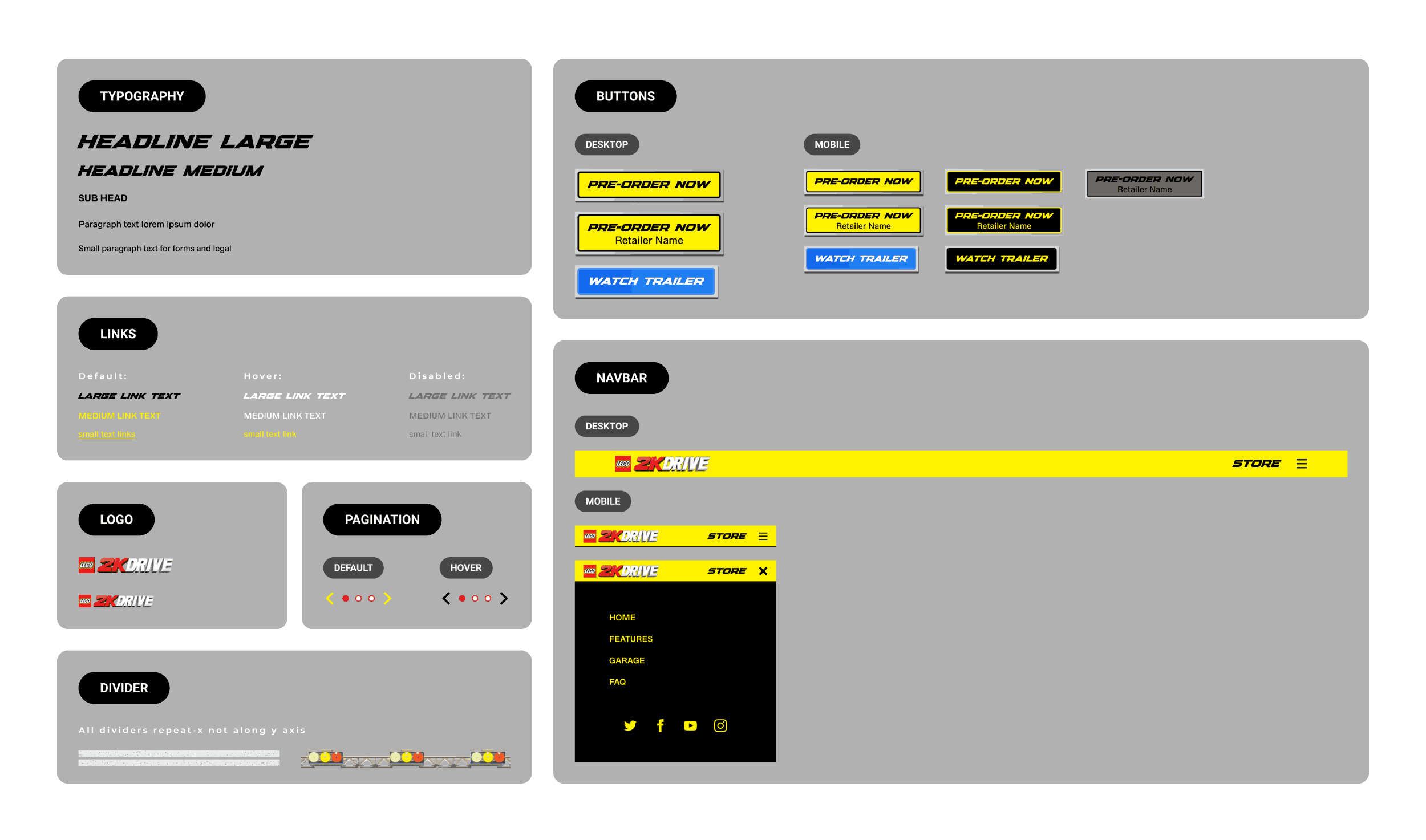
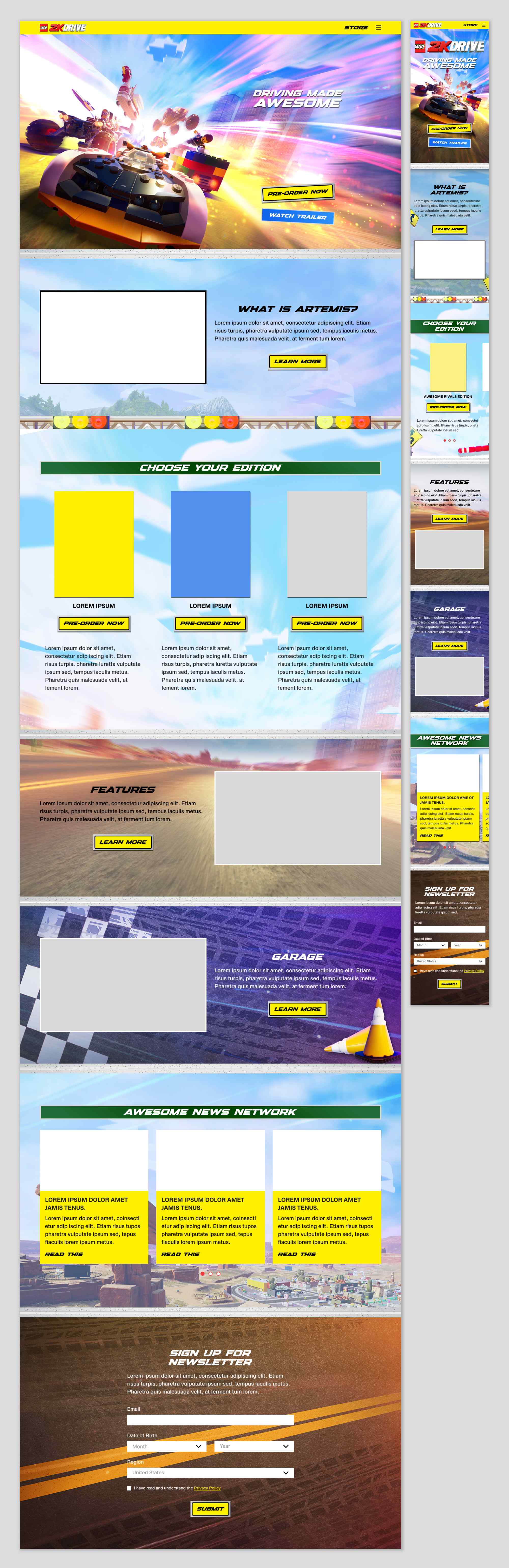
 The design leaned into a bold, playful aesthetic aimed at younger audiences and families. A bright colour palette, chunky type, and animated UI elements echoed the energy of Lego’s brand and arcade-style racing. Layouts emphasised fun and discovery, with character art and vehicles featured prominently across modules.
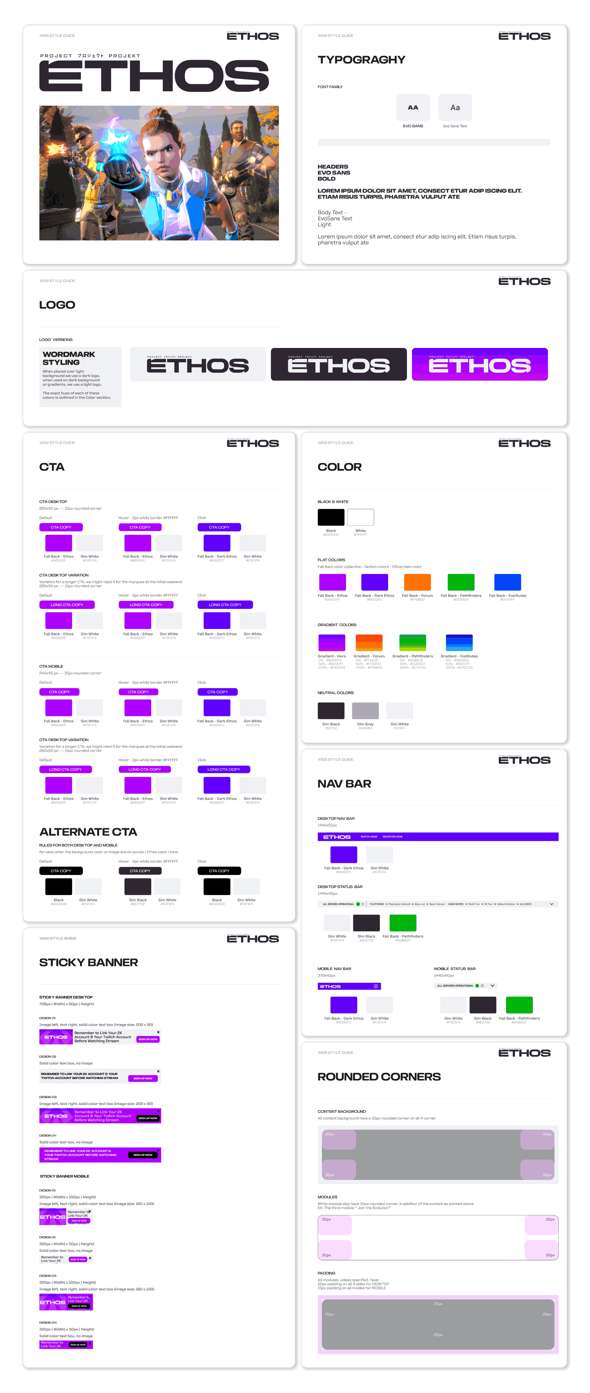
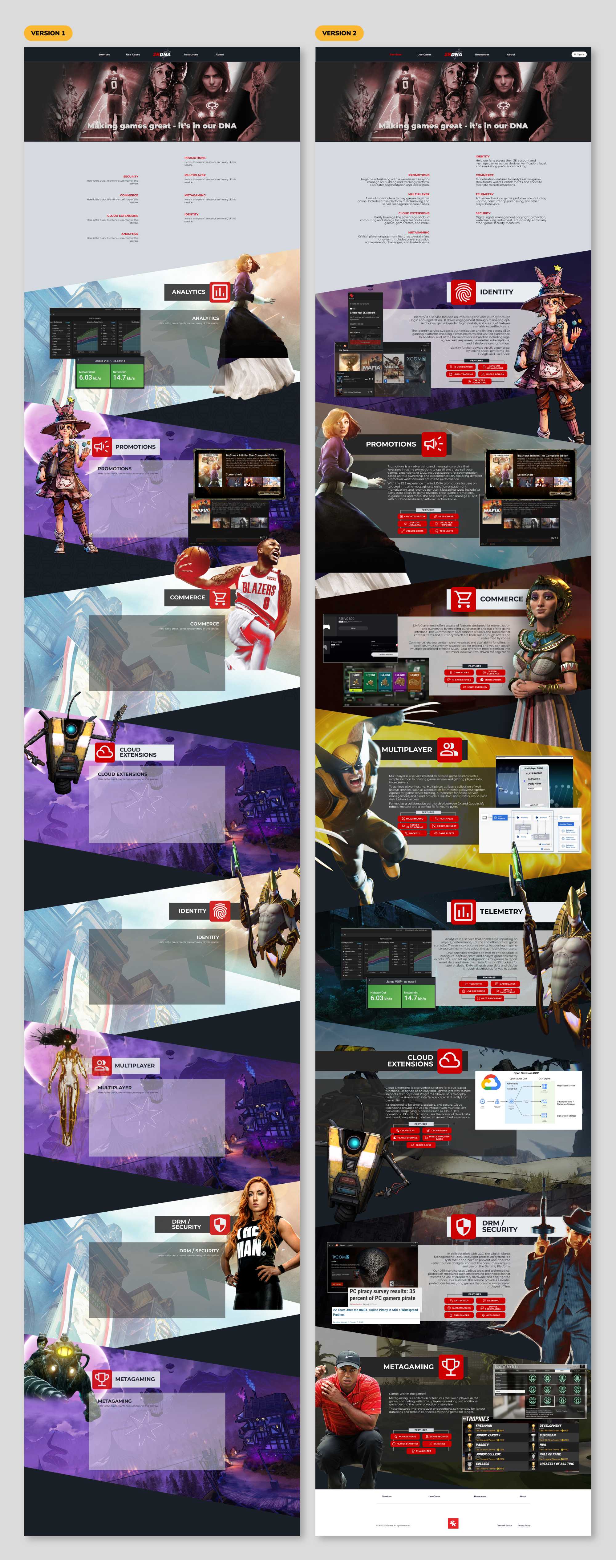
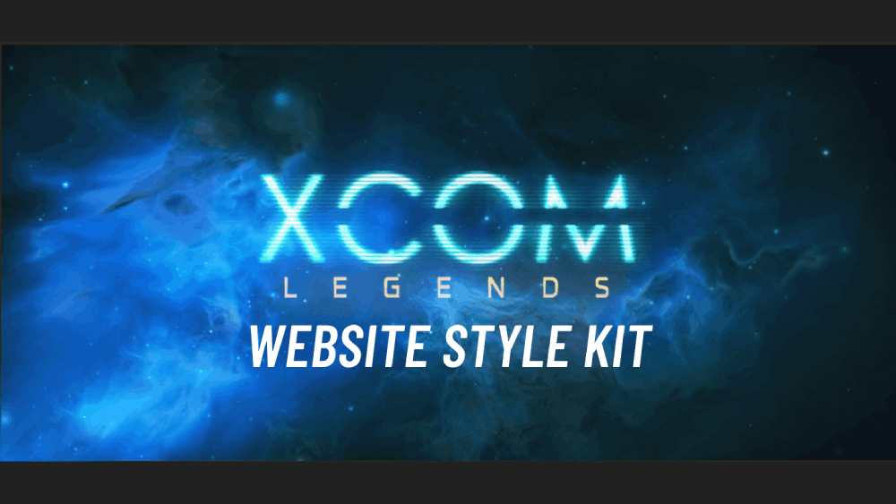
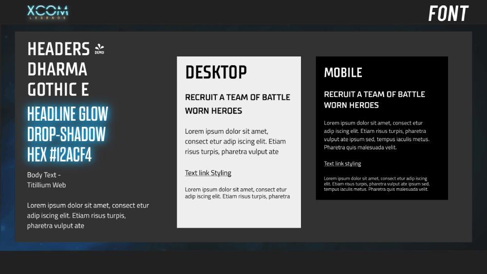
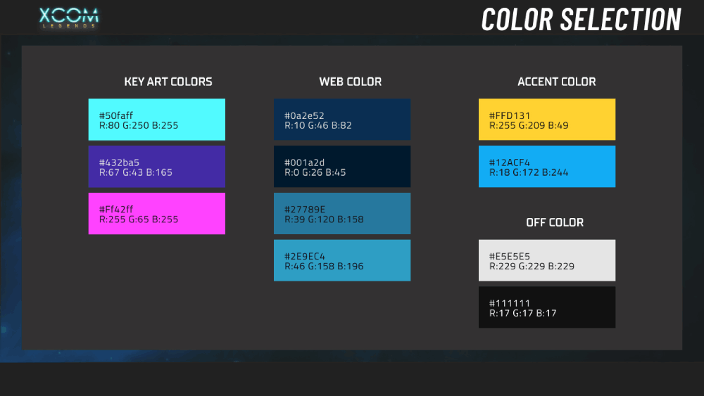
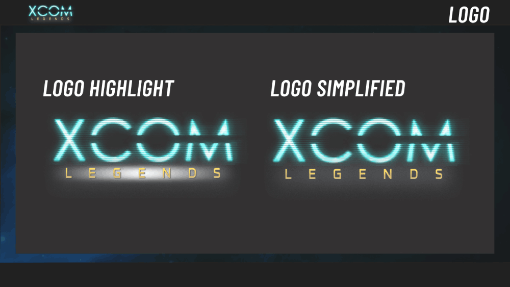
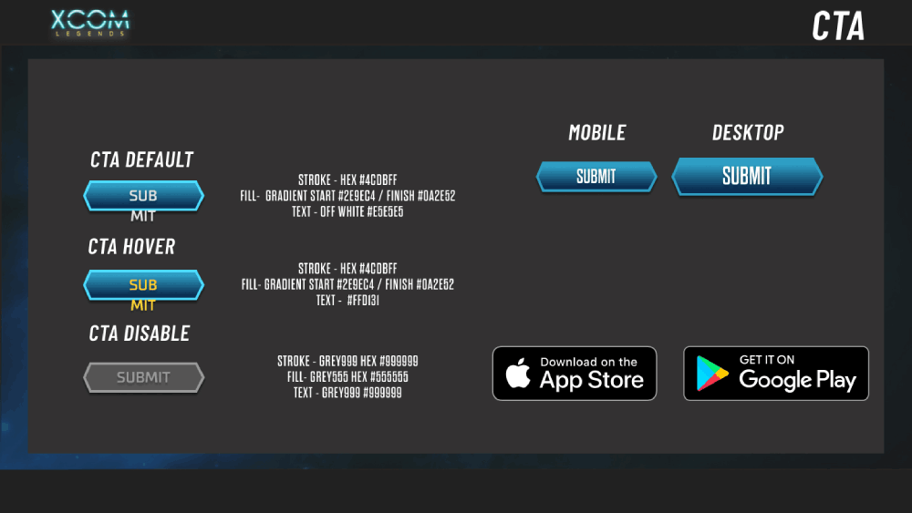
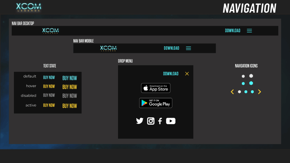
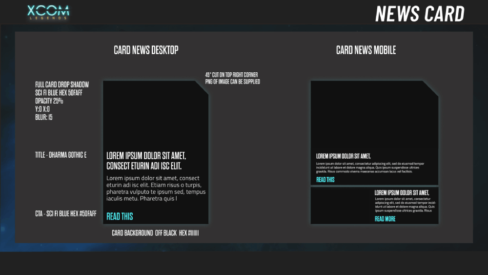
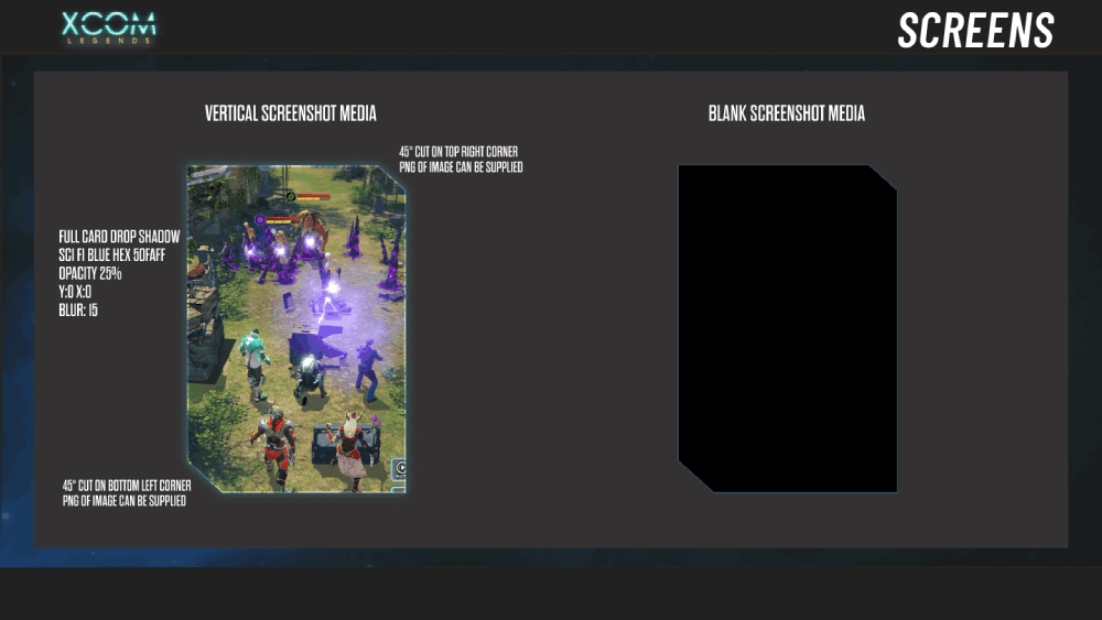
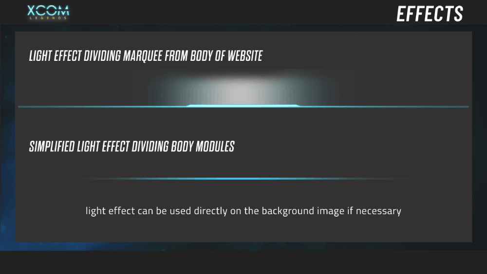
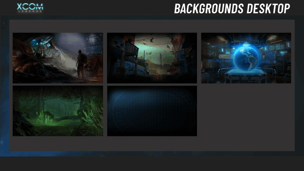
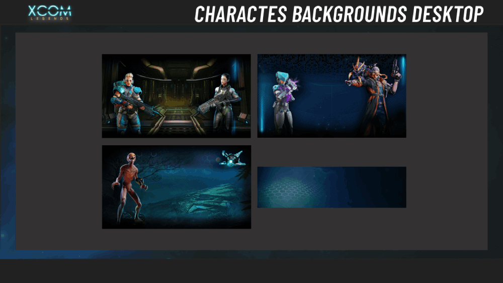
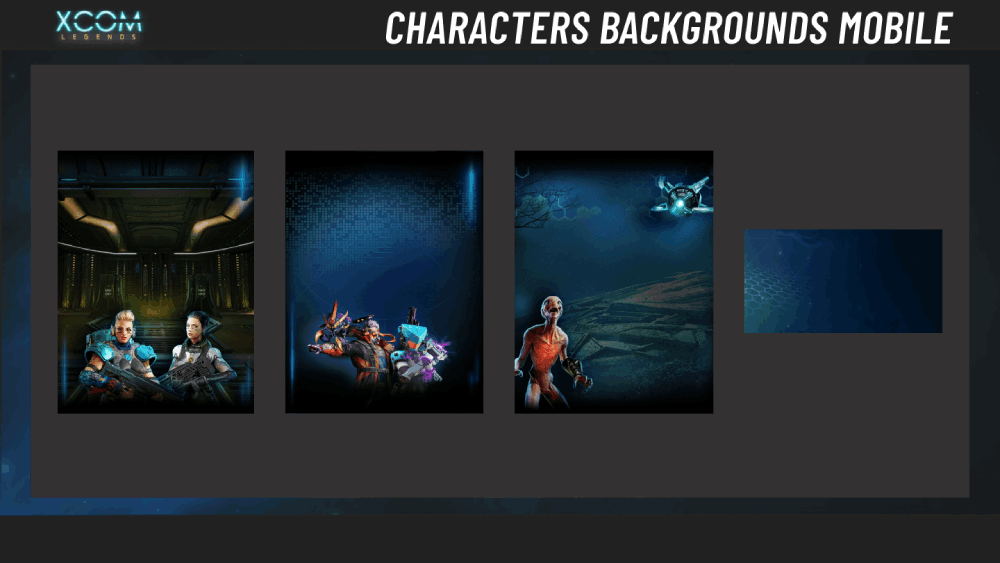
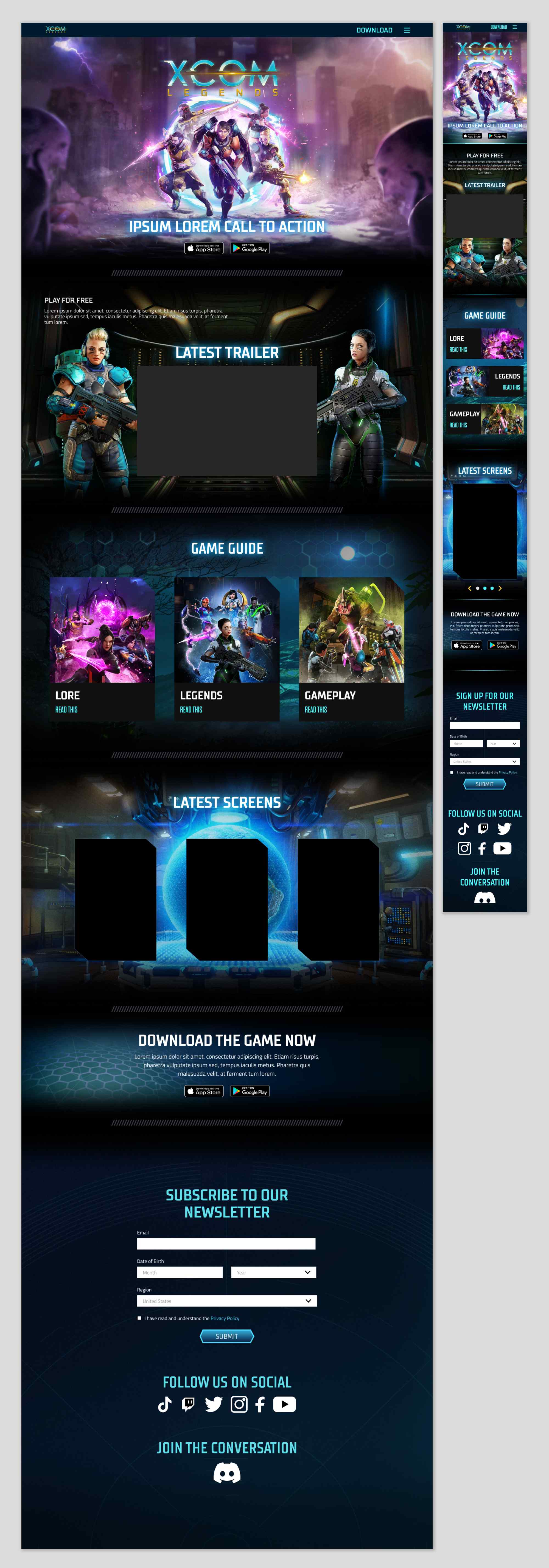
 The promotional page emphasised a sci-fi aesthetic for the renowned tactical squad-building, turn-based combat game, with visuals of an ongoing battle against alien forces. A dark colour palette with neon highlights and stylised illustrations reinforced the gritty, high-stakes atmosphere, while clear CTAs encouraged pre-registration and community engagement.
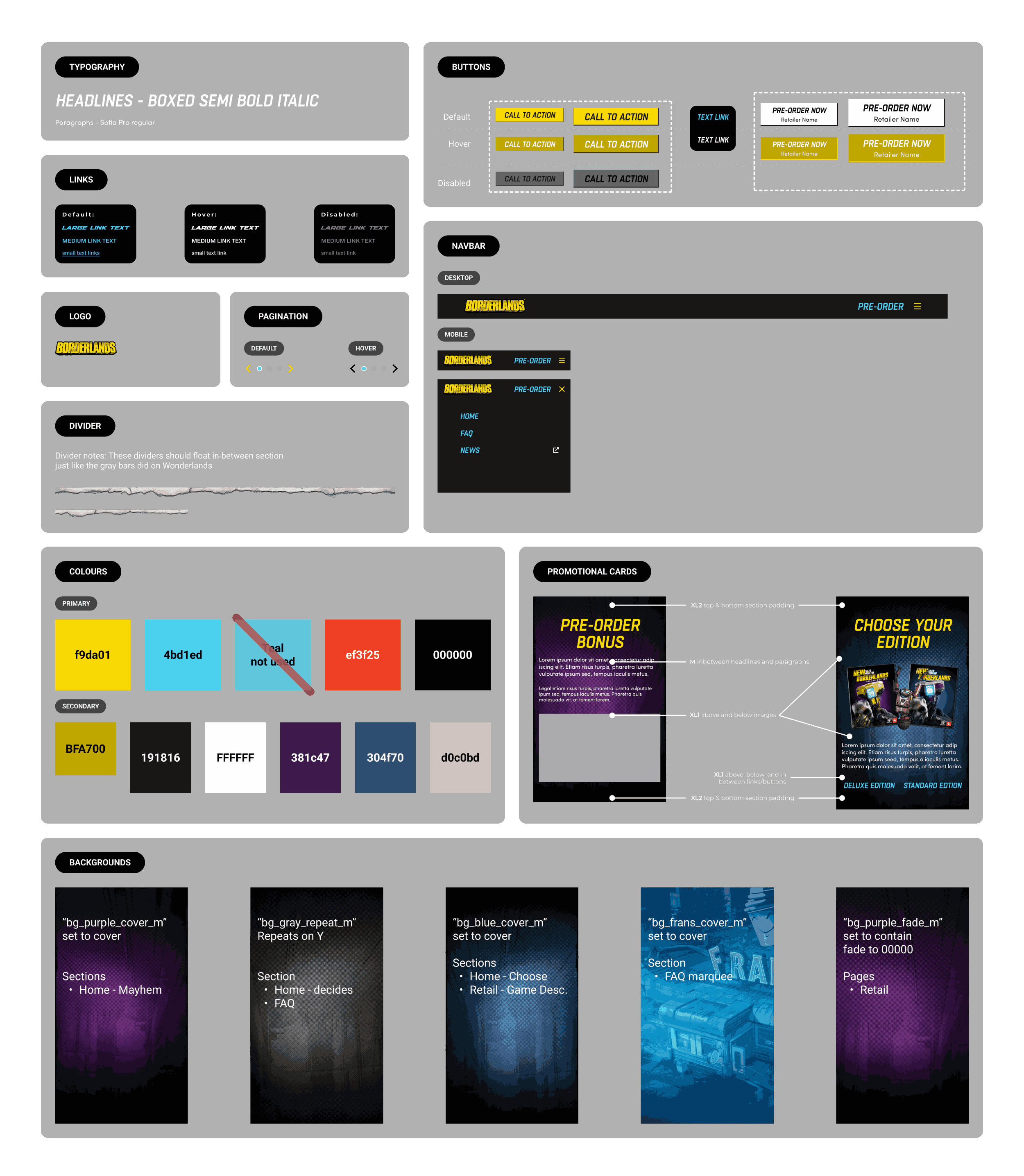
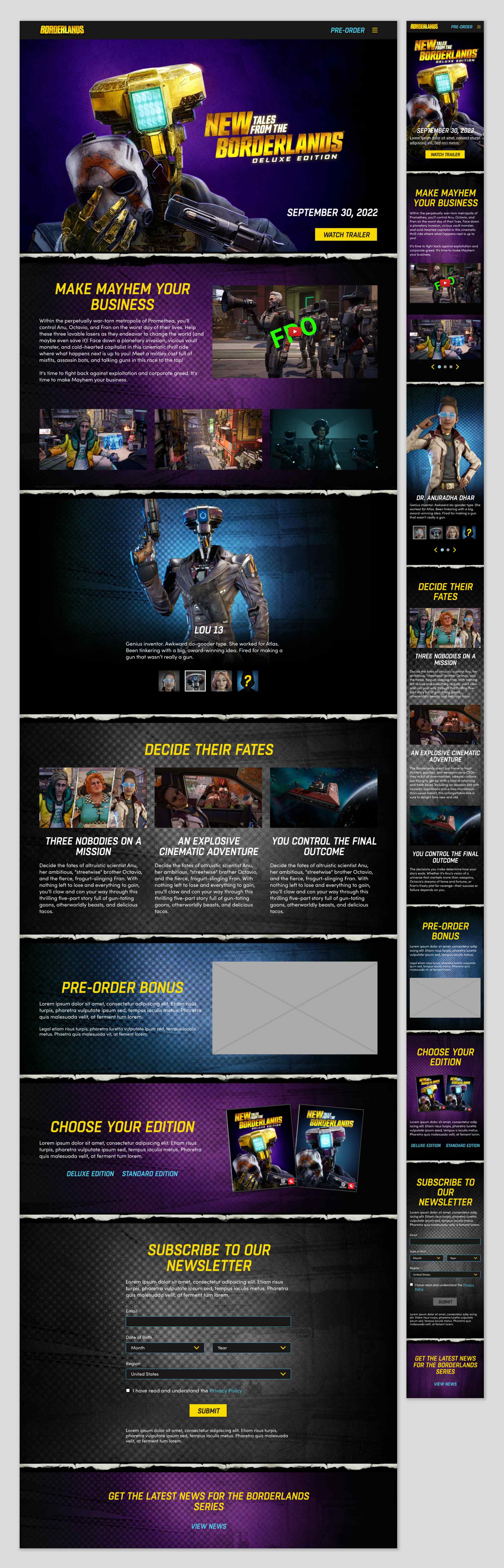
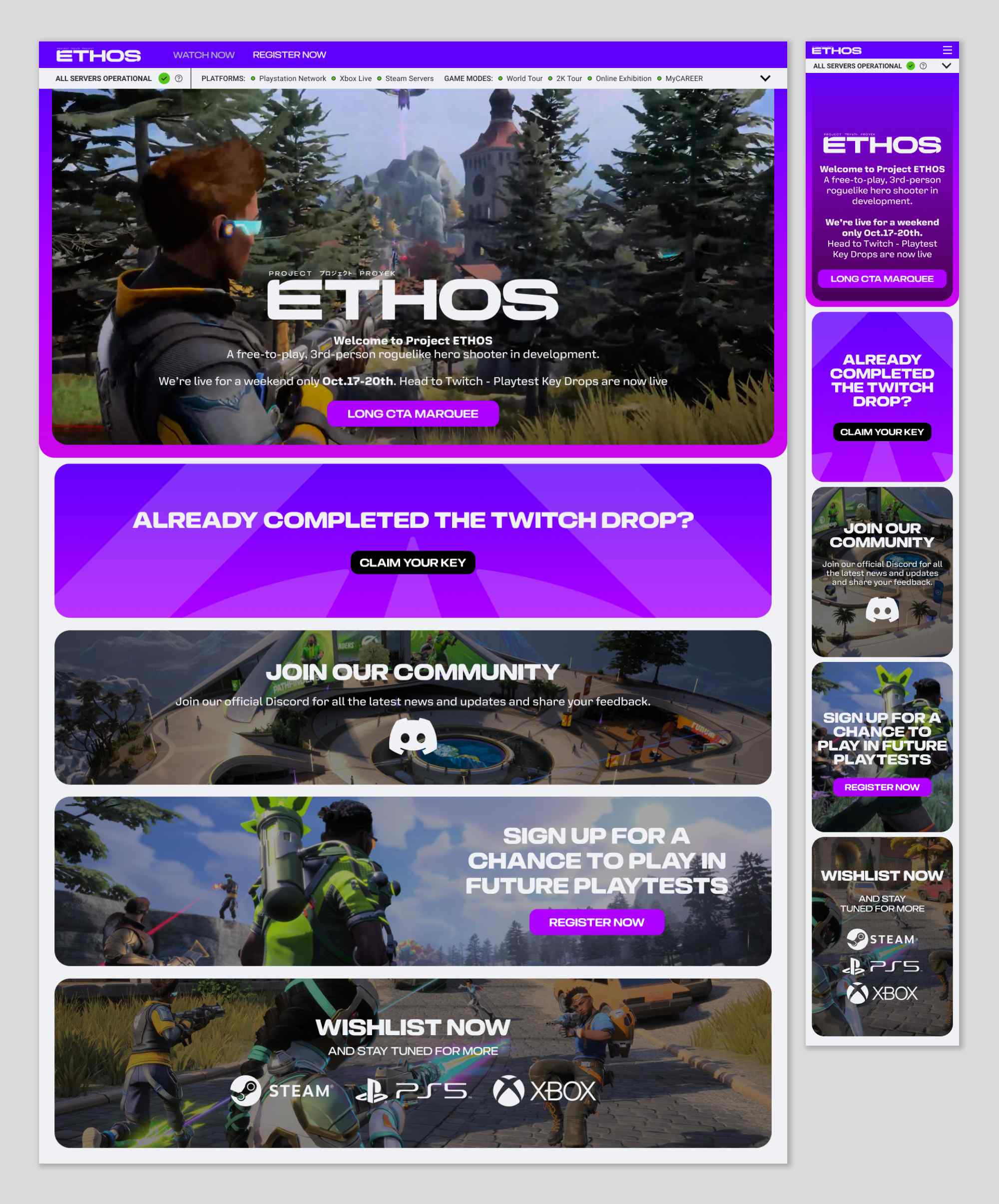
 The Borderlands design adopted a gritty, comic-book visual style aligned with its irreverent tone and cel-shaded graphics. Rough textures, bold outlines, and expressive typography captured the anarchic spirit of the franchise. Key sections featured character callouts, loot-focused mechanics, and pre-order incentives with stylised illustrations.