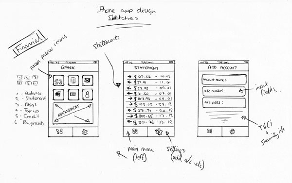
Mobile Banking
Barclays
Contents
Intro
The Barclays Mobile Banking app enabled customers to make payments, transfer funds between accounts, and view balances and transactions directly from their smartphones.
Challenge
A wave of modern fintech apps had begun to disrupt the traditional banking sector by offering seamless, user-friendly digital experiences. To remain competitive and meet rising user expectations, a complete redesign of the existing mobile dashboard was necessary.
Solution
The dashboard was reimagined following in-depth research and iterative user testing. A comprehensive set of design guidelines was developed to modernize the interface and reinforce Barclays’ brand identity across digital channels.
1. Introduction

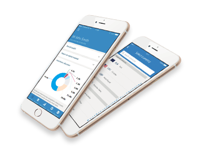
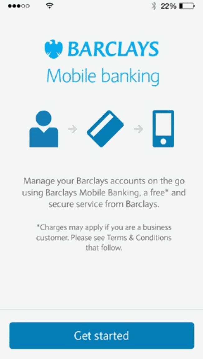
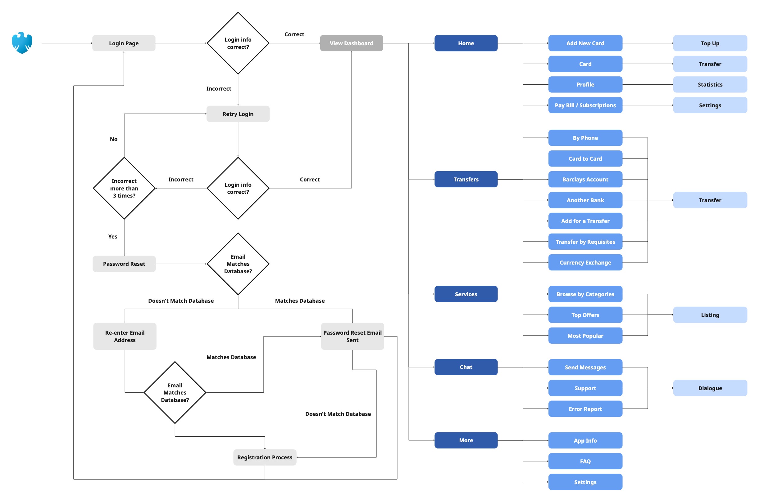
The Barclays Mobile Banking app served millions of users across the UK, offering essential features such as account balance checks, transaction history, money transfers, and bill payments.

As digital banking evolved, the app faced growing pressure from newer, design-led competitors entering the market with cleaner, more intuitive user experiences. In response, the mobile dashboard underwent a comprehensive redesign aimed at improving usability, aligning with modern UX standards, and maintaining the trust and familiarity associated with the Barclays brand.

The project focused on streamlining user journeys, creating a scalable design system, and enhancing the overall visual and functional experience for mobile users.
Constraints
  • The app relied on outdated design patterns that no longer met user expectations.
  • Competing Fintech apps raised the bar for usability and design.
  • Design updates had to preserve brand trust and recognition.
Project Goals
  • Modernise the interface using current UX/UI standards.
  • Simplify navigation and streamline user journeys without disrupting existing user habits.
  • Maintain Barclays’ brand while improving usability and competitiveness.
Mobile Screen
2. User Flow

The initial phase of the project involved a thorough review of the existing user flow to uncover opportunities for streamlining and enhancement. The diagram below illustrated the navigation structure, centering on five primary entry points within the dashboard: Home, Transfers, Services, Chat, and More.
User Flow
User Flow
The app redesign would centre around four primary Transfer models that defined the app’s core functionality:
The full user journey was mapped from end to end, revealing key pain points, redundant steps, and inconsistencies in interaction patterns. This analysis helped uncover opportunities to streamline actions, simplify language, and remove unnecessary screens, ultimately leading to a more efficient and intuitive user experience.

Although the main focus was on improving functionality, it was equally important that the updated experience felt modern and intuitive for all users.
3. User Research

An open card sort exercise was conducted with five participants to explore how users naturally grouped features and functions. This method helped uncover mental models and provided valuable insight into users’ expectations for navigation and categorisation.

Two rounds of card sorting revealed consistent patterns (shown below).
Card Sort
Card Sort
These insights informed a reorganisation of the dashboard, resulting in clearer a navigation structure that aligned closely with the users’ mental model.

Key Findings
3. Design System

Following the initial research and analysis, a comprehensive design system was established to ensure consistency, scalability, and brand alignment across the mobile app. This system was built around a set of core principles and atomic elements that guided every visual and interactive component within the interface.
The Grid
The Grid
Colour Palette
Colour Palette
Typography
Typography
Icons
Icons
4. Wireframing

Initial sketches were created using insights gathered from the research and user flow analysis. By identifying the core tasks users needed to complete, such as sending money, checking balances, or accessing support, the design process became more focused and purposeful.

The goal at this stage was speed and flexibility. Sketches served as a low-commitment way to explore layout ideas and test interface logic without getting caught up in visual details. These early concepts helped define the structure of key screens and ensured that user actions were front and centre.

Once the main interactions and navigation pathways were validated, mid-fidelity wireframes were developed to build on the sketches. These wireframes focused on layout consistency, component spacing, and functional clarity, setting the foundation for the high-fidelity designs that followed.
Sketches
Sketches
Wireframes
Wireframes
5. Final Design

The final designs used a refined design system, which remained coherent with the Barclays brand identity. It was important to keep true to the brand value of Barclays as it had a strong presence in the UK; its logo (the eagle) and its colour (sky blue) were easily identifiable. A change in the iconography or in the colour range could disrupt the message sent by the product, which had to be avoided.
Final App Screen Designs
To accompany the new screen designs a guide was created to help users to get the most out of banking on the go. The guide would help users to set up, register and use the Barclays Mobile Banking app on an iPhone.

Please click the thumbnail below to see the Barclays Mobile Banking app guide.
Barclays Mobile Banking App Guide
7. Branded Marketing Assets

A brochure was commissioned to promote Barclays’ presence in the UK, with the goal of reaching a wider and more diverse audience. Rather than following a traditional corporate format, the piece was designed to be vibrant, playful, and engaging, drawing from editorial and magazine-style layouts. Custom illustrations were developed to accompany the provided copy, adding a visual narrative that brought the content to life.

Following the brochure’s positive reception, further responsibility was given to produce an infographic and animated video to highlight Barclays’ achievements throughout 2017. The campaign was distributed globally across all Barclays locations, using bold visuals and motion design to communicate and reinforce the brand’s international impact.
Slide 1
Slide 2
Slide 3
Slide 4
Slide 5
Slide 6
Brochure
Infographic
Infographic
6. Conclusion

This project marked a valuable learning milestone, not only in refining design skills but also in adapting to new ways of working. While there was prior experience leading creative direction within interdisciplinary teams, this was the first time collaborating closely with fellow UX designers, each bringing their own expertise and approaches. It was a steep learning curve at times, but ultimately a rewarding one.

Throughout the process, new tools like Adobe XD and benchmarking frameworks were introduced, expanding the design toolkit and streamlining workflows. However, the most significant takeaway was the importance of accessibility. The project highlighted that accessibility shouldn't be a one-time checkbox, but rather a progressive and integrated part of the design process from the very beginning.

Finally, testing played a crucial role, not just in validating usability, but in ensuring the solution stayed aligned with the strength of the Barclays brand. This helped avoid unexpected gaps and ensured the final product delivered a familiar yet improved experience for users.