To better understand how users interacted with the current website, interviews were conducted with three long-term customers of Close Brothers Group. These participants were selected based on their familiarity with the business and their regular use of the website’s services.
The interviews aimed to uncover how users navigated the site, what challenges they faced, and how well the platform communicated its services and brand values. Each session focused on first impressions, task completion, and overall usability.
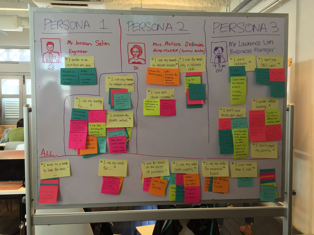
Insights from these sessions were grouped and organised using an affinity diagram, created on a whiteboard with post-it notes. This visual process helped highlight recurring themes and major usability concerns across all participants.
Several key issues were identified in the data collected:
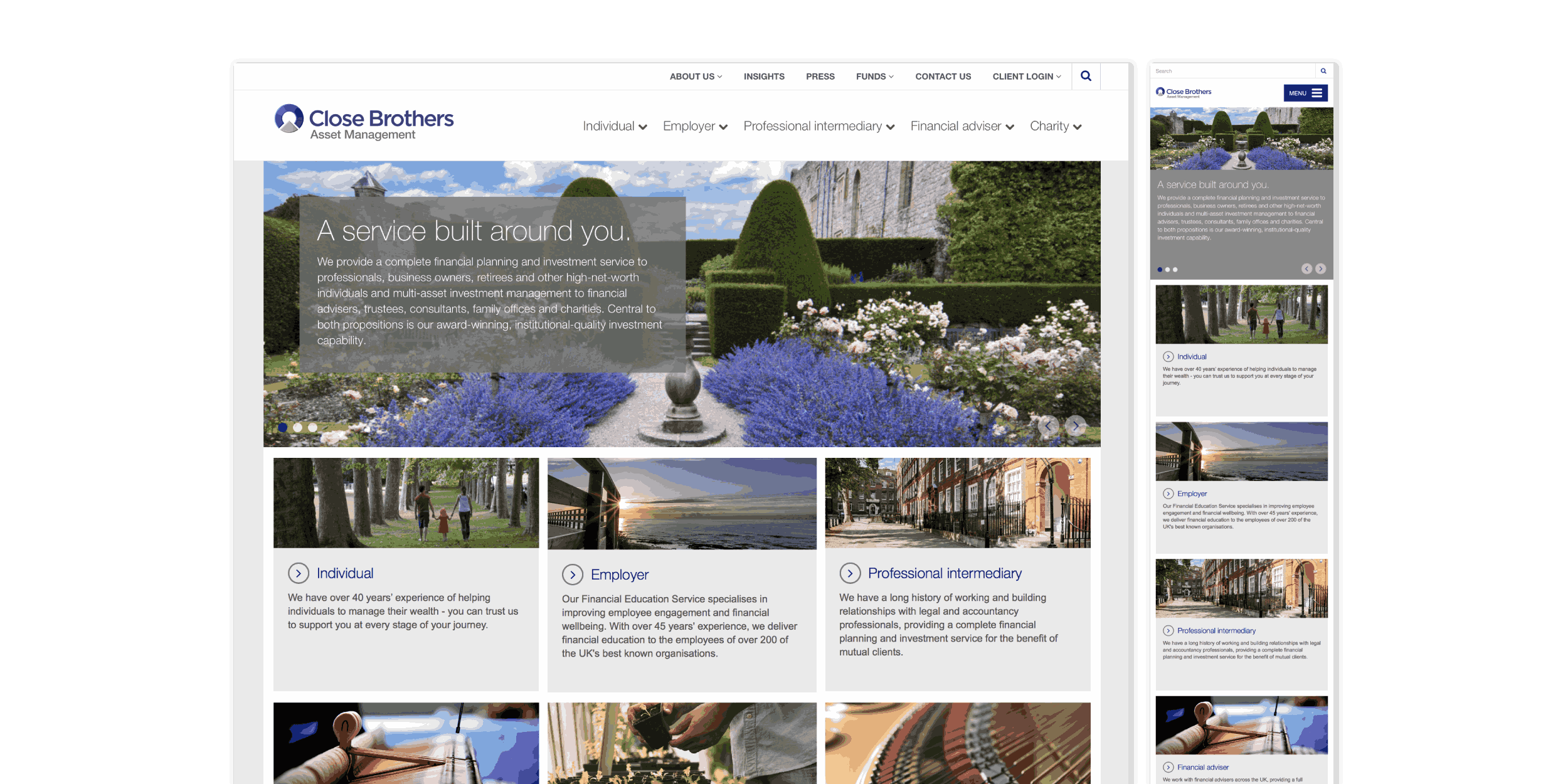
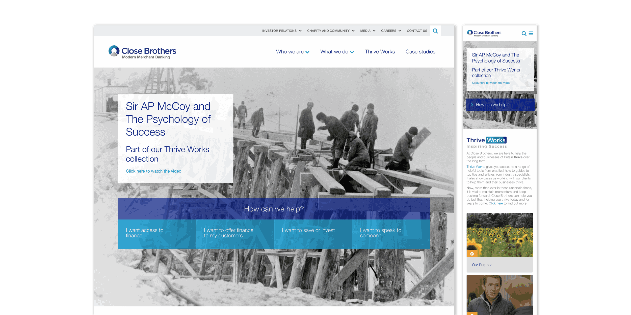
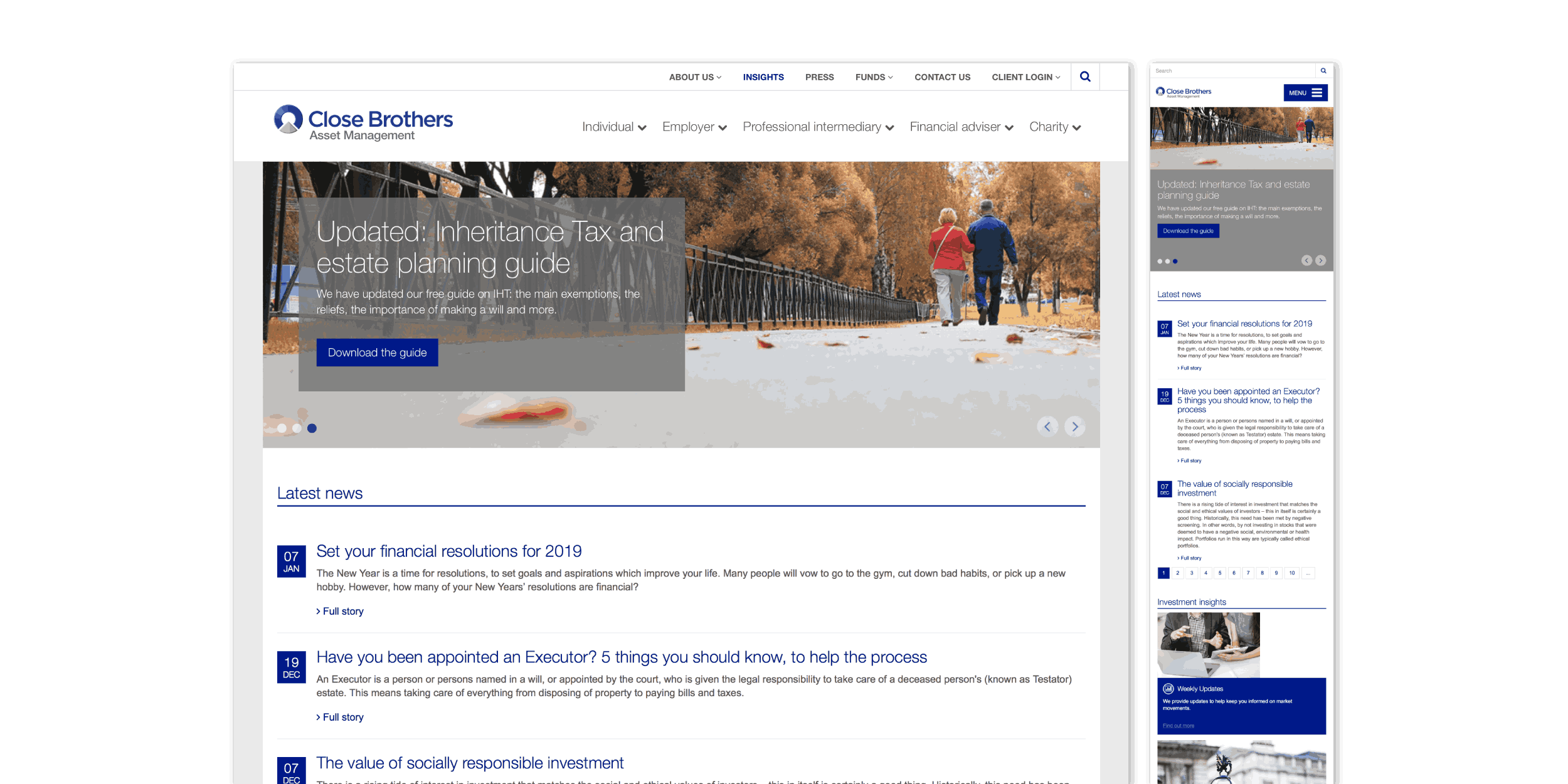
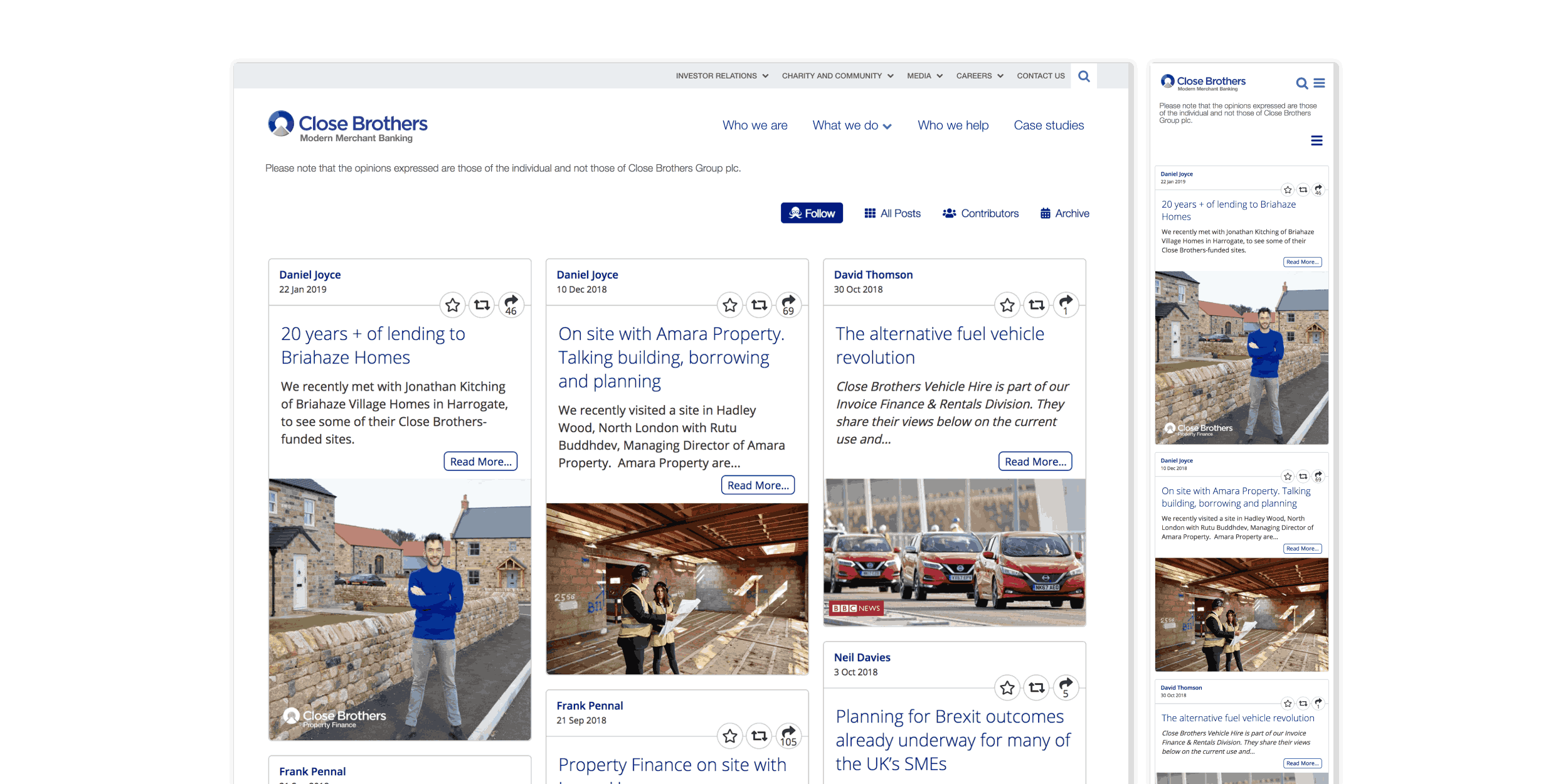
Unclear Purpose
Users struggled to understand what the company offered.
Content Overload
Pages felt text-heavy and tiring to read.
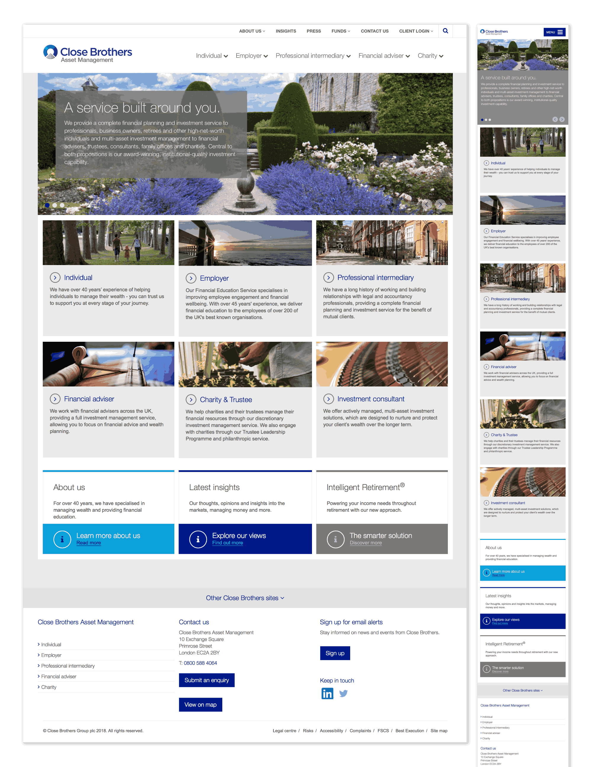
Visually Unappealing
The design felt blocky and lacked visual interest.
Poor Link Placement
Important links like "Learn more about us" were hard to find.
Limited Navigation
Menu options were too few, restricting site exploration.
Lacked Personal Relevance
Content felt generic and didn’t speak directly to user needs.