Website - Redesign
Nutmeg
Contents
Intro
The Nutmeg website enabled customers to build and manage diversified portfolios, using technology to keep charges low and transparently display where investments were held.
Challenge
A general consensus across the business identified the need for a website refresh. The launch of a new TV advertisement prompted the project to proceed, aiming to align the website’s look and feel with the updated brand direction.
Solution
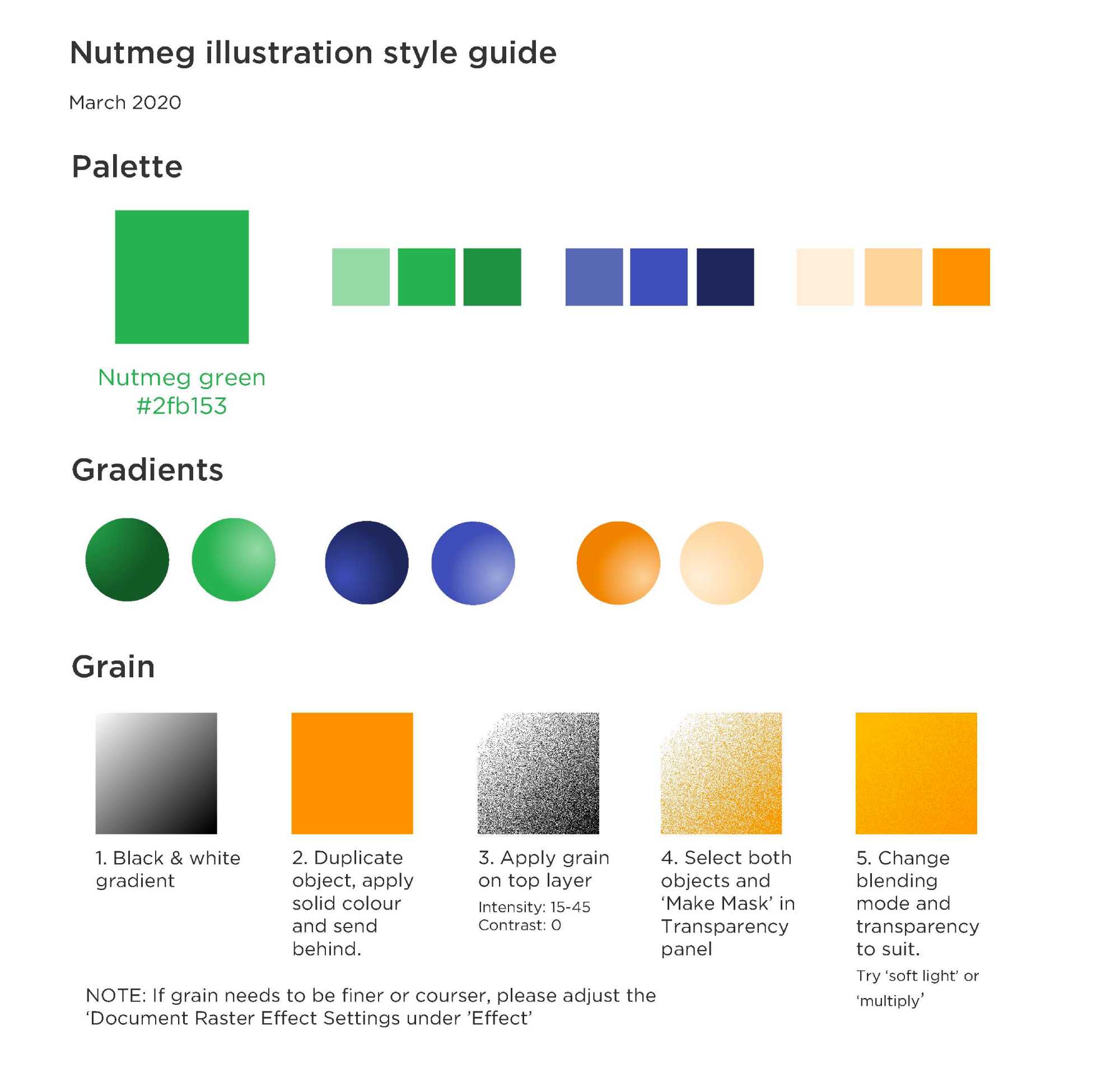
The website was redesigned as proposed, with an added focus on defining a consistent branding system to be applied across all platforms, addressing the existing lack of visual consistency.
1. First Launch

Following the launch of a new video campaign (see video), created independently by an external agency without aligning to the website branding, a surge in 'dual screening' behaviour highlighted a disconnect between the advert and the online experience. Users arriving from the TV campaign encountered confusion, as the website’s look and feel did not match expectations.

A rapid sprint was initiated to refresh the site and align it with the advert’s visual style. With only a one-week deadline, no user testing was conducted prior to launch. Despite this, the updated homepage drove a 79% increase in site traffic on the day of release.
Before
After
Nutmeg Homepage
2. Design Development

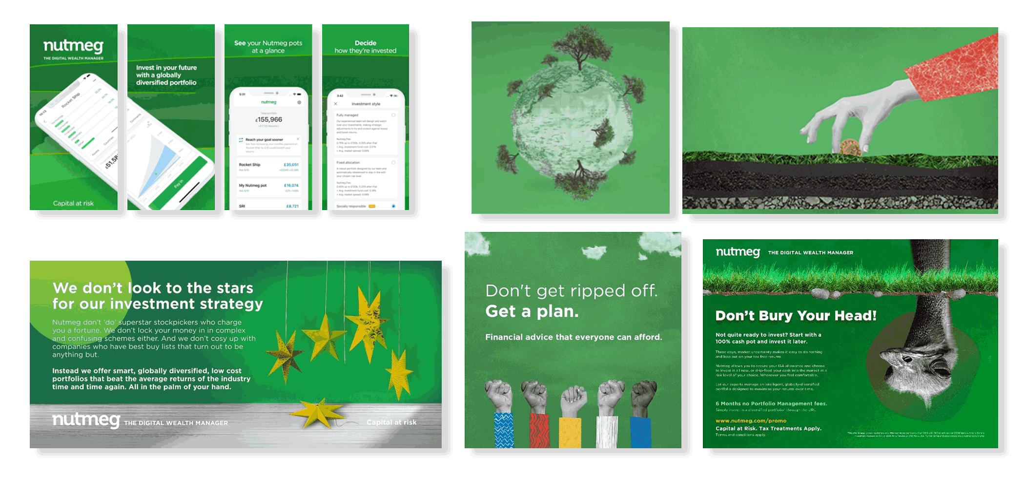
The response to the new 'collage' approach was positive. Over the following weeks and months, the style was further developed and applied across various channels, including marketing campaigns, brochures, multimedia presentation decks, and other branded materials.
The Collage Approach Being Used in a Range of Media
However, it was clear that the style had been retrofitted rather than designed as a long-term solution. As Nutmeg’s focus shifted towards attracting a higher net worth audience, concerns emerged about the lasting suitability of the montage approach.
3. Competitor Analysis

While aiming to 'disrupt' the financial sector, it became clear that many FinTech brands were starting to look the same. Many relied heavily on similar visuals such as mobile screens, credit cards, and bright colours, which caused them to blend together rather than stand out.
Competitor Adverts Looking Similar to Each Other
The collage approach resonated strongly with Nutmeg’s brand, helping it to stand out from competitors. It blended traditional strengths (investment expertise, real people behind the service, a human touch), with modern advantages (strong UX, digital efficiency, and transparent, low fees).

Similarly, the montage style reflected this balance: combining the traditional (hand-crafted artistry, a sense of care and craft), with the modern (digital-first design, three-dimensional depth, and clean simplicity).
4. Montage - Testing

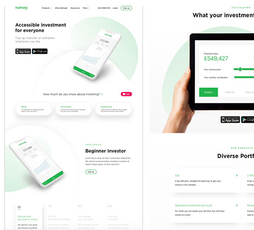
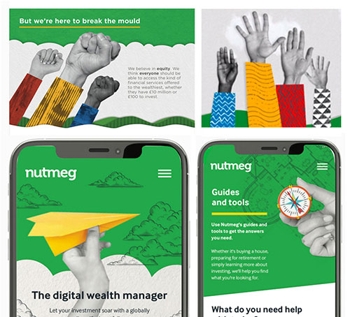
The next critical step was user testing with Nutmeg’s target audiences, ensuring decisions were based on real feedback rather than personal opinions. Two different moodboards were tested:
Classic vs. Modern
Classic vs. Modern
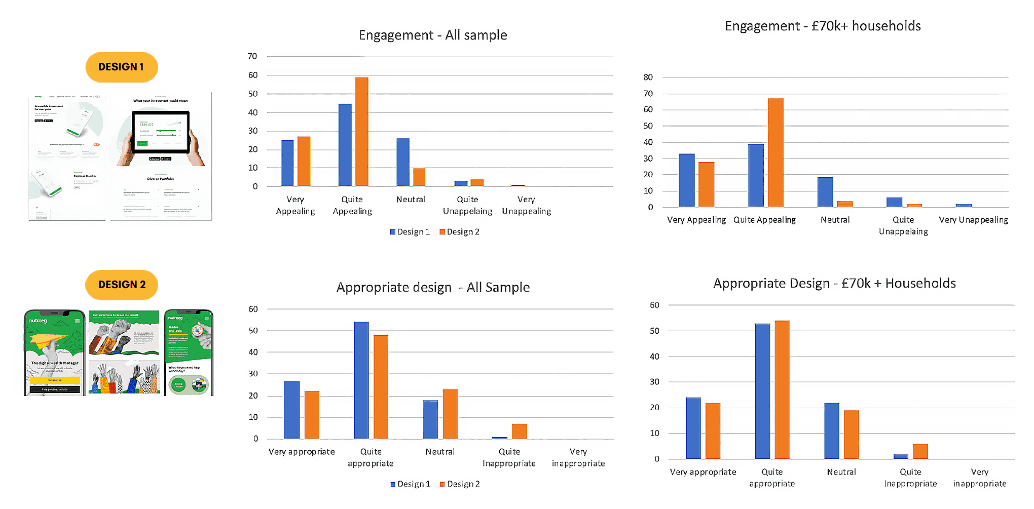
Among households earning £70k+, both designs scored similarly in terms of appropriateness. However, the montage style (Design 2) significantly outperformed the classic style in overall engagement, a crucial result for building a standout, emotionally resonant brand.

Key Insights
See chart results below for full breakdown.
Findings from the User Testing
5. Montage - Exploration

In the next round of testing, three creative directions were explored. Alongside the Classic FinTech and vibrant Montage Style, a third option was introduced: a refined version of the montage creative. This refinement included adjustments to the colour palette, a more restrained use of collage, and a more stylised, digital abstract montage approach.
Classic Fintech Design Classic Fintech Commentary Generated the lowest engagement scores among higher-income households. Although associated with positive traits such as simplicity, modernity, and professionalism, the design was perceived as generic within the FinTech landscape.
Engagement Scores
All respondents:
Very: 24.7%
Quite: 45.4%
Neutral: 26%

Family income >£75k:
Very: 23.8%
Quite: 42.9%
Neutral: 23.8%
Montage Style Design Montage Style Commentary Achieved exceptionally high engagement levels across all respondents, with over 85% rating it as 'quite' or 'very' engaging, rising to 94.5% among high-net-worth households. This style was strongly associated with vibrancy, innovation, engagement, and a sense of fun.
Engagement Scores
All respondents:
Very: 26.7%
Quite: 59.3%
Neutral: 10%

Family income >£75k:
Very: 27.8%
Quite: 66.7%
Neutral: 3.7%
Abstract Digital Montage Design Abstract Digital Montage Commentary Although engagement scores were favourable with affluent audiences, it did not perform as strongly as the original montage style, which continued to stand out as the direction to take for the rebranding.
Engagement Scores
All respondents:
Very: 16.9%
Quite: 46.6%
Neutral: 25.7%

Family income >£75k:
Very: 25.5%
Quite: 45.5%
Neutral: 23.6%
Across multiple rounds of testing, the montage approaches consistently delivered the strongest engagement scores, particularly with affluent audiences. While the abstract digital and classic FinTech styles were both considered professional and modern, the more vibrant and distinctive montage approach emerged as the clear standout.

It aligned more closely with Nutmeg’s ambition to reassert its position as a challenger brand in the marketplace.
6: Second Launch: Montage

Following in-depth research and careful exploration, the team opted for a distinctive collage style featuring paper cut-outs. This bold visual direction gave the brand a unique and memorable identity. The refreshed design launched in October 2019 and led to a 78% increase in traffic.
Scroll Here
Second Website Launch
7. Raster vs. Vector

Following the successful launch of the new homepage design, it became clear that another refresh was necessary. The website and mobile app lacked consistency, each operating within its own visual ecosystem with distinct styles. This fragmentation weakened the brand identity and contributed to customer confusion.

To resolve this, raster graphics were replaced with scalable vector graphics. This ensured that assets retained their quality across all platforms, including the mobile app.

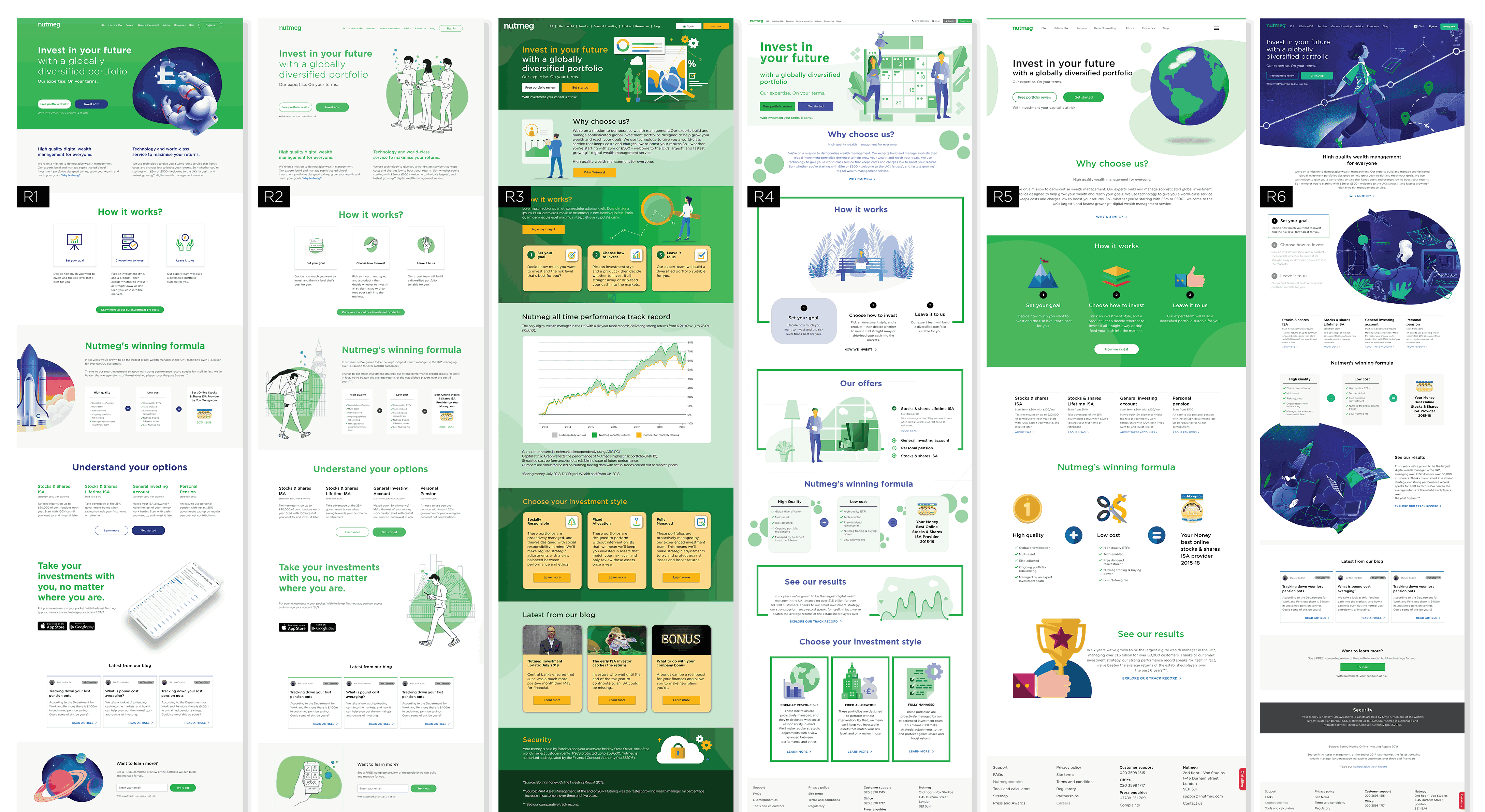
A variety of new designs were then developed, some revisiting the familiar montage style, while others experimented with illustration. All graphics used in these updated designs were created as vectors to support consistency and scalability across the digital experience.
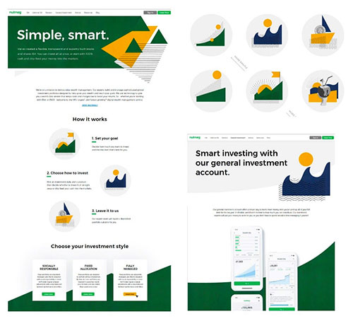
Some Vector Designs of the Homepage
8. Vector - Testing

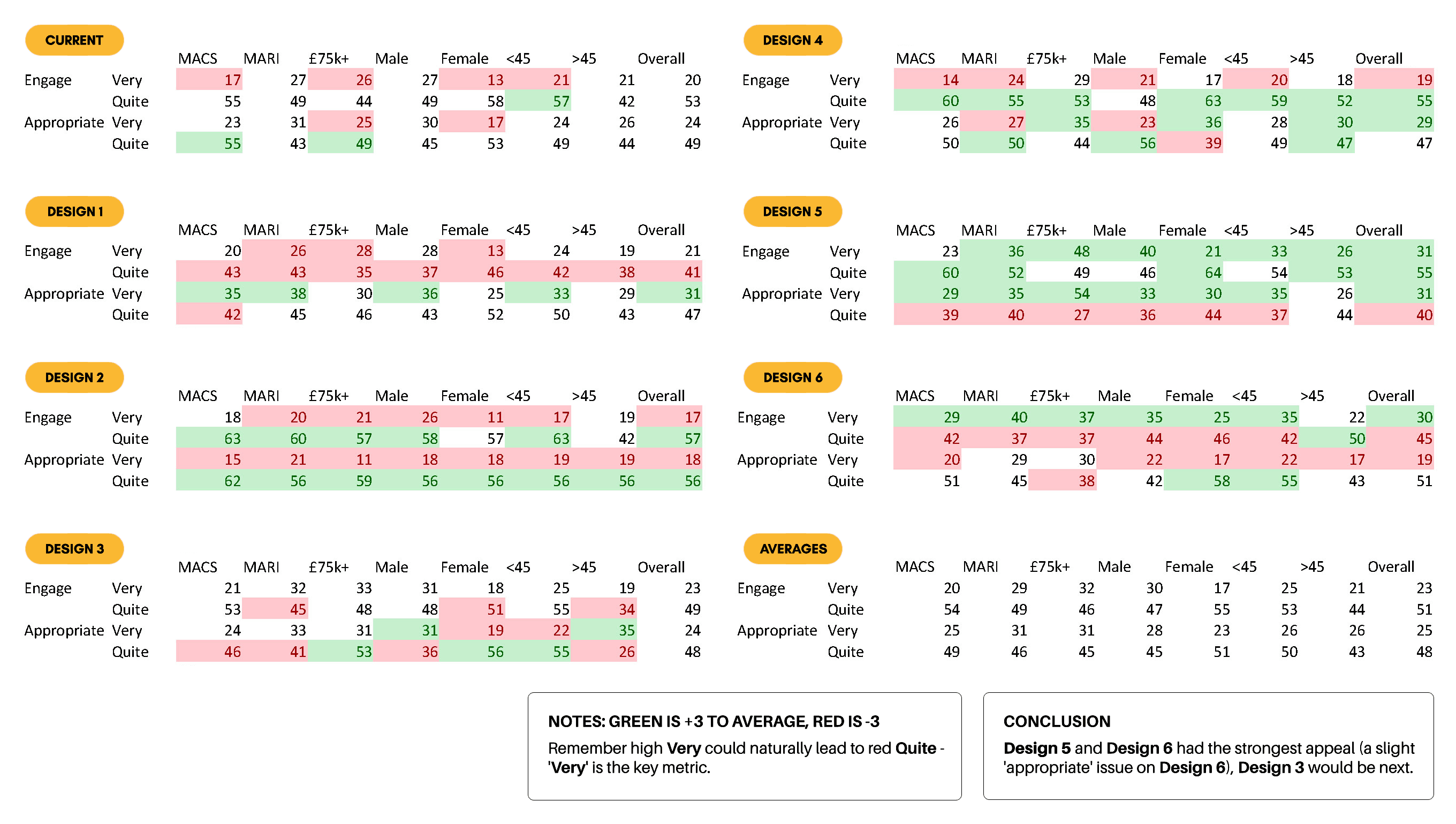
The test results were conclusive. Designs 5 and 6 received the strongest positive responses, with Design 6 slightly ahead in terms of overall engagement. Both were described by participants as “eye-catching,” “modern,” and “engaging.” Despite its strong appeal, Design 6 revealed some issues with perceived appropriateness across certain demographics.

Based on the findings, the decision was made to develop Design 6 further, incorporating successful elements from Design 5, such as a white background for the hero image and reduced use of textures.
Results from the Vector-Based Designs
Following several rounds of iteration and user testing, the final designs were produced. These performed well with Nutmeg’s target audience and were received positively within the organisation.

However, a shared observation across the business highlighted that, although the new designs were visually strong and functional, they lacked the distinctiveness of the earlier montage style. The updated visuals were ultimately viewed as too generic, with some of the brand’s previous uniqueness having been lost. Additionally, it was felt that representing the platform with imagery of individuals, however thoughtfully chosen, risked narrowing its appeal. As a financial service intended to be inclusive and accessible to all, the product needed a visual language that transcended specific identifiers such as gender, race, or age.
Vector Illustration 1
Vector Illustration 2
Vector Illustration 3
Scroll Here
Website Screenshot
Final Vector Based Design
9. Third Launch: Montage / Vector

Competitor Adverts Looking Similar to Each Other Building on all previous findings, the decision was made to return to the vibrant montage-style graphics introduced at the project's outset, while incorporating the textured, illustrative qualities developed later in the process. All visuals were produced as scalable vector graphics, with no raster images used.

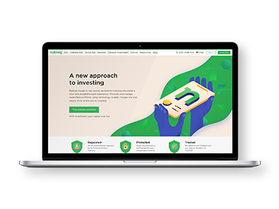
Following extensive development and testing, the final design (shown below) was launched in February 2020. The refreshed homepage led to an 82% increase in traffic and received particularly strong feedback from higher-net-worth audiences.

The success of this new visual direction prompted a wider rebrand across all customer touchpoints, including marketing assets, digital campaigns, and the mobile app, which entered the redesign phase shortly thereafter.

A new set of brand guidelines was also developed to ensure consistency across all channels, enabling internal teams and external partners to apply the updated identity effectively.
Scroll Here
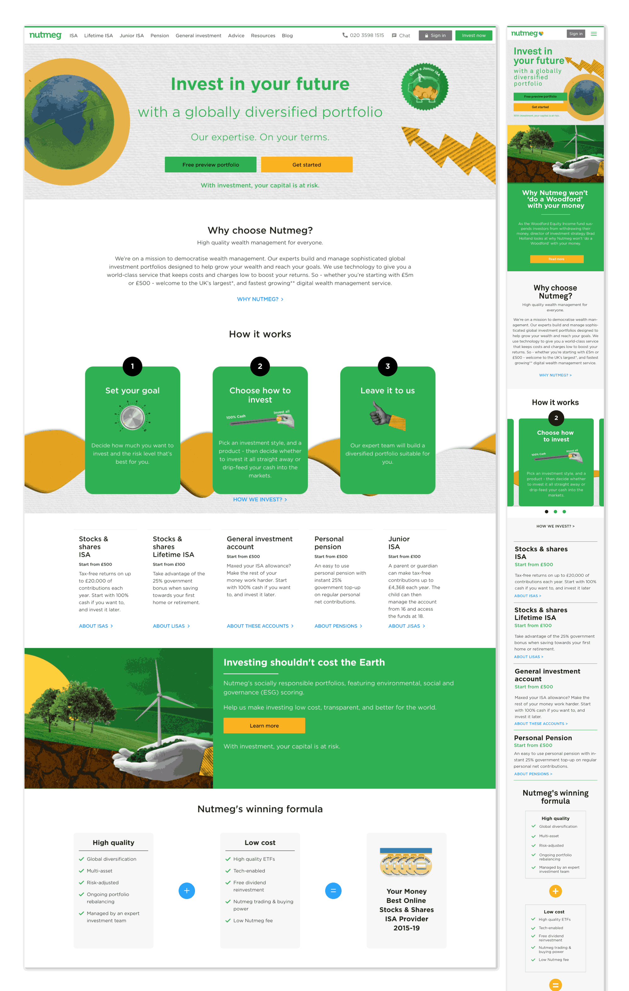
Final Website
Final Website
Following the success of the new brand direction, all product pages were fully redesigned, with selected before-and-after examples shown below.
Before
After
Fully Managed Page
Before
After
How We Invest Page
10. Illustrations & Icons Overhaul

With the new visual direction firmly established, a complete set of branding assets was developed from the ground up. This included a bespoke illustration style and an entirely new iconography system, designed to align with the updated montage and vector-based aesthetic.

Every element was crafted to maintain visual consistency across platforms, from the desktop homepage to mobile app interfaces. The illustrations combined clean vector shapes with layered textures and subtle gradients, reinforcing the brand’s professional yet approachable tone.
Icon 1
Homepage
Icon 2
General Investments
Icon 3
Pensions
Icon 4
ISA
Icon 5
LISA
Icon 6
JISA
Illustration 1
Illustration 2
The icon set was also reimagined to reflect the same design language (modern, geometric, and easily scalable), ensuring clarity and recognisability at any size. This cohesive asset library became the foundation for future product and marketing rollouts, helping to unify the brand experience across all touchpoints.
Icon 1
Icon 2
Icon 3
Icon 4
Icon 5
Icon 6
Icon 7
Icon 8
Icon 9
Icon 10
Icon 11
Icon 12
Icon 13
Icon 14
Icon 15
Icon 16
Animated Icon 1
Animated Icon 2
Animated Icon 3
11. Conclusion

The project spanned nearly 6 months, involving the creation of numerous design mock-ups and multiple rounds of user testing. It was a complex and demanding process, but one that brought valuable insights at every stage. The evolution of the design, from early experimentation through to the final creative direction, was a clear demonstration of how iterative thinking, collaboration, and audience feedback shaped the outcome. Though challenges arose, the process remained grounded in learning and discovery. The final result not only reflected the brand's strategic shift but also delivered a distinctive and engaging creative solution that stood apart in a crowded FinTech space.