App Dashboard - Redesign
Zilch Technology
Contents
Intro
Zilch was a rapidly growing Buy Now, Pay Later (BNPL) platform that allowed users to make purchases at thousands of retailers, including prominent brands like Amazon, eBay, AliExpress, and Nike.
Challenge
The app faced significant hurdles, including a substantial drop-off in user registrations and the need to enhance its features to attract a broader audience. A redesign became imperative to effectively address these issues.
Solution
To improve user engagement and expand the audience, an overhaul of the dashboard was proposed. This redesign introduced new components and features tailored to enhance the customer experience and reduce registration drop-off rates.
1. Introduction

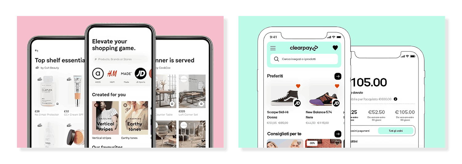
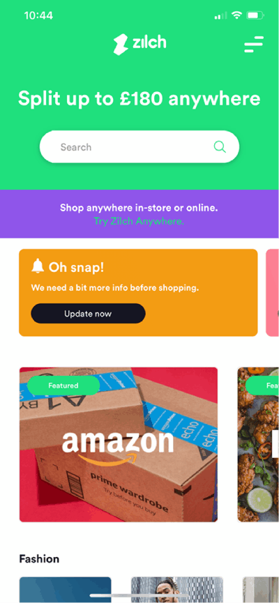
Zilch established itself as an innovative Fintech startup. They offered a virtual card that allowed users to engage in Buy Now, Pay Later (BNPL) transactions at a wide range of retailers, including industry giants like Amazon, eBay, AliExpress, and Nike. This model aimed to provide a flexible payment solution, allowing consumers to make purchases without the burden of upfront costs, thereby enhancing their shopping experience.

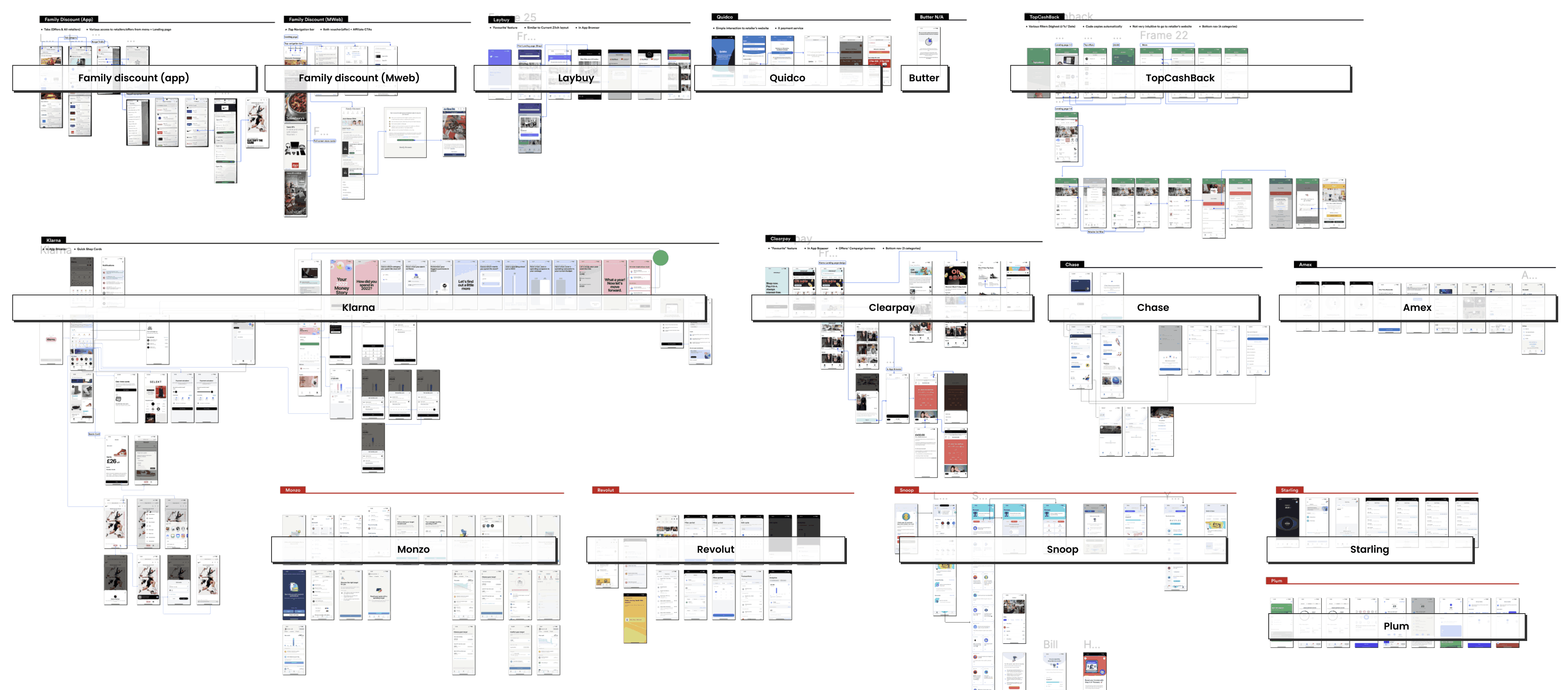
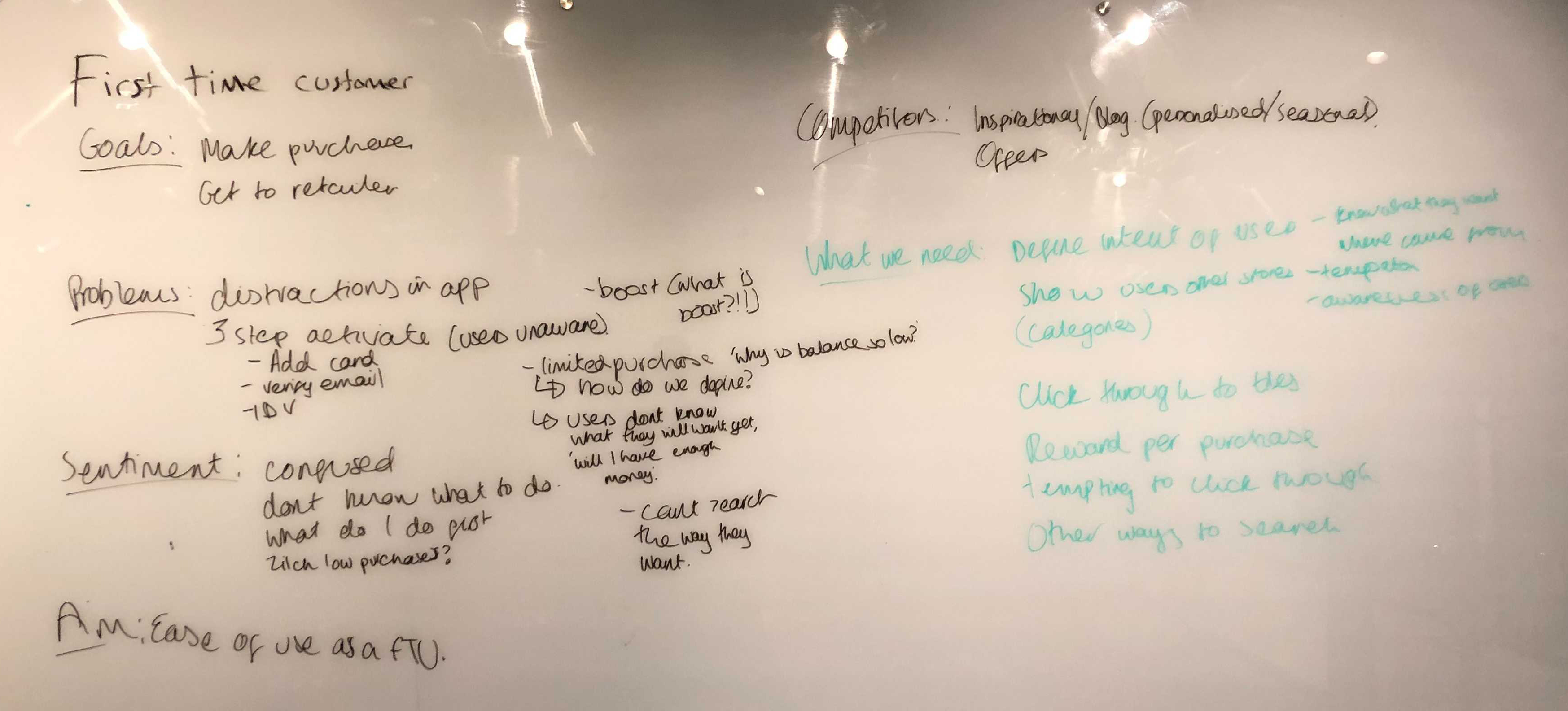
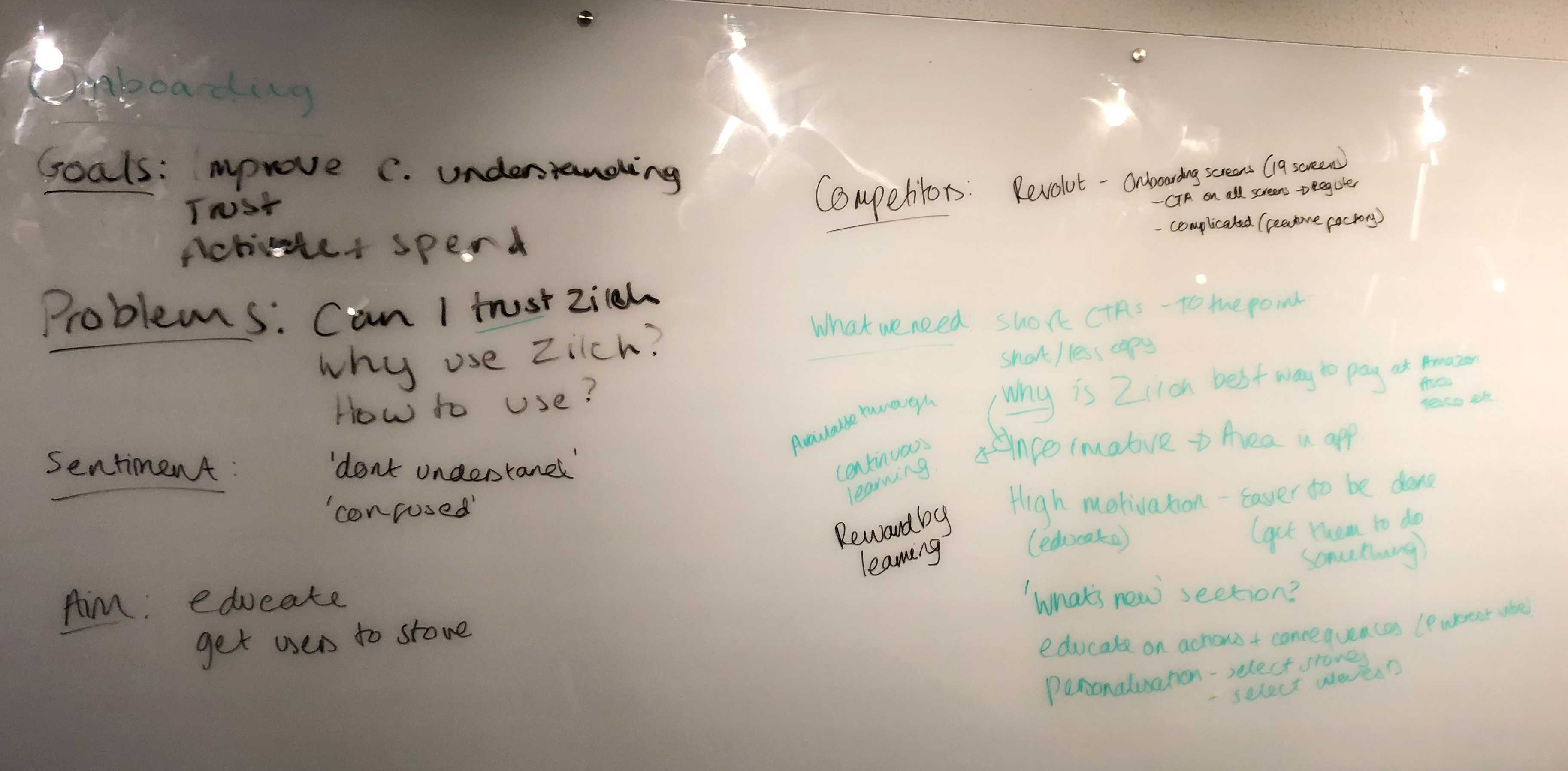
However, as the BNPL market became increasingly competitive, Zilch encountered significant challenges. A noticeable drop-off in user registrations highlighted issues within the app's onboarding process and overall user experience.
Constraints
  • Users found the registration process confusing and frustrating.
  • Asking for personal information and bank details upfront caused hesitation.
  • A spike in burner accounts showed the need for better verification.
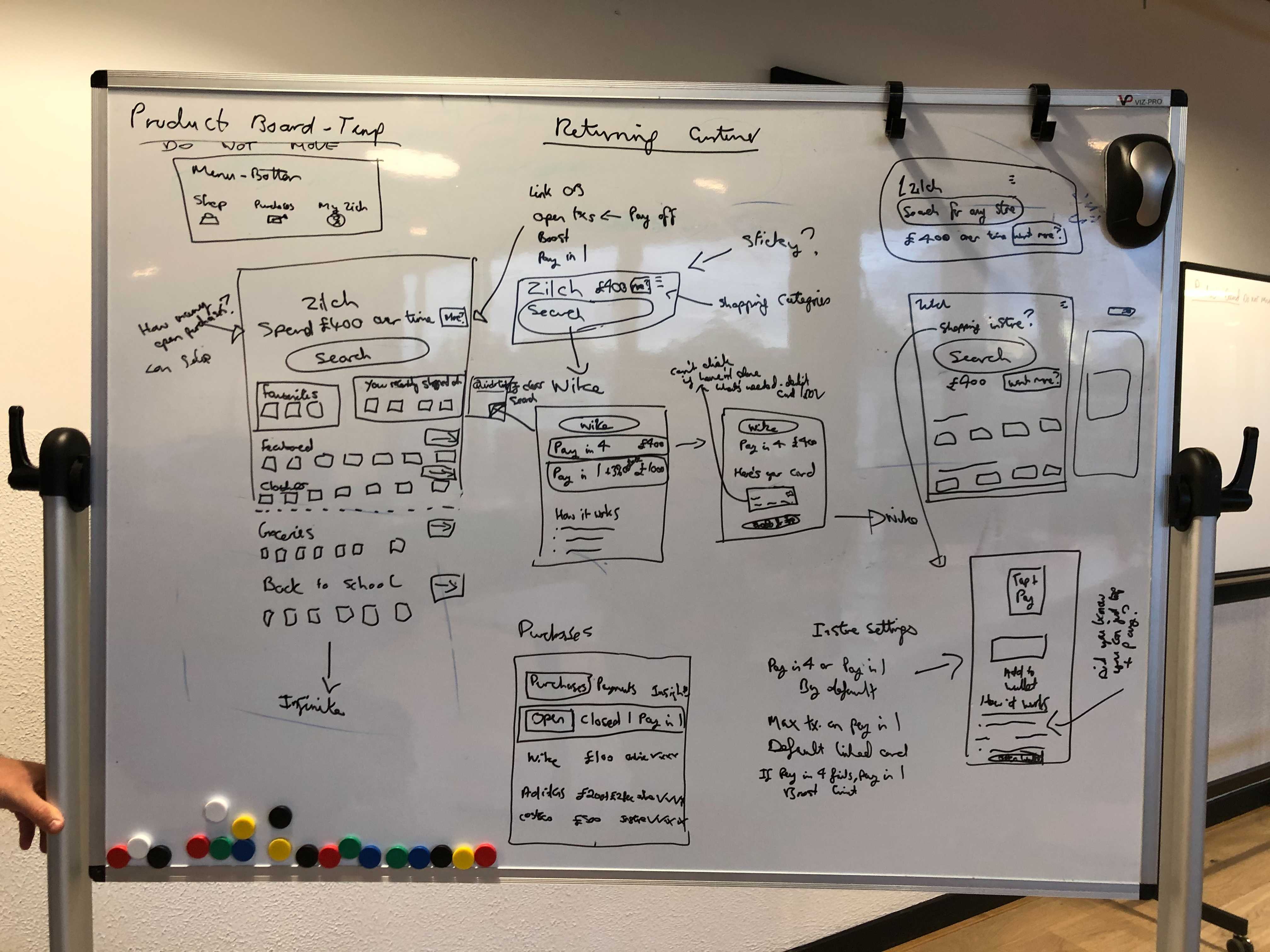
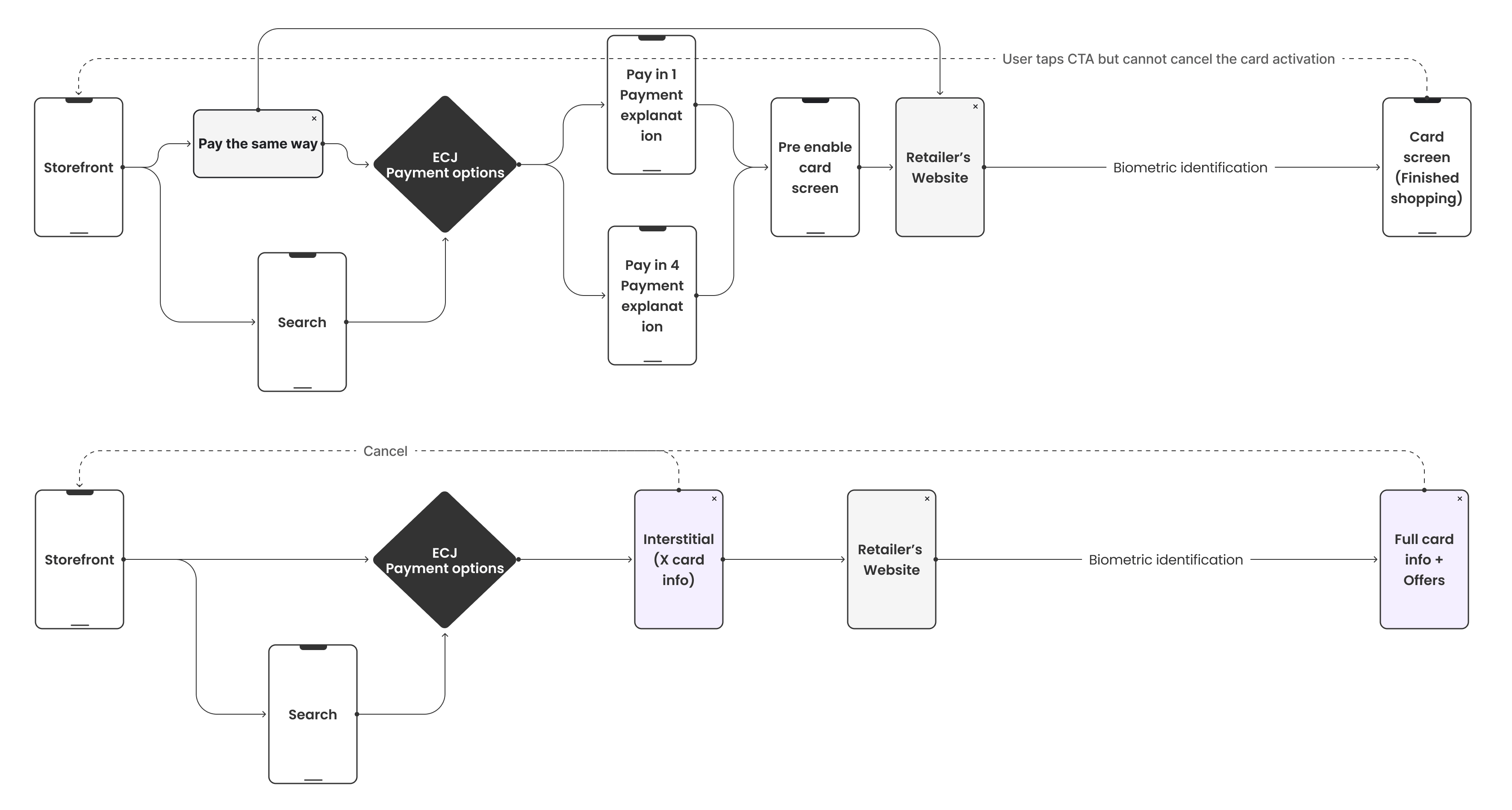
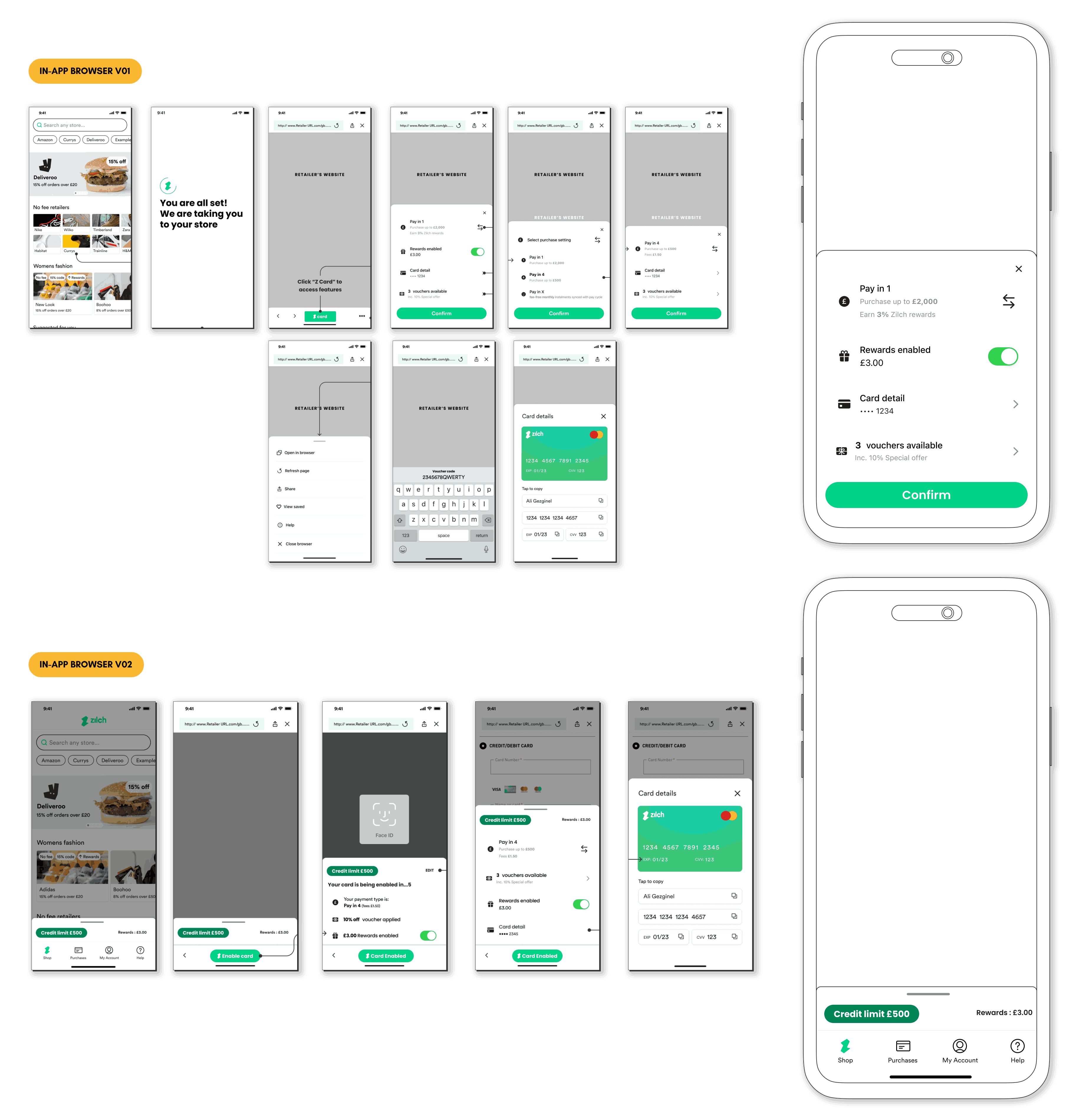
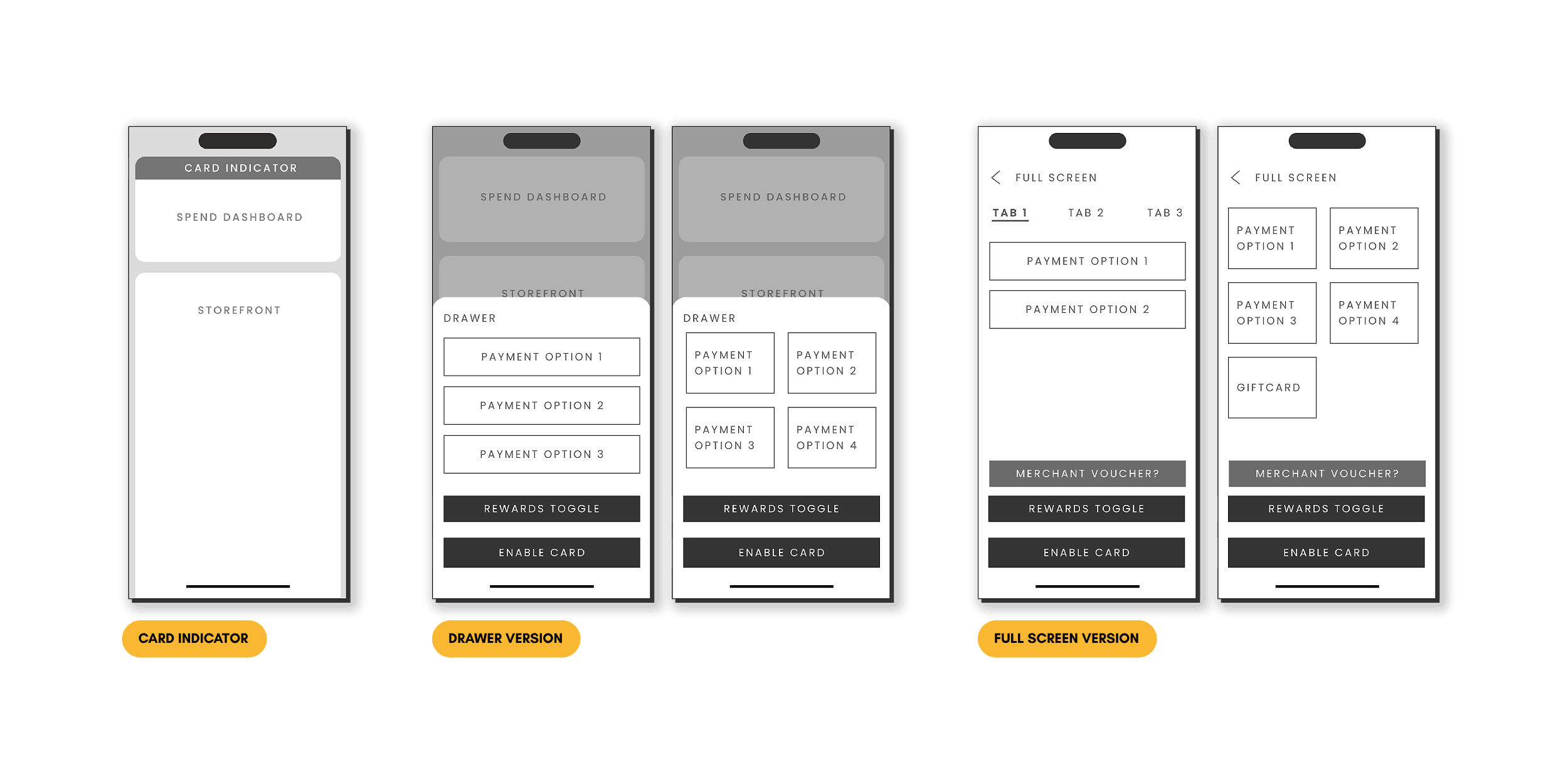
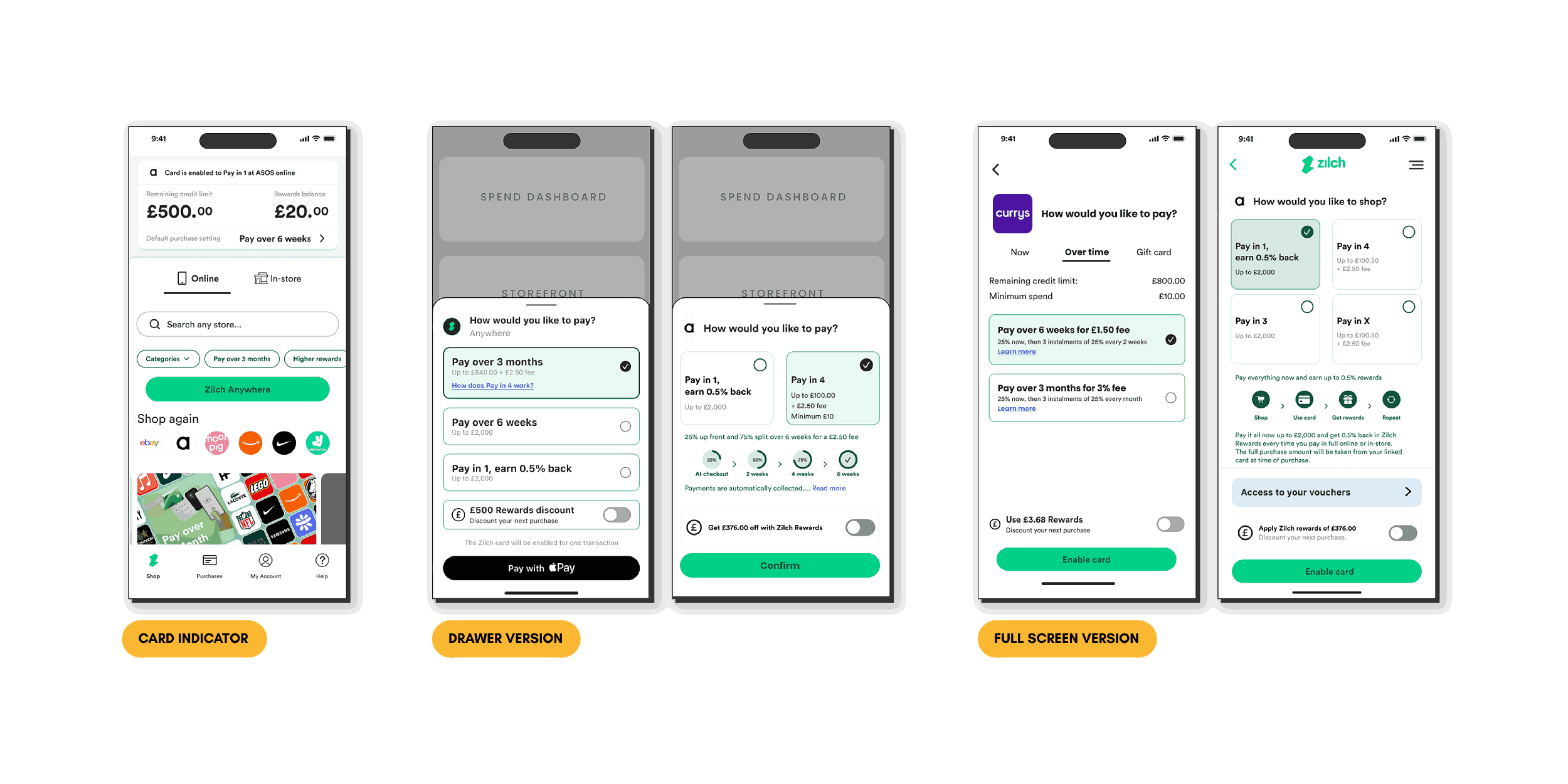
  • Zilch saw a full app redesign as key to staying competitive in the Fintech space.
Project Goals
  • Streamline the user journey to reduce friction and improve flow.
  • Simplify the registration process to increase completion rates.
  • Introduce new features that would improve usability and support user needs.
  • Broaden the platform’s appeal to reach a wider audience.
Zilch Storefront
2. User Flow

The user flow map (shown below) for the Zilch app provided a detailed overview of interactions across various sections, including Discovery, Storefront, Sign-Up, Verification, My Purchases, and Support options such as FAQs and Chat Support. The diagram illustrated the pathways users followed to access core features, highlighting decision points and branching paths that revealed the app's complexity. Mapping out each stage allowed redundancies and potential friction points in onboarding and navigation to be identified.
Scroll Here
User Flow in Miro
User Flow in Miro
To illustrate the findings from the user flow analysis, the screenshot below showcased the flow of interactions across the Zilch app. This visual representation highlighted the key stages users went through, from Discovery to Support, and identified decision points, branching paths, and potential redundancies. Analyzing these app screens revealed areas where the user journey could be simplified and streamlined for a more efficient experience.
Example of a Current Flow Analysis
Key FindingsMiro
Identifying these redundancies helped to simplify navigation paths and improve overall efficiency.
3. User Research

Internal Testing Report To gain insight into user needs and expectations for a BNPL platform, feedback was gathered from Zilch customers to better understand their purchasing habits and interactions with the app. A survey was sent to a random group of customers, resulting in 47 responses.

The survey consisted of the following 6 questions:
  1. Have you purchased using Zilch before this week? If yes - how long ago was that? If no - why not?
  2. What three things do you most dislike/find confusing about the app?
  3. What three things would you change/add into the app?
  4. How would you rate your experience using Zilch? Poor - Excellent (scale of 10)
  5. Could you elaborate on your answer for question 4?
  6. What three things do you like about the app?
Click the thumbnail on the right to view the full user testing report.

Key Findings

The user research provided valuable insights into the experiences, preferences, and challenges faced by users of the BNPL platform. Feedback gathered through surveys and detailed responses, revealed several core themes that highlighted areas for improvement and opportunities for enhancement.
Improvement
Description
Suggestions
Payment Process & Flexibility
Users emphasised the need for greater payment flexibility.
  • Monthly instalments
  • Longer split payment durations (6, 9, or 12 months)
  • Clear understanding of payment limits
Frustration with current purchase limits was common.
  • A consolidated overview of payments and balances
  • A dedicated calculator to predict instalments based on financial situations and basket totals
Storefront & Merchant Page Enhancements
Users found the current storefront and merchant pages disorganised and hard to navigate.
  • A structured layout for easy navigation through categories like fashion, technology, and home goods
  • Filtering options to locate specific retailers or products
  • Enhanced search functionality for keyword searches
  • A more visually appealing and intuitive interface to improve the shopping experience
Rewards & Gamification Elements
There was strong interest in a more engaging and rewarding user experience.
  • Introducing gamification features to earn points for actions like referring friends or making timely payments
  • Implementing a tiered rewards system, similar to other financial services, where bonuses could be earned based on spending habits
Profile Customisation & Usability Improvements
Users wanted enhanced profiles with greater customisation options.
  • Ability to add profile pictures and set favourite merchants
  • Easy updates of personal information without contacting customer service
Users wanted improved security.
  • Options for PIN-based logins
  • Better support for password managers
Transparency & Trustworthiness
Users were hesitant to register because they had to provide personal information and bank details before accessing the storefront.
  • Allow users to sign up with just their email for immediate access, with bank details to be completed later
Users expressed a strong need for clearer communication regarding:
  • Fees and payment timelines
  • Processes involved in using the app
  • Detailed explanations of the fee structure for specific transactions
  • Clear guidelines on card activation and limit increases
  • Real-time notifications for issues or required actions to build trust in the platform
4. Competitor Analysis

A general competitor analysis was conducted, looking at digital banking platforms such as Monzo, Revolut, and Starling. While these companies were exploring options to introduce BNPL features to offer customers more flexible ways to pay, none had a dedicated BNPL service at the time. As a result, they were excluded from the core research focus.
Competitor Analysis
Competitor Analysis
Klarna and Clearpay were selected as the primary competitors for in-depth analysis, as both offered established BNPL services and were closer to Zilch in terms of product scope and user experience. Each provided interest-free instalment options and had partnerships with a wide range of merchants across categories such as fashion, beauty, travel, and tech.
Competitor Research
Competitor Research
Reviewing Klarna and Clearpay’s offerings and user journeys revealed consistent patterns and uncovered actionable insights that directly influenced the redesign of the Zilch platform. The following insights are summarised below.
Strengths
  • Flexible Payment Structures: Klarna offered multiple ways to pay, including “Pay After Delivery,” “Pay Now,” and “Pay Over Time”, giving users more control. Clearpay used a consistent four-instalment model with fixed bi-weekly payments, making budgeting more predictable.
  • Simple Onboarding: Both platforms featured fast and low-friction sign-up processes. Klarna allowed registration with just an email, while Clearpay restricted new user spending to promote safe usage.
  • Mobile App Support: Each app provided features that helped users manage their payments, Klarna with a to-do list for tracking, and Clearpay with calendarm-style reminders for upcoming instalments.
  • In-Store Payment Options: Clearpay stood out with its scannable barcode system, enabling seamless in-store purchases through the mobile app.
Weaknesses
  • Confusing or Rigid Payment Systems: Klarna’s multiple payment types could overwhelm users, while Clearpay’s four-instalment plan offered little flexibility for those needing different schedules.
  • Limited In-Store Support: Klarna’s features were primarily online-focused, offering fewer options for brick-and-mortar transactions.
  • Short Payment Intervals: Clearpay’s two-week instalment cycle didn’t always align with monthly pay periods, potentially complicating budgeting.
  • Penalty Risks: Both services included late fees for missed instalments, creating potential financial stress.
  • Lack of Personalisation: Neither platform offered dynamic adjustments to payment plans or tools for deeper financial planning beyond reminders and limits.
Insights Gained
  • Klarna provided a flexible, user-centric payment system with quick onboarding and smart tracking, but lacked clarity in-store and risked confusing users with too many options.
  • Clearpay succeeded with a straightforward and reliable four-part payment model, bolstered by wide merchant partnerships and strong in-store support, though its rigid structure and short payment cycles presented some challenges.
  • Both platforms leaned heavily on email and in-app notifications but offered minimal educational support or adaptive budgeting features.
Key Findings
These findings helped shape Zilch’s new feature roadmap, focused on loyalty rewards, transparent fee structures, customisable notifications, and accessible financial tools to deliver a BNPL experience built on trust, clarity, and control.
5. Brainstorming

Brainstorming sessions were organised to generate creative solutions for issues identified in the user research, specifically focusing on first-time users and the onboarding process. Each session aimed to address the challenges new users encountered, with the goal of streamlining their experience, building trust, and encouraging engagement.

Below are some ideas generated during these sessions.
Brainstorming Ideas
Brainstorming Ideas
The sessions began by defining specific goals and challenges for each user segment:
First-Time Customers
  • Goals: Enable users to make purchases smoothly and connect with retailers.
  • Problems: Distractions within the app, complex activation steps (such as adding a card, email verification, and ID verification), and limited understanding of features like "boost."
  • Feedback: New users frequently reported feeling confused and uncertain about what steps to take after signing up, experiencing challenges with low purchase limits and concerns around balance.
  • Aim: Simplify the experience for first-time users, enhancing ease of use and clarity around the purchasing process.
Proposed solutions:
  • Defining the intent behind each user action and displaying alternative store categories for improved guidance.
  • Enhancing navigation and providing click-through links to categories for greater accessibility.
  • Implementing a reward mechanism per purchase to encourage further engagement and exploration of app features.
Onboarding
  • Goals: Improve user understanding, instil trust, and encourage spending.
  • Problems: Trust concerns, a lack of clarity about Zilch's purpose, and a complicated onboarding process.
  • Feedback: Users reported confusion and a lack of clarity, particularly due to an onboarding process requiring bank details before accessing the storefront, which led to hesitancy in adopting the service.
  • Aim: Educate users and build trust by creating a more informative and accessible onboarding process.
  • Aim: Educate users and build trust by creating a more informative and accessible onboarding process.
Proposed solutions:
  • Shorter, more concise calls-to-action (CTAs) and a reduction in the number of screens required for registration.
  • Continuous learning features and a reward-by-learning mechanism to provide gradual education for users.
  • Highlighting Zilch’s advantages as a payment option at popular retailers (e.g., Amazon, Tesco) and creating an informative app area to reassure users about its unique offerings.
  • Incorporating motivational prompts to guide users towards completing essential actions, making the process more engaging.
In each session, participants brainstormed ideas individually before discussing and refining them collectively. This collaborative approach enabled the team to explore a variety of potential solutions, ultimately selecting strategies designed to enhance Zilch’s user experience, making it smoother, more intuitive, and engaging for new customers.
6. Solution

The feature list below was shaped by user research, competitor analysis, and team brainstorming sessions. Priority was given to enhancements that offered the most immediate value.

Key focus areas included:
The following features were omitted from Phase 1 due to time constraints and were scheduled for consideration in Phase 2 or future development stages.
7. Wireframing

Initial wireframes for the redesigned Zilch app were developed alongside rapid idea generation and early concept sketching. Whiteboards were used to explore and iterate quickly, allowing a focus on a minimal layout that prioritised core functionality. Visual distractions were removed to help test and refine key design elements before committing to digital wireframes.
Initial Screen Ideas on the Whiteboard
Before creating wireframes, several iterations of the app’s user flow were carefully reviewed and refined to ensure a smooth and natural progression between steps. This process focused on identifying and removing potential friction points, while incorporating insights from earlier research to enhance clarity and usability.
Flow Iteration
Flow Iteration
Design exploration began by translating the refined user flows into higher-fidelity app screens. Multiple design variations were explored. This stage was crucial for visualising how the final product would appear and function, enabling the team to make design decisions that aligned with the intended user experience.
Scroll Here
Design Exploration
Design Exploration
Feature reiteration involved revisiting key functionalities based on ongoing user feedback and testing. As new features were added or modified, the design was updated and refined. This process ensured that features not only met user needs but also integrated seamlessly into the overall app experience. Each iteration allowed for adjustments to be made to the UI and interaction elements, ensuring that all features were intuitive, accessible, and aligned with the overall design vision.
Low-Fi
Mid-Fi
Feature Reiteration
8. Design System

Refreshing the design system was a primary objective identified at the start of the project. Core components were defined, including:
The refreshed design system provided a comprehensive reference for maintaining visual consistency and laid the foundation for scalable future enhancements.
The Grid
The Grid
Colour Palette
Colour Palette
Typography
Typography
9. Final Design

The final design of the Zilch app incorporated valuable insights and feedback gathered throughout the user research and design process. Key enhancements addressed the identified challenges and prioritised user needs, resulting in a more engaging and user-friendly experience.

Key improvements included:
These enhancements not only aimed to improve user satisfaction but also to position Zilch as a competitive player in the BNPL market.
Scroll Here
Final Rebranded Designs
Please click the link below to see the Figma board showcasing the various design concepts and ideas that were explored throughout the project.

Ideas Exploration Features
10. Testing

The testing phase of the Zilch app redesign involved an iterative process aimed at refining the user experience based on real user feedback. A total of 18 users participated in testing sessions, offering valuable insights into how effectively the new features and design elements addressed their needs and expectations.

The testing utilised various tools to facilitate both qualitative and quantitative feedback, including: Results and Outcomes
'Click through' payment option
16 18
didn't like the lack of visibility of alternatives via the "Pay a different way" click-through.
4 18
found it difficult to distinguish between the full screen and mobile drawer versions.
12 18
preferred the drawer because of the simple interaction. Users also liked that they could see other features behind the drawer.
'Click through' payment option
Tabbed categorisation
2 18
expressed a preference for the tabbed design to be more organised and visually appealing.
16 18
preferred to see all payment options to be displayed on one screen.
Tabbed categorisation
Card info screen variants
17 18
users preferred the inclusion of a card representation as it established a sense of familiarity and built trust among users.
All
users preferred having both the card and info fields on the same screen. Incorporating this crucial information directly onto the card designs brought a new level of clarity and facilitated a seamless understanding of ownership.
Card info screen variants
The testing sessions revealed several key findings:
The insights gained from the testing phase were instrumental in fine-tuning the design and ensuring that user needs remained at the forefront of the development process. Feedback loops established during testing helped inform adjustments that enhanced user satisfaction and ultimately contributed to a refined final design.
11. Conclusion

In conclusion, the project centred on enhancing the user experience of the Zilch app through insights gathered from user research and feedback. Key improvements included:
Although features such as rewards and gamification, transparency measures, and an instalment calculator were omitted from the first phase, they were identified for future development. The initial updates successfully gained user trust, simplified navigation, and created a more enjoyable shopping experience. Ongoing user feedback remained essential for refining the platform to better meet user needs as development progressed.

The research methods used for this project provided valuable insights into user needs and preferences, leading to a targeted feature list for the initial redesign. However, there were opportunities for improvement:
By enhancing these methods, the project could achieve an even deeper understanding of user needs and create a more reliable, user-centred design for Zilch moving forward.